
Eye-Catching Main Titles and Creative Typography Design Topics
Need to make a Eye-Catching Main Titles and Creative Typography Design poster? Find topic options, copy references, section ideas and layout suggestions.
Topics you can use
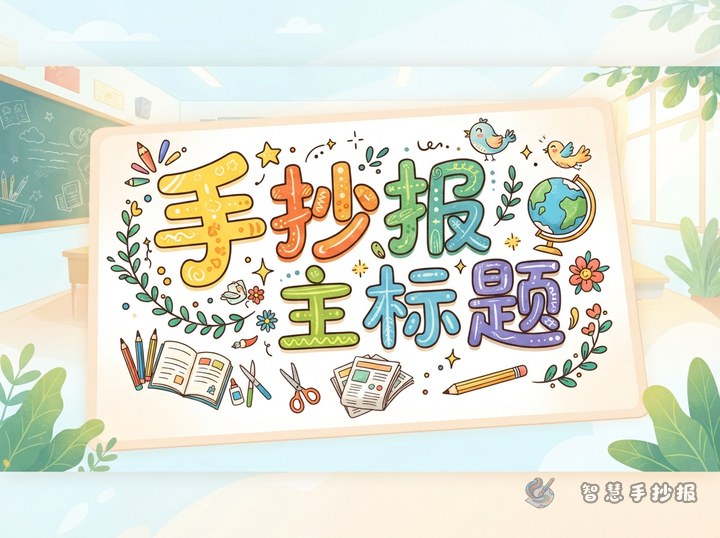
How to Space a Poster Title: Letter Gaps and Size Rhythm That Grab Attention
Many posters have neat single letters that still look cramped or scattered once lined up. This article starts with measuring the title area, then explains tight, even and loose letter spacing, shows how to enlarge one key character to create rhythm, and adds title word lists, color rules and simple fixes for a crooked title.
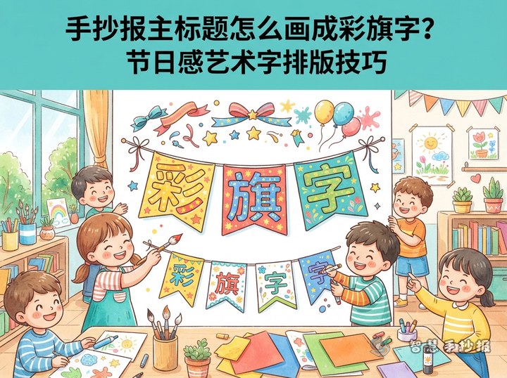
How to Draw a Pennant-Style Handwritten Poster Title
Pennant lettering turns a main handwritten poster title into a row of small colorful flags. With consistent shapes, bold centered letters, string details, and a controlled palette, children can create a lively headline that matches the poster theme and leaves room for clear content sections.
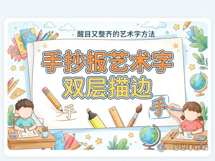
How Do You Draw a Neat Double-Outlined Title for a Hand-Copied Poster?
A double outline keeps a hand-copied poster title readable against colorful illustrations and panels. This guide covers pencil planning, thick letter construction, light and dark contours, three-color combinations, themed details, suggested content sections, and spacing around the title.

How Do You Replace Headline Strokes With Small Pictures?
A hand-copied poster headline can become more expressive when a few strokes are replaced with leaves, books, stars, or rockets. This guide explains which strokes to change, how to coordinate colors and outlines, what sections and short text to include, and how to preserve spacing and readability.
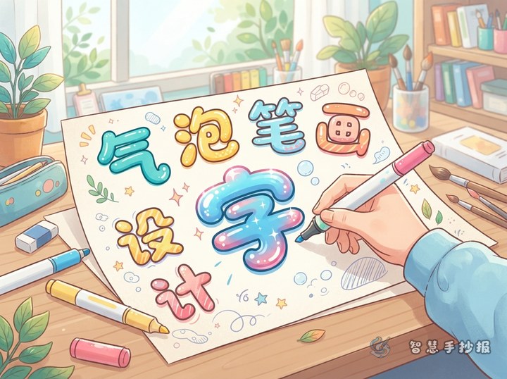
How Do You Draw Bubble Letters for a Hand-Copied Poster?
Turn a plain hand-copied poster heading into lively bubble letters with rounded strokes, a consistent outline, bright color, and upper-left highlights. This guide also offers theme-based decorations, section ideas, short writing samples, and practical spacing tips for a clear, balanced school poster.
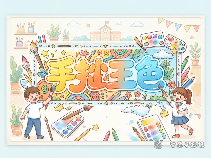
How Do You Color a Gradient Title for a School Poster? Three-Color Blending Tips
A strong gradient title can make a handwritten school poster eye-catching without making it look crowded. This guide explains how to divide thick letters into light, medium, and dark color areas, blend the transitions, select colors for common themes, and coordinate the title with useful sections, short text material, borders, and decorations.
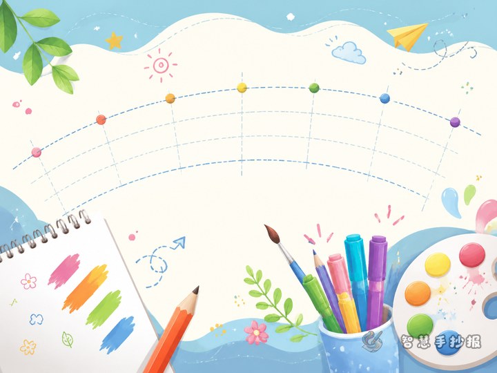
How Do You Draw a Wavy Main Heading for a School Poster?
A gently curved title can give a hand-copied school poster energy while staying easy to read. This guide explains how to use a pencil guideline, center the letters, control spacing, match decorations to reading, environmental, holiday, or science themes, and balance the heading with content boxes and open space.

How Do You Draw Hollow Title Letters with Theme Patterns?
Hollow lettering makes a school poster heading stand out while leaving room for theme-based decoration. This guide explains how to sketch the letter shapes, add simple motifs, control colors and spacing, connect the title with content sections, and keep the finished heading easy to read.
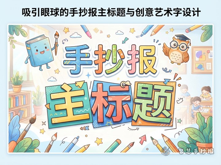
How Do You Arrange a Long Hand-Copied Poster Title? A Two-Line Offset Lettering Guide
A long poster title does not have to be squeezed into tiny lettering. Divide it at a natural phrase break, arrange the two lines with a slight offset, and enlarge the key words. Consistent outlines, limited colors, and a few theme-related motifs will keep the title clear while preserving room for content sections.
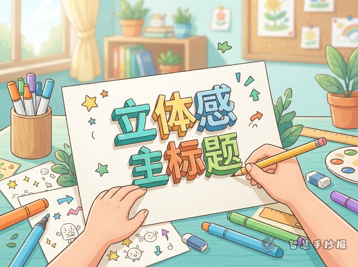
How to Draw a 3D Hand-Copied Poster Title: Layered Shadow Lettering Guide
A clear 3D title can make a hand-copied poster stand out without requiring advanced drawing skills. Build thick outlined letters, add a consistent offset shadow, and finish them with highlights and theme-based decorations. This guide also offers color plans, sample wording, and layout ideas.
Want to create a poster now?
Scan with WeChat, enter this theme, and generate the layout, section copy and line art.
 Scan with WeChat