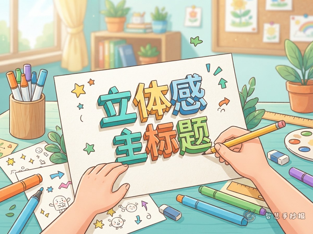
Make Readability the First Goal
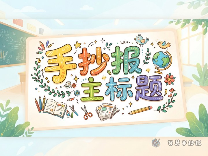
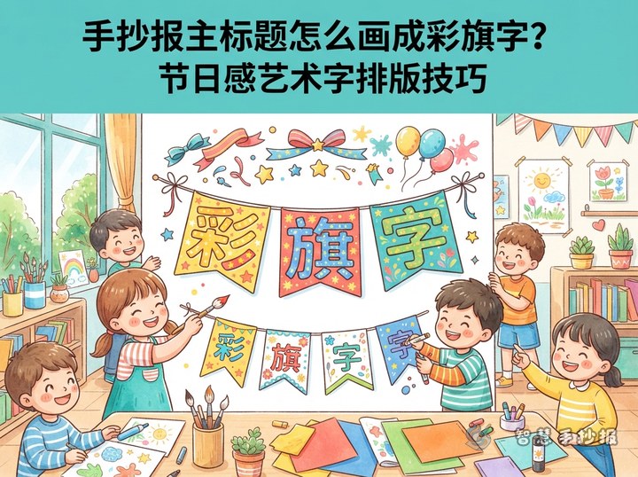
A hand-copied poster title should be attractive, but its first job is to communicate the theme immediately. Count the words before drawing and reserve about one quarter of the page near the top or visual center. A short title can stretch across one line, while a longer title may work better on two lines with two to four key words enlarged.
Useful title ideas include Reading Lights Up Childhood, Be an Eco Helper, Explore the Wonders of Science, and Grow Up Safely. Add a short line beneath the title when needed, such as “Small actions today can build good habits for every day.”
Build Offset Shadow Letters in Five Steps
- Mark the space: Lightly draw a title box and center line, then divide the area according to the number of words.
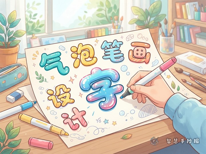
- Create thick letters: Write the basic forms first and expand each stroke into a clear outlined shape.
- Offset the outline: Repeat the lower-right edges a short distance away from every letter.
- Connect the corners: Join matching points on the original and offset outlines to form visible sides.
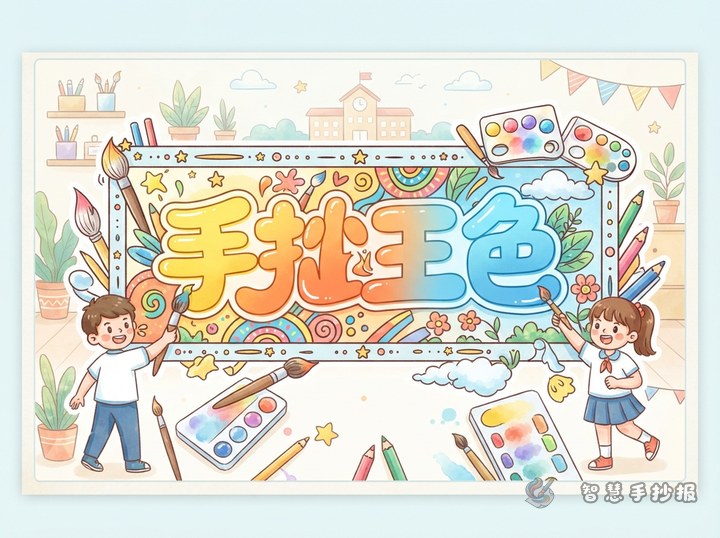
- Add color: Fill the front with a bright color, darken the sides, and finish with white highlights or a fine outline.
The shadow does not need to be wide. Small letters need only a narrow offset, while large letters can support deeper sides. Complete all outlines before coloring so the direction and depth stay consistent across the whole title.
Match the Palette to the Topic
- Reading: Use golden orange fronts with dark red-brown shadows, then add tiny books, pencils, or stars.
- Environment: Pair light green fronts with deep green sides and use leaves or water drops as small accents.
- Science: Try blue-to-purple fronts with navy shadows, surrounded by simple gears, planets, or sparkles.
- Safety: Combine bright yellow fronts with orange-red sides and add a shield or crosswalk symbol.
Color should support recognition rather than distract from it. Add a darker outline on pale paper or a thin white border when the title sits on a dark panel. Keep decorations in open spaces so they do not cover important letter strokes.
Let the Title Guide the Page
When the main title sits at the top, its down-right shadow can lead the eye toward three content sections below. Possible section headings include “Quick Facts,” “My Action List,” and “Friendly Reminder.” Use them for a short introduction, practical actions, and a closing message.
For an environmental poster, the facts section might say, “Saving one sheet of paper or avoiding one plastic bag is a real step toward protecting the environment.” The action list can include turning off unused lights, sorting waste, and using both sides of paper. A closing line could read, “Let green be a color we see in our lives every day.” Keep paragraphs short and leave breathing room between sections.
Check the Poster from a Distance
- Confirm that the main title is clearly larger than every section heading.
- Check that all 3D sides point in one direction and use the same depth.
- Keep body text colors calm so they do not compete with the title.
- Leave space between the border and the title instead of filling every gap.
If the title size, palette, or section placement still feels uncertain, continue in the 智慧手抄报 WeChat Mini Program to choose a theme and layout. You can then adjust the content to fit the paper size and prepare a clear poster that is easy to copy by hand.