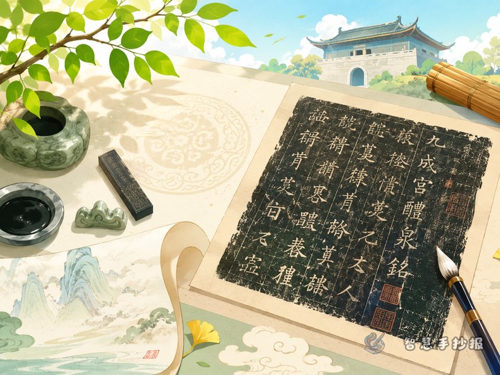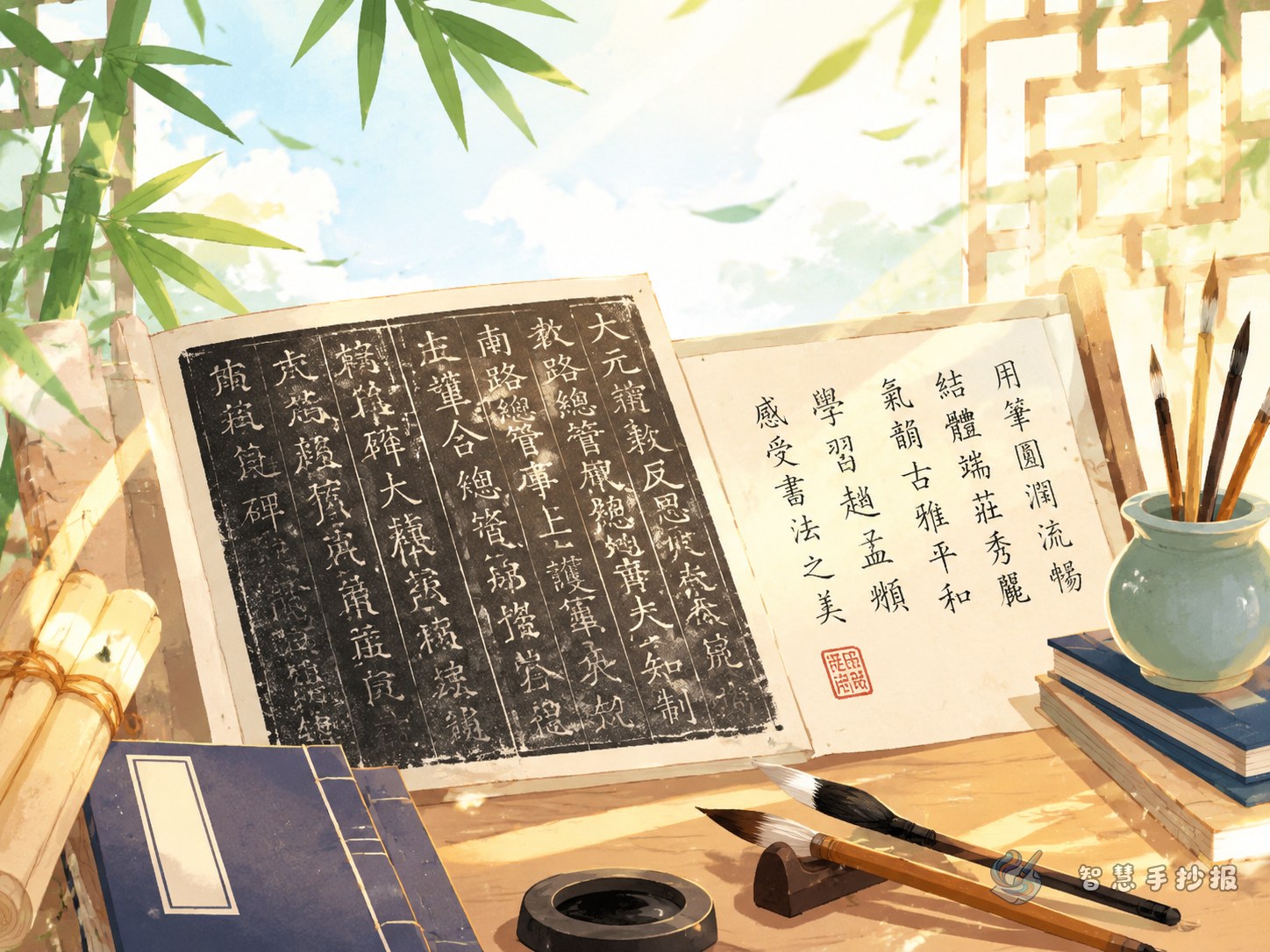
Begin with the idea of gentle and well-balanced regular script
Zhao Mengfu was a famous calligrapher of the Yuan dynasty, and Danba Stele is often appreciated when students learn regular script. For a handwritten newspaper, you do not need to turn it into a difficult academic article. Focus on two simple ideas: graceful and well-structured.
Possible titles include “Discovering Zhao Mengfu and Danba Stele,” “The Beauty of Balanced Chinese Characters,” or “A Small Exhibition of Regular Script.” The goal is to help classmates understand who the calligrapher was, what makes the copybook special, and what we can learn from careful handwriting practice.
Short text materials you can use
Calligrapher profile
Zhao Mengfu, also known as Ziang, was a renowned calligrapher and painter in the Yuan dynasty. His calligraphy learned from many traditions. His regular script is neat and elegant, while his running script is natural and flowing.
Copybook appreciation
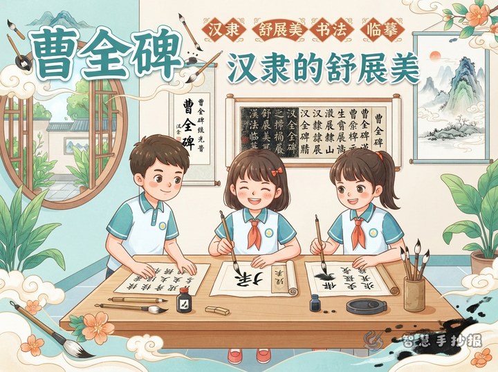
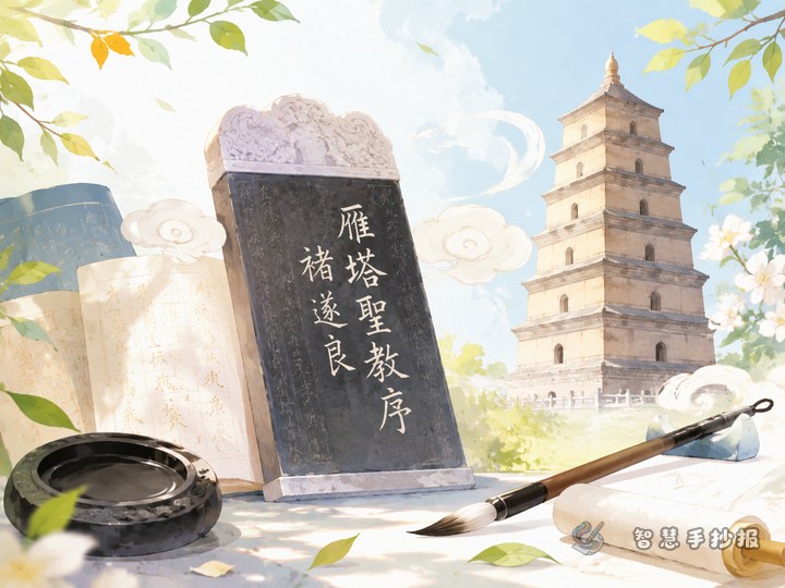
Danba Stele has clear strokes, balanced character structures, and a calm overall style. When appreciating it, students can observe whether the horizontal strokes are steady, the vertical strokes are upright, and the dots and strokes connect naturally.
What I learned from copying
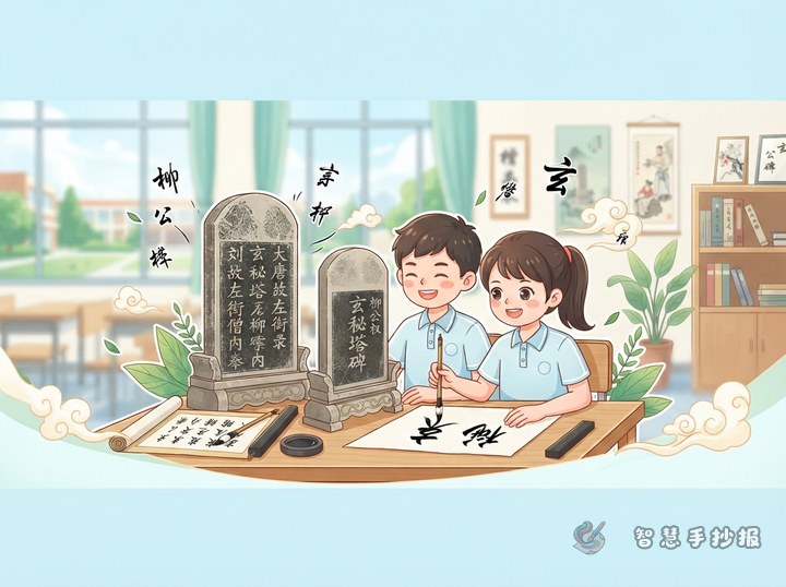
Copying a calligraphy model is not simply writing after it. It teaches us to observe carefully, write slowly, and compare our work after finishing. With correct posture and patient practice, handwriting can become cleaner and more beautiful.
Design the page like a small calligraphy exhibition
- Calligrapher card: Introduce Zhao Mengfu’s dynasty, name, and calligraphy style.
- Highlights of Danba Stele: Use three or four sentences to describe its strokes, structure, and overall feeling.
- Character observation window: Choose simple strokes such as horizontal, vertical, left-falling, right-falling, and dot strokes.
- Copying tips: Write ideas such as “look first, write slowly, compare after writing, keep the page neat.”
- My practice plan: Add a small corner about how many characters to practice each day.
Use a scroll-like layout for a traditional feeling
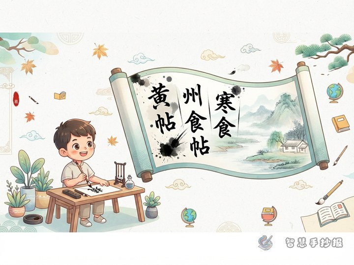
Soft colors such as ivory, light brown, and ink green work well for this topic. You can draw an unfolded scroll in the center for the main title, then place short text boxes on the left and right sides. The bottom area can be used for handwriting tips or a practice plan.
Decorations should be simple. Brushes, inkstones, red seals, bamboo slips, and cloud patterns are suitable. Keep the title large and clear, and make the body text neat so the whole page feels calm and elegant.
Small details that make the work stand out
- Add a red seal-style mark beside the title to strengthen the calligraphy theme.
- Choose two or three simple Chinese characters and show how their strokes are arranged.
- Keep each text section short, with three to five sentences for easy reading.
- Leave enough blank space, because a calligraphy-themed page looks better when it feels quiet and balanced.
If you want to arrange the title, sections, and layout more quickly, you can continue making your handwritten newspaper in the Zhihui Handwritten Newspaper WeChat mini program.