Choose a clear theme: the lively rhythm of Running Script
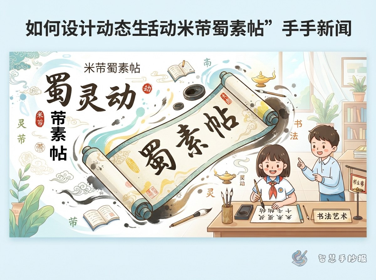
This handwritten newspaper can focus on Mi Fu’s Shu Su Tie and its lively Running Script. Instead of listing many calligraphy works, build the page around three ideas: changing shapes, varied speed, and different shades of ink. These ideas help readers understand why Running Script looks both readable and full of movement.
A suitable title is “The Rhythm of Running Script in Shu Su Tie”, with the subtitle “Mi Fu and a Scroll of Moving Ink.” It introduces the master and the artwork while leaving room for expressive lines and ink-inspired decoration.
Text materials for the page
A short profile of Mi Fu
Mi Fu was a Northern Song calligrapher, painter, and art connoisseur. He was especially known for Running Script. He valued the methods of earlier masters while developing a personal style with lively strokes, quick movement, and rich variation.
An artwork appreciation card
Shu Su Tie was written on silk fabric from Shu and contains several poems. The size, balance, and ink tones of its characters change from line to line. When viewing the work, notice how neighboring characters respond to one another and how each line moves forward as a whole.
Small knowledge box
- Running Script: A style between Regular Script and Cursive Script, combining readability with smooth movement.
- Tilted balance: Characters are not always perfectly upright or symmetrical; their lively poses are balanced through the whole structure.
- Line energy: The direction, rhythm, and overall feeling created by characters across one line.
Turn calligraphy features into layout elements
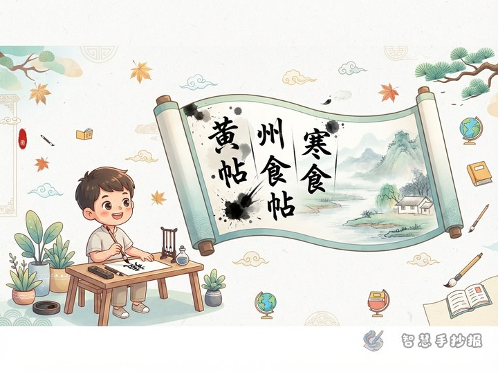
Avoid making the page look like a crowded wall of copied characters. Try a scroll-like layout: place the title and Mi Fu profile at the top, connect the middle appreciation card with a curved ink line, and put calligraphy features and personal thoughts at the bottom. The line can suggest an unfurling scroll and guide the reading order.
- Use clear Regular Script or a readable Running Script for the large title.
- Choose ivory, light gray, or pale blue boxes to suggest silk and paper.
- Highlight “tilt,” “ink shades,” and “rhythm” with different levels of darkness.
- Add a brush, inkstone, scroll, and a few flowing strokes in the corners without covering the text.
How to make the page feel lively
First sketch three or four text boxes in different sizes with a pencil. Then connect the sections with a decorative line that changes in density. Keep the body text evenly spaced, and use calligraphic variation only in the title, dividers, or key words. This keeps the page attractive while making it easy for children to read.
You can also create a small “look closely” box featuring one or two characters, with prompts such as “observe the structure,” “observe the connections,” and “observe the ink.” Do not copy a long, difficult-to-read passage. Short explanations and a clean layout work better for a school project.
A concluding reflection
You may write: “Shu Su Tie shows me that calligraphy is not only about making characters neat. It is also about observing the direction, speed, and breathing of each stroke. Mi Fu’s Running Script changes constantly without becoming messy. It reminds me to build a strong foundation while learning to feel the rhythm of an artwork.” After sketching the draft, open the WeChat mini program and use Smart Handwritten Newspaper to refine the sections, colors, and decorations.