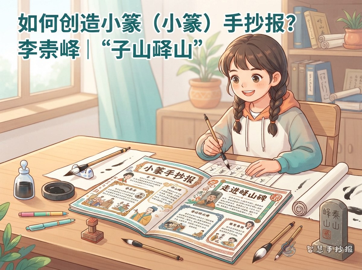
Start With a Question: Why Build a Page Around the Yishan Stele?
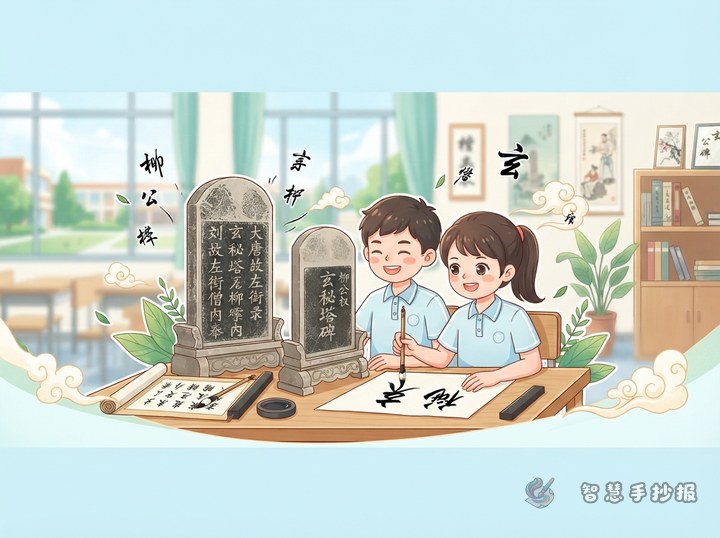
Most handwritten newspapers feature regular or clerical script masters, so a seal script theme stands out immediately. The Yishan Stele is traditionally attributed to Li Si of the Qin dynasty and is often mentioned as a starting point for learning small seal script. The original stone no longer survives, and the versions seen today are later reproductions. Its characters have three features that are easy to explain on a poster:
- Tall and narrow shape: each character fits inside a slim rectangle, so columns look tidy on their own.
- Rounded turns: corners are curved rather than sharp, which gives a gentle look.
- Even stroke weight: lines stay roughly the same thickness, so students can draw them with confidence.
Once these three points are clear, the mood of the whole page is set: calm, balanced and quietly traditional.
Making the Masthead Work With Curved Strokes
The masthead is the first thing a reader sees. Try a two-line title: seal script on the top line, a small regular script line underneath giving the same meaning, so anyone can read it. Four to six characters is plenty; keep the spacing even and leave a finger-width gap between characters.
- Place the masthead at the top left or slightly left of centre, leaving breathing room on the right.
- Avoid covering the title with patterns. Two thin horizontal lines above and below are enough, and they can curve slightly to echo the rounded strokes.
- If you worry about spoiling the sheet, practise the four characters three times on scrap paper and then lightly trace them into place.
Four Text Sections and What Goes in Each
A Short Stele Profile
Use three or four sentences: the stele is traditionally attributed to Li Si of the Qin dynasty, the script is small seal script, the characters are tall and the strokes evenly rounded, and the original stone is lost while later reproductions are common today. Finish with one line explaining why this stele was chosen, so the section has a personal voice.
Guess the Character
This is the section readers enjoy most. Pick three to five simple characters such as mountain, water, sun, moon or tree. Write the seal form on the left and the modern form on the right, and invite readers to guess before checking. Avoid complex characters, which blur easily when hand drawn.
Stroke-by-Stroke Comparison
Choose one character and enlarge it, then use two or three short lines to describe the stroke order: which stroke comes first, where the line should curve, where it should stretch. Simple arrows drawn in text form are enough to show direction.
My Appreciation Note
Keep a small space for a personal response, two or three sentences at most, for example: these characters look like drawings, and writing them evenly takes real patience. Honest observations read better than copied praise.
Laying Out Tall, Narrow Characters on One Page
- Pencil the sheet into three vertical columns, making the middle one slightly wider as the main content area.
- Put the masthead in the top left and the guess-the-character box in the top right, so the two balance each other.
- Down the main column, place the stele profile first, then the stroke comparison, and end with the appreciation note.
- Leave a finger-width of white space between columns and divide them with thin straight or curved lines rather than heavy borders.
- Limit decoration to two or three colours; fewer colours make the traditional feel stronger.
One reminder matters more than the rest: do not fill the whole sheet with seal characters. White space is part of the design, and the empty areas are what give the page its quiet character.
Sentences You Can Copy Straight Onto the Page
- Every character stands upright, like a row of soldiers lined up neatly.
- Wherever a stroke turns, the corner is rounded, never sharp.
- Each line keeps almost the same thickness from start to finish, so the hand has to stay steady.
- It looks simple until you try it, and then you realise every stroke needs slowing down.
- The characters are far away in time, but the care inside them feels close.
If you still need words, add a short note on seal script: it is one of the earlier forms of Chinese writing and later developed into clerical and regular script, and many characters used today still resemble their seal forms. Two or three sentences are enough; avoid turning it into a long explanation.
Final Checks and Where to Continue
Check three things before finishing: is the masthead clear, does every section have content, and is the seal-to-modern comparison easy to read? Then erase the pencil lines gently and go over the title outline once with a darker pen, which instantly sharpens the whole page. If you would like a different stele, more sections or a fresh layout, open the Smart Handwritten Newspaper mini program in WeChat, choose a template that suits the theme and carry the draft straight through to a finished sheet.