Why focusing on bronze ware makes the poster easier to design
A museum history poster can become too broad if it tries to cover every type of relic. Choosing bronze ware in museums as the main topic gives the page a clear center. Bronze objects have recognizable shapes, patterns, and cultural meaning, so they are perfect for short handwritten sections and student-friendly design.
Your main title can be “Bronze Ware in the Museum,” “My Museum Notes on Bronze Relics,” or “Discovering Ancient Bronze Civilization.” A short subtitle can make the topic feel more lively and personal.
Useful sections to include on the page
1. What is bronze ware?
Write a short explanation: bronze ware refers to ancient objects cast from copper-based metal. These items were often used in rituals, music, food, or ceremonies, and they are valuable historical relics today.
2. Common types of bronze objects
- Ding: often linked with ritual use and ancient authority.
- Bell: an important musical instrument in ancient culture.
- Zun: a vessel often connected with wine.
- Pot: practical and decorative at the same time.
3. Pattern observation corner
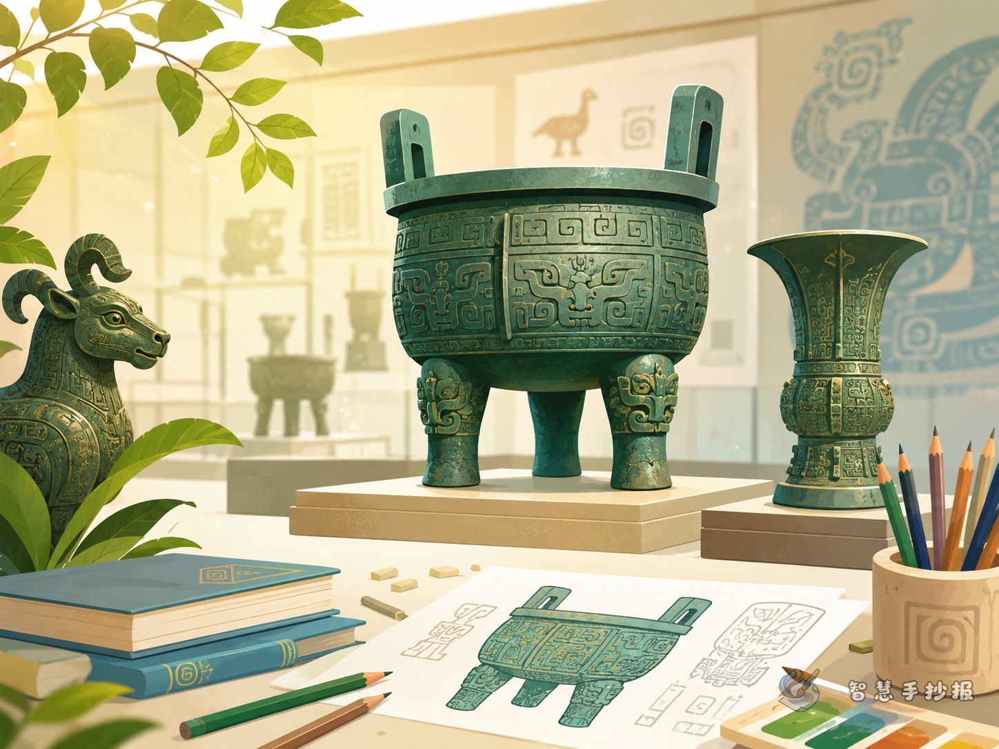
You can mention taotie-like mask patterns, cloud and thunder motifs, or dragon-style designs. Explain that ancient people used patterns to express strength, beauty, and imagination.
4. Protecting cultural relics
- Keep quiet in the museum
- Do not touch displays or cases
- Read the labels carefully
- Help keep the museum clean
Short text materials you can copy into the poster
- Bronze ware is an important witness to ancient Chinese civilization.
- Each bronze object is not only a tool, but also a record of history.
- Shapes and patterns show the wisdom and creativity of ancient people.
- Museums help old relics speak to us again.
- Protecting relics means protecting our shared memory.
You may also add a brief reflection: when I saw bronze ware in the museum, I felt amazed by ancient casting skills. The beautiful patterns seemed to tell stories from a long time ago and made me want to learn more about history.
Layout tips that make the page look more organized
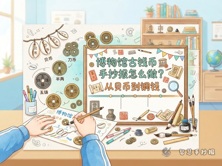
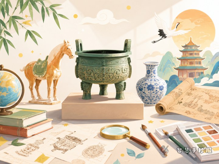
Instead of dividing the page into equal boxes, create a clear visual center. Put the title at the top, a simple bronze vessel drawing in the middle, and smaller text sections around it. This gives the poster a stronger museum style and better reading flow.
- Use a larger title with a bronze or dark green color.
- Keep each section short, around three to five lines.
- Add borders or small icons for each subtitle.
- Use repeated patterns in the corners for unity.
If handwriting the final page feels difficult, sketch the layout first. After that, you can continue refining the structure and style in the Zhihui Shouchaobao WeChat mini program.
Best colors and decorations for a museum feeling
Bright rainbow colors are not the best choice for this topic. A better palette includes bronze green, brown, beige, and dark gray. These colors make the page feel calm and historical. Decorative ideas include vessel outlines, bells, ancient motifs, scroll lines, and simple display-case shapes.
Younger students can keep the drawings simple by sketching only object outlines and names. Older students can add repeating border patterns to make the poster look more polished.
Three final checks before finishing
- Topic check: can readers tell right away that the poster is about bronze ware in museums?
- Text check: are the paragraphs short and easy to read?
- Layout check: do the title, drawings, and sections have clear balance and spacing?
With a focused topic, neat sections, and matching decorations, this museum history handwritten newspaper will look more complete and classroom-ready.