Start with a clear theme
A handwritten newspaper about Zhaozhou Bridge works best when it focuses on ancient Chinese bridge architecture. You do not need to fill the page with too much information. The goal is to let readers understand the topic at a glance. A title like “Zhaozhou Bridge,” “Discover Zhaozhou Bridge,” or “Wisdom of an Ancient Bridge” works well.
If you want a stronger visual effect, shape the title like an arch to echo the bridge itself. This simple idea makes the whole page feel more connected.
Section ideas you can use directly
Bridge fact card
This part can briefly explain that Zhaozhou Bridge is one of China’s famous ancient bridges and an important historical landmark. Keep this section short because it serves as the opening introduction.
What makes the bridge special
- Its shape looks like a large arch
- Its structure shows clever engineering
- It combines strength with beauty
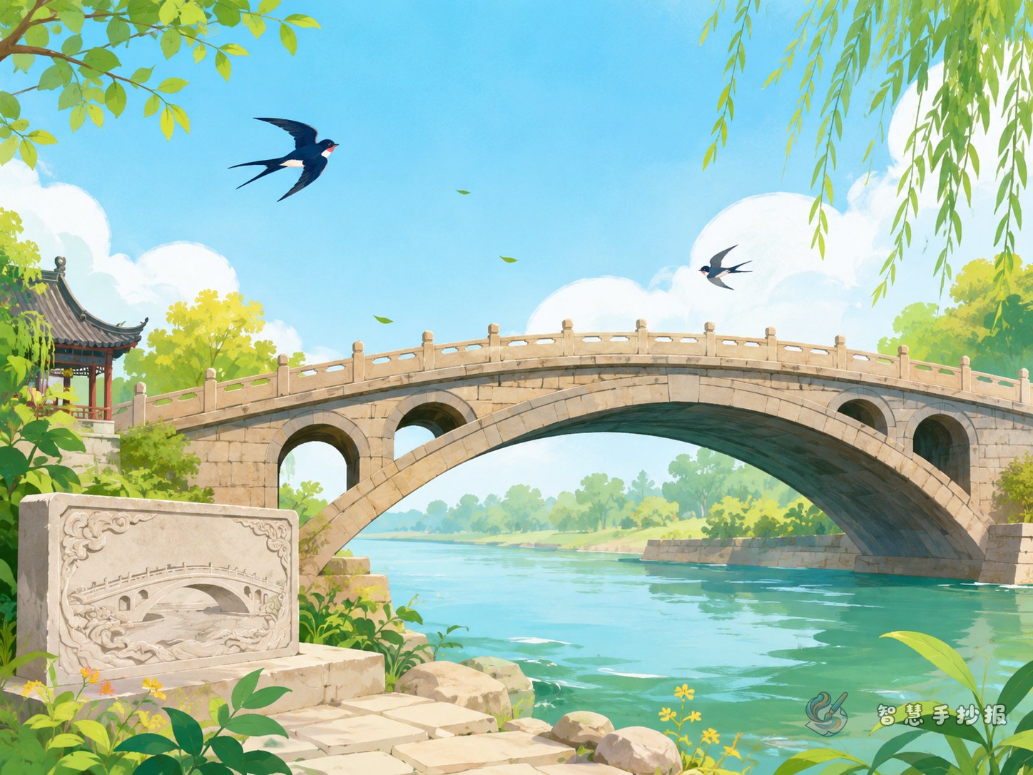
This section looks even better with a simple line drawing of the bridge, water, or the bridge opening.
Why it matters
You can write about its historical value, building wisdom, and cultural meaning. For example, it is not only a bridge but also a symbol of the creativity of ancient craftsmen. This section fits well near the center of the page.
Short writing materials for students
If full paragraphs feel difficult, use short sentences instead. They are easier to copy neatly and help the layout stay clean.
- Zhaozhou Bridge is one of China’s well-known ancient bridges.
- Its graceful shape looks like a curved moon.
- The bridge shows the wisdom of ancient builders.
- It is both practical and beautiful.
- Learning about Zhaozhou Bridge helps us appreciate Chinese architecture.
You can place these lines in different parts of the page instead of putting them all together.
A layout that stays neat
A very suitable page design is center image with side sections. Draw the bridge in the middle, place the basic introduction on one side, and the key features on the other. At the bottom, add personal thoughts or a small knowledge box. This kind of structure keeps the page balanced and easy to read.
- Write the title at the top in larger letters.
- Use the bridge drawing as the visual center.
- Put simple facts on the left and features on the right.
- Use the bottom area for reflections or extra notes.
Soft gray, light blue, and beige colors work especially well because they match the calm feeling of an ancient bridge.
Small details that improve the final look
Decorations can make the newspaper more vivid. Try drawing stone railings, flowing water, willow branches, or cloud patterns in the corners. The title can have a slight calligraphy style, but it should still be easy to read. Clarity is always more important than complexity.
If you already have your topic and text ready, you can continue refining the layout, colors, and sections in the Zhihui Shouchaobao WeChat mini program for a more complete handwritten newspaper.