Why flashcards deserve a poster of their own
Many students review characters, words, and formulas by staring at a page again and again, and their attention drifts. A flashcard breaks knowledge into small pieces: the front holds only a question, the back holds only the answer, and you must answer it yourself before turning it over. That turns reviewing into an active recall task, which sticks far better than silent rereading.
A poster on this theme is also easy to draw. Cards are natural layout blocks, so a few squares already explain the whole method without any complicated illustration.
Three zones: card wall, flow strip, and record corner
Card wall on the left
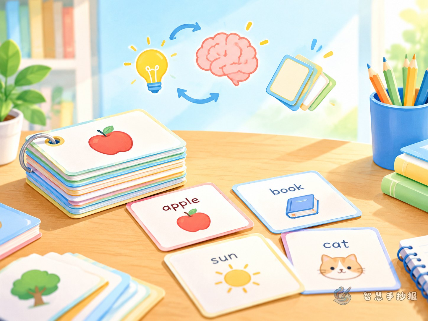
Use three to five evenly sized squares to stand for cards. Show one with the front facing up and one with the back facing up, then stack the rest slightly behind. A thin gap between them makes the stack look like real cards rather than scattered boxes.
Three-step flow in the middle
Connect three dots or arrows: write the card, test yourself, mark the result. Put one short sentence under each step so a reader can follow the whole method in a single pass.
Self-test chart on the right
Draw a small table with dates across the top and rows for correct, wrong, and test again. Keep the lines light so the right side contrasts with the heavier card wall and the page does not feel evenly crowded.
Text you can copy straight onto the poster
- Opening line: Reading it once is not remembering it. Being able to say it yourself is.
- Quick fact: A flashcard holds one single point. The simpler the card, the easier the recall.
- Three rules: One question per card. Think for three seconds before turning it over. Put wrong cards at the front of the pile.
- Common mistakes: Copying a whole paragraph onto a card, looking without answering, and dropping a card after one correct answer.
- Slogan: Ten small cards a day keeps exam panic away.
Keep each line short and start a new line for each item. Short lines are easier to copy neatly and easier for a teacher to photograph.
Writing the front and back without mixing them up
- Write the question on the front and keep it under about ten words, such as what sound does this character make.
- Write the answer on the back, then add one example sentence or a small example to support the next recall.
- Mark the subject and a number in the bottom corner, such as CN-03, so cards do not get mixed together.
- Separate front and back with color. On the poster you can simply use diagonal lines to show the back instead of coloring it twice.
Time planning: do not spend it all on the border
A practical order is to sketch the three zones in pencil, write the headline, draw the card wall, fill the flow strip and the chart with text, and only then decorate the border. Text should cover more than half of the page, and a little empty space looks better than a crowded edge.
To make the poster more lively, add a small draw-a-card section with three blank cards and lines underneath, inviting classmates to fill in answers on the spot. The poster then becomes an interactive display board. For more card templates, column boxes, and layout references, open the Smart Handwritten Poster mini program in WeChat and turn these ideas into a finished poster.