Look at the Painting First: How One Orange Sun Became a Masterpiece
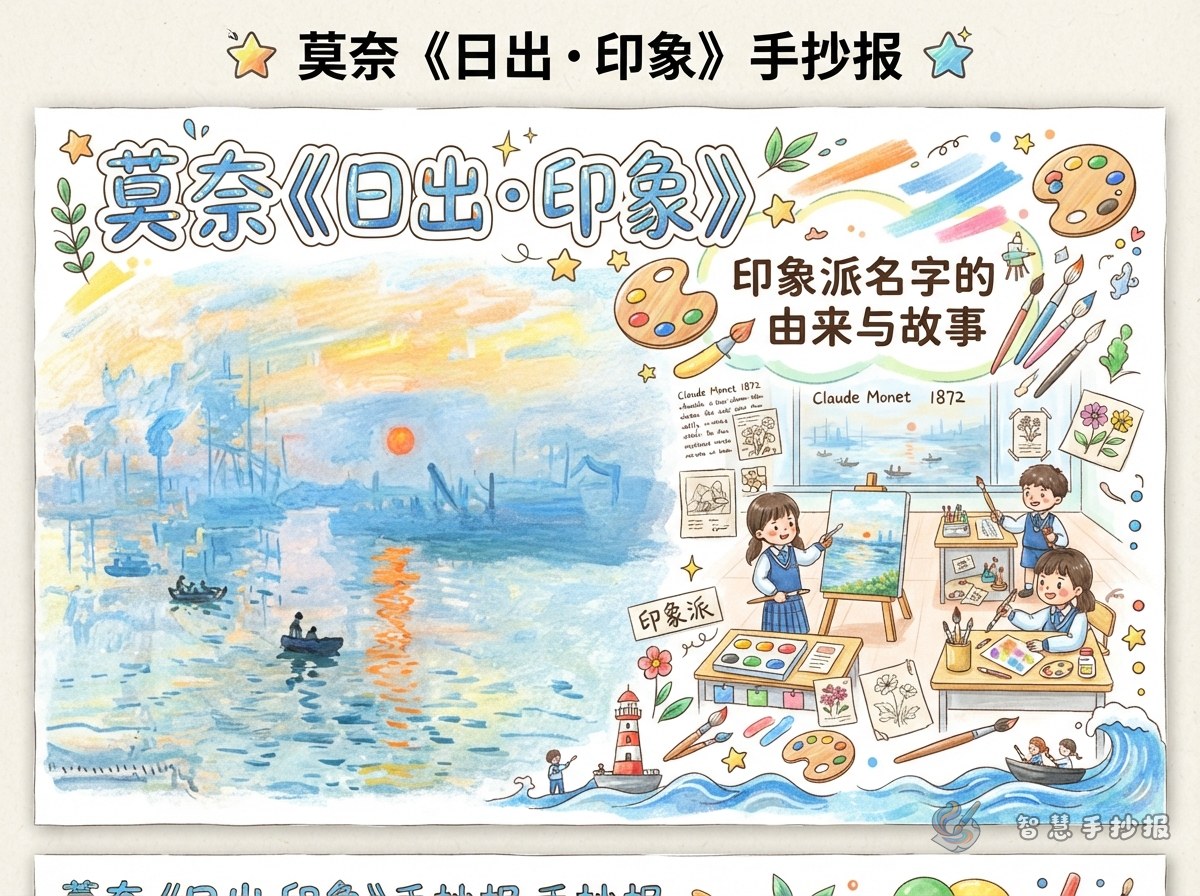
Impression, Sunrise shows a harbor in Le Havre, France, early in the morning. There are no clear faces, only grey-blue water, blurred mist, the silhouettes of a few small boats, and one orange-red sun just above the horizon. The point of the picture is not realistic detail but catching a single moment of light and color.
Turn that idea into your layout: let color tell the story instead of simply gluing a picture onto the page. What readers should notice first is the mist, the water and that stroke of orange.
Words for Your Page: A Short Artist File and One Good Story
Artist file
- Name: Claude Monet
- Nationality: French
- Lived: 1840-1926
- Well-known works: Impression, Sunrise; the Water Lilies series; the Haystacks series
- Key words: Impressionism, light and color, painting outdoors
The story worth telling
Around 1872 Monet painted the harbor at Le Havre in the early morning. When the picture was later shown in an exhibition, a critic picked up on its title and used the word "impression" to poke fun at this kind of painting, as if the artists had only scribbled a few strokes. The painters were not offended. They accepted the label, and a group of artists who cared about light and color ended up with a name for their movement.
Add one sentence of your own reaction, for example: a word meant as a joke became the name of a whole style, which shows it is worth keeping your own way of drawing.
Short lines you can write yourself
- The sun rises once, but its light can be remembered.
- What stays blurry leaves room for imagination.
- A harbor at dawn is where color wakes up.
These lines are your own summary, so the page feels like your observation rather than copied text.
Building the Layout Around Fog and Harbor Water
Zones
- Main picture: place it on the left or a little above center and give it the largest space. Paint water, small boats, the distant harbor and the orange sun.
- Title: write it across the top of the picture in an orange-to-pale-yellow gradient with wide spacing.
- Text: use a narrow left column for the artist file and a wide right column for the story and your thoughts.
- Decoration: a small boat or a few seagulls in the lower corner, with plenty of empty space around them.
Borders and dividers
- Draw the border as waves with alternating thick and thin lines so the water seems to move.
- Instead of straight lines, separate columns with faint mist-like curves.
- Add one small round sun near the heading to act as the eye of the whole page.
Colors and Easy Ways to Paint Morning Mist
Color palette
- Main colors: orange-red and pale yellow for the sun and the bright sky
- Middle tones: grey-blue and slate for the water and mist
- Accents: deep blue or black for boat and harbor silhouettes
Three mist techniques
- Lay a light horizontal stroke of grey-blue crayon or pencil, then rub it with a finger or tissue so the edge disappears.
- For watercolor, brush clean water first, then touch in grey-blue and pale purple and let it bleed.
- Paint the boats and the sun first, then overlap a light wash around them so they look wrapped in mist.
If you are short on time, flat blocks of marker color work fine. What matters is a soft transition between colors instead of black outlines around every object.
Three Steps to Finish Your Handwritten Newspaper
- Sketch: in pencil, mark out the title area, the main picture and two text columns, and settle the proportions before you start.
- Paint and write: finish the main picture first, then the artist file and the story, and finally add short lines and decoration.
- Check: step back and look at the whole page. If the colors feel busy, add white space; if the text looks crowded, cut a sentence or two.
If you want a tidier layout, preview a famous-painting template in the "智慧手抄报" mini program first, adjust the title and columns until you like them, then copy the final version onto paper.