Build the page around an almost-touching moment
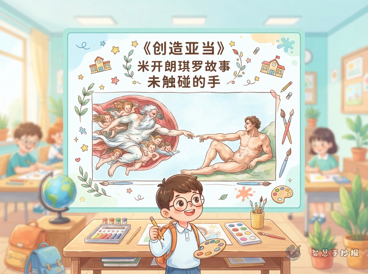
The most memorable detail in The Creation of Adam is not the complex background, but the moment when two fingers are about to meet. For a handwritten newspaper, use “creation, expectation, and connection” as the main ideas instead of copying the entire fresco. This keeps the page clear and gives the artwork a strong visual focus.
- Theme line: One approaching touch can open a world of imagination.
- Visual keywords: fingers, light, clouds, fresco, and creation.
- Suggested sections: artist profile, artwork reading, my response, and drawing tips.
A short story box for the artwork
Who was Michelangelo?
Michelangelo was an important artist of the Renaissance. He worked in sculpture, painting, architecture, and poetry. He created the ceiling frescoes of the Sistine Chapel, and The Creation of Adam is one of the best-known scenes. A child-friendly profile can describe him as a versatile artist who carefully observed human poses and body structure.
What should readers notice?
Adam reaches out from one side while God approaches from the other. Their fingers nearly meet, but a small gap remains. That pause creates expectation and leaves room for the viewer’s imagination. A useful sentence for the text box is: “Sometimes the strongest moment is hidden in an action that has not yet been completed.”
Make the two hands the focal point
Try a centered vertical or horizontal layout. Place the title at the top, draw the approaching hands in the middle, and connect the sections with curved lines, clouds, and soft color blocks. Do not cover the space between the fingers with text. That untouched gap is the most recognizable feature of the artwork.
- Top area: Write “The Creation of Adam” and “Michelangelo’s Art Story,” using an arched frame to suggest the chapel setting.
- Left side: Add the artist profile, decorated with a small portrait, a paintbrush, or a sculpture outline.
- Right side: Explain the two hands, the poses, and the mood of the scene in three short points.
- Bottom area: Add “My Art Discovery” or “If I Were a Young Artist” for personal thoughts.
Color planning and five easy steps
- Use a pencil to mark the title box, the direction of the hands, and the section positions, keeping the central space balanced.
- Use sky blue, ivory, and light gray for the atmosphere, then add ochre, brown, or warm yellow to emphasize figures and borders.
- Do not worry about perfect realism. Simple lines can show the palm, wrist, and reaching fingers.
- Use a dark pen for outlines and key words, while keeping the body text in short, readable paragraphs.
- Add small stars, cloud patterns, or mini frames at the end, but avoid too many decorations so the theme remains calm and dignified.
For more title styles, section combinations, and color ideas, you can arrange the layout in the Zhihui Shouchaobao WeChat mini program before completing the page by hand.