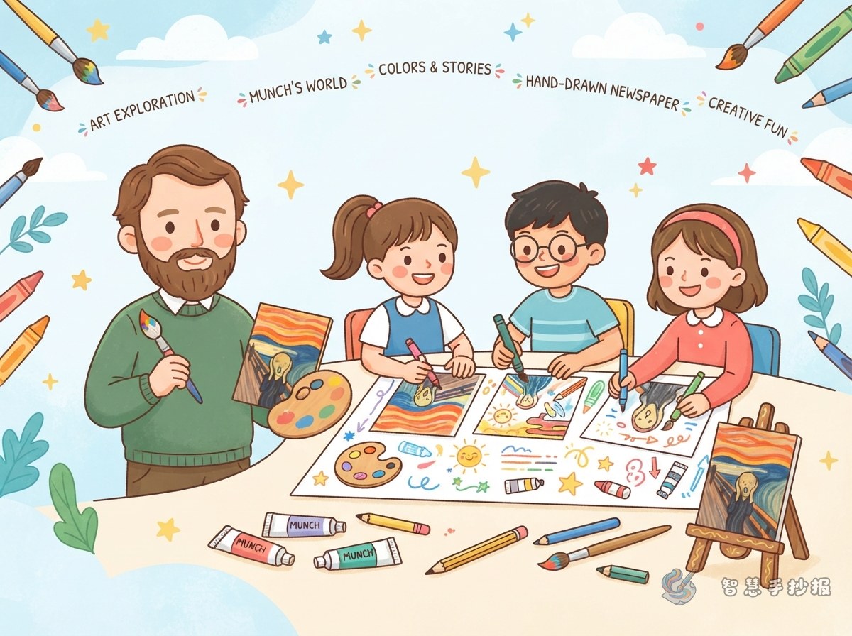
Turn The Scream into a story you can tell
This school poster does not need to be only a list of facts. Build it around one question: why does the figure look as if they are making a powerful cry? The Scream is one of Norwegian artist Edvard Munch’s best-known works. Its curving sky, intense red and blue colors, and figure on the bridge create a feeling of tension, unease, and loneliness.
Suggested theme sentence: Discover Munch’s world of emotions through one famous painting.
Let the bridge, figure, and sky guide the layout
Draw a bridge that moves from the upper left toward the lower right so it becomes a visual path across the page. Place the title and a short color study near the top, a simplified figure from The Scream in the center, a small Munch profile on one side, and an “Emotions I Notice” section along the bottom.
- Top: Decorate the title with orange and red wave-like lines to echo the mood of the painting.
- Center: Draw large eyes, an open mouth, and a curved body. Simple shapes are enough.
- Side panel: Add an artist card with Munch’s name, nationality, and representative works.
- Bottom: Leave space for your own response so the poster is more than a copied introduction.
Short text you can place on the poster
Artist profile
Edvard Munch was a Norwegian painter who used exaggerated lines and strong colors to show inner feelings. The Scream is one of his representative works. Instead of focusing only on a realistic appearance, Munch used a distorted figure, a moving background, and vivid colors to suggest unease, loneliness, and other complicated emotions.
Looking at the painting
The figure stands on a bridge with both hands against the face and the mouth open, as if hearing a huge sound from the world around them. The distant figures and bridge feel calmer, while the curved sky makes the whole scene seem to vibrate. The contrast between red, orange, and blue makes the mood even stronger.
My response
When I first look at The Scream, the picture feels tense. After looking more carefully, I notice that lines and colors can speak like words. The painting shows me that art does not always have to look exactly like reality; it can use exaggeration to express an inner feeling.
Make the emotional colors clear and easy to draw
- Use a pencil to lightly place the bridge, distant figures, and central figure.
- Use repeated curves for the sky and water to create a sense of movement.
- Exaggerate the face slightly, focusing on the eyes, mouth, and hands.
- Use orange-red, yellow, and blue in the background, then outline the figure with black or dark brown.
- Label each main color with an emotion, such as “red — tension” and “blue — loneliness.”
If the page begins to look crowded, keep only the face, a few curved background lines, and several strong color blocks. This makes the painting recognizable while keeping the project manageable for younger students.
Add an interactive section of your own
In the lower-right corner, create a section called “How would I show a feeling?” Ask the student to choose one color and one type of line, draw a personal emotion symbol, and write one sentence about it. You can also add small questions: Which lines are curved? Which color stands out most? What does the figure’s pose make you feel?
After the text and sketch are ready, use Zhihui Shouchaobao to organize the sections, colors, and borders, making the The Scream poster clearer and more balanced.