Why The Last Supper Works So Well as a Handwritten Newspaper Topic
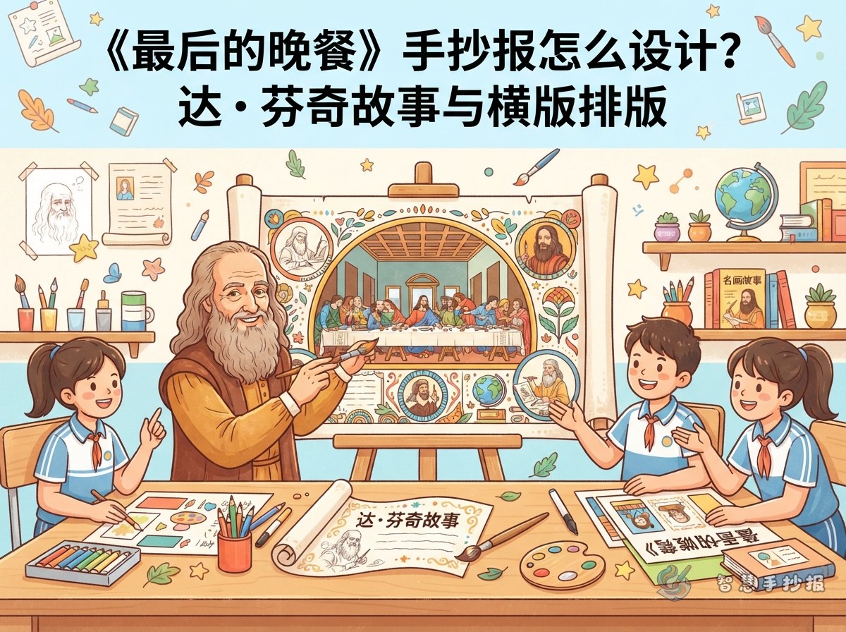
The Last Supper is a great subject for a handwritten newspaper because it combines a famous artwork, a clear story, and a rich artist background. You can write not only about the painting itself, but also about why it is memorable, how the figures are arranged, and what makes Leonardo da Vinci such an important artist. This gives your page both visual appeal and useful information.
Plan the Page in Three Simple Sections
Top left: Artwork profile
Include the title, the artist’s name, the creation period, and the type of artwork. Keeping this part short makes the page easy to read and helps readers understand the basics right away.
Middle: What makes the painting special
Focus on the most noticeable details, such as the long table, the different facial expressions, and the strong sense of order in the composition. These observations are perfect for a student-friendly art page.
Bottom right: The artist’s story
Add a short introduction to Leonardo da Vinci as an artist who observed people carefully and studied light, space, and composition. This section makes the handwritten newspaper feel more complete and educational.
Short Sentences You Can Use Directly
- Artwork: The Last Supper
- Artist: Leonardo da Vinci
- Main features: Rich expressions, clear composition, strong storytelling
- Key words: Light, order, emotion, perspective
- Writing style: Short, neat, and easy to read
If you want the text to feel more natural for a child’s project, turn long descriptions into short lines such as “Each person looks different,” “The painting feels calm but full of tension,” and “The composition leads your eyes to the center.”
How to Make the Layout Look Artistic
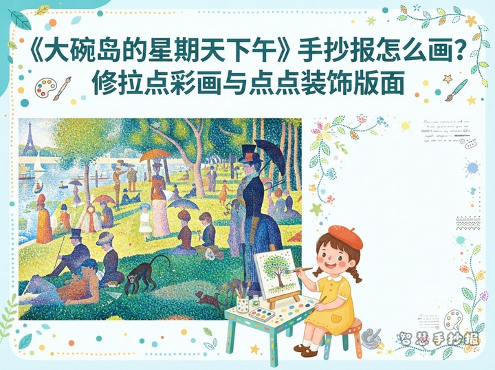
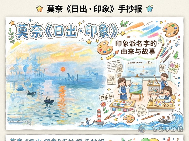
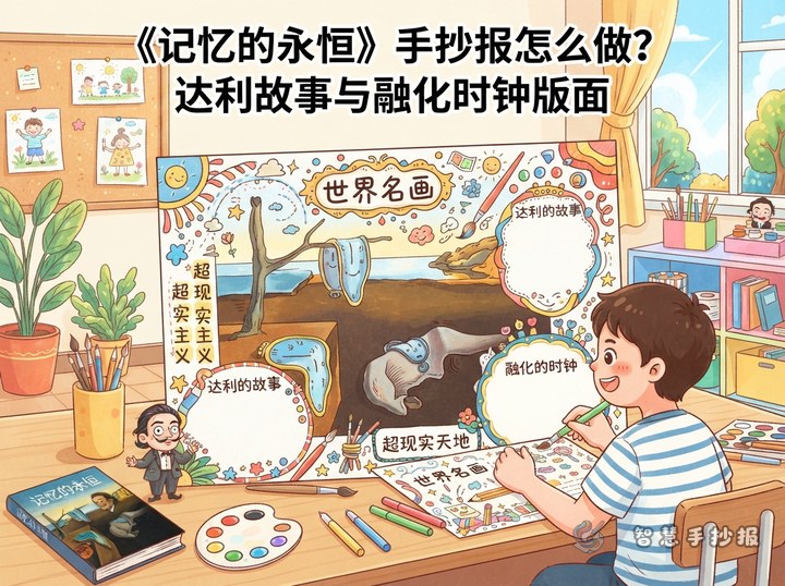
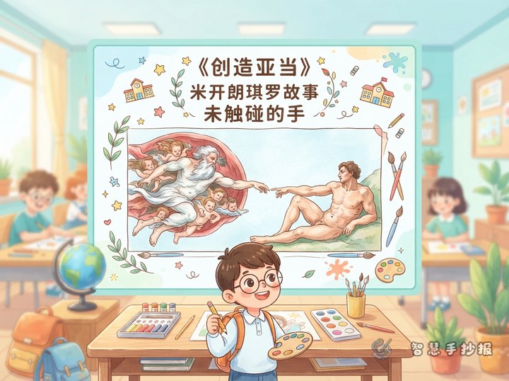
A horizontal page works especially well because the painting itself is wide and balanced. Place the title at the top center, then arrange two or three content blocks around a main visual area. For decoration, you can draw simple table lines, windows, and geometric borders. Soft colors like beige, light brown, and pale blue create a quiet museum-like feeling.
To keep the page elegant, avoid filling every corner. A little empty space will make the whole design look more like an art poster and less crowded.
Tips to Make the Handwritten Newspaper Stand Out
- Use a stable title style: Choose neat and bold lettering for the main title.
- Keep each block short: Three to five lines per section is enough.
- Limit the color palette: Stick to two or three main colors.
- Leave one area open: Empty space helps the page breathe.
If you want to keep improving the design, you can use the handwritten newspaper ideas in the Wisdom Handwritten Newspaper mini program to organize the title, sections, and notes more quickly before drawing and coloring.
A Nice Closing Line for the End of the Page
A famous painting is more than something beautiful to look at. It is a doorway into an artist’s world. The Last Supper helps us understand the power of composition and shows how art can tell a story with depth and emotion.