Why painted pottery makes a strong poster theme
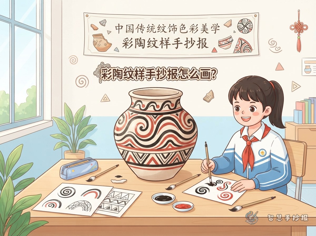
Painted pottery is one of the earliest sources of Chinese ornament, and pieces such as the Maijayao swirl and the Banpo human-face-and-fish design appear in art textbooks. The lines are mostly curves and simple straight edges, so they are easy to copy, and the contrast between black, red and sandy beige is strong without being noisy.
If the assignment mentions Chinese traditional pattern and color aesthetics, painted pottery also gives you an angle for the text: where the pigments came from and how the clay color shows through after firing.
Choose the palette first: black, ochre red, sandy beige
Painted pottery uses few colors, but each one has a clear job.
- Sandy beige or light clay tone as the background, either on light paper or painted as a soft texture.
- Black for outlines, borders and the title, so the page keeps its structure.
- Ochre or brick red for filling only part of a motif, never the whole shape.
Color mistakes to avoid
Filling almost everything with red makes the motifs disappear, and very thick black lines make the page feel heavy. Aim for a calm balance: background over half, black lines around a third, red a small accent.
Four motifs that are easy to draw well
Swirl motif
Draw a circle, then add one curved line turning outward from the center and wrap two or three arcs around it. A row of swirls in different sizes makes a lively border for the page.
Wave lines and grid patterns
Wave lines are repeated curves that work well along the bottom edge, like a river. Grids are crossed lines that fill empty corners. Keep the spacing even and the whole page looks tidy.
A simple human-face-and-fish design
The original is complex, so reduce it to a round face, two curved eyebrows, a small fish-shaped mouth and one fish on each side. Placed near the title, it is instantly recognizable.
Dancing figures
A row of small figures holding hands below the text columns adds movement. Draw them in black with just a little red, and keep the shapes simple.
Split the page into three clear zones
- Title zone: a short headline in bold letters with one swirl motif beside it.
- Motif gallery: three or four patterns, each labeled with a small name underneath.
- Text columns: two short blocks, one about where the colors came from and one about your favorite motif.
Leave a finger-width margin around the whole page instead of drawing to the edge, so the layout can breathe.
Short text you can copy onto the page
Keep the sentences short so they fit into narrow columns. You can trim or rewrite these as needed.
- The colors on painted pottery came from natural mineral pigments, which became durable after firing.
- Black plus ochre red over a clay-colored background is the most common combination.
- Swirls turn round and round, like water in a whirlpool or wind moving through a valley.
- The human-face-and-fish design puts people and fish together, showing how early people imagined daily life.
- Three colors are enough to create a rich picture, and that is the wisdom of Chinese color.
If you have space left, add one or two sentences about how it felt to draw the motifs yourself.
Working order from pencil sketch to final color
- Sketch the title position and the frames of the text columns lightly in pencil.
- Use a fine black pen to outline the main motifs such as swirls and wave lines.
- Write the text inside the columns, keeping the spacing even.
- Fill a small part of each motif with ochre red and leave the rest of the page open.
- Erase the pencil lines and check for any color that ran past the border.
If you would rather skip the layout work, open the WeChat mini program 智慧手抄报, pick a traditional pattern template, type in your text and then hand-draw the motifs inside the frame.