Decide the main focus before writing
The easiest way to make a typhoon handwritten newspaper is to keep the theme clear: learn about typhoons and stay safe. This helps students avoid collecting random facts and makes the whole page easier to organize.
For schoolwork, three to four content blocks are usually enough. A focused page often looks better than one filled with too much text.
Useful sections you can place on the page
Section 1: Basic typhoon facts
Write a short explanation of what a typhoon is and mention that it often brings strong wind and heavy rain. You can also add simple terms like eye of the storm or storm center.
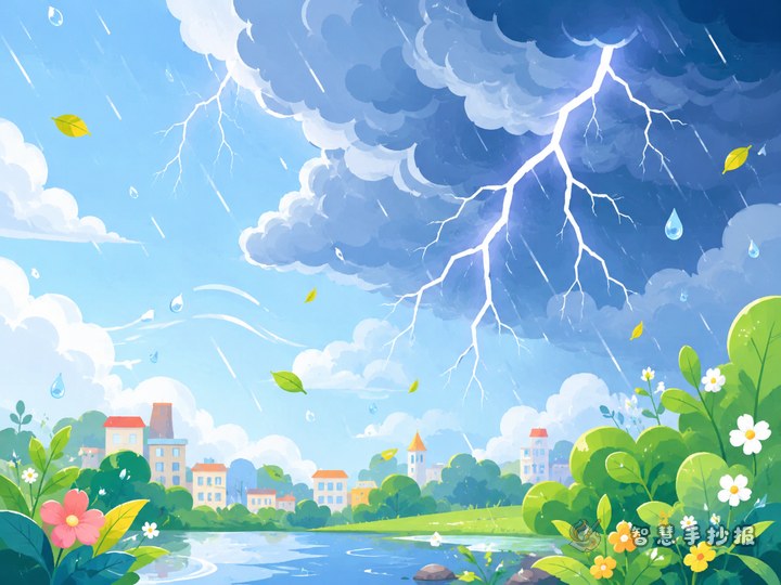
Section 2: What problems can a typhoon cause?
- Strong wind may damage trees or signs
- Heavy rain can cause flooding
- Big waves may affect coastal areas
- Travel and school plans may change
Section 3: How to prepare before a typhoon
- Close windows and secure loose items
- Prepare a flashlight, water, and daily supplies
- Check weather forecasts and alerts
- Stay indoors when possible
Section 4: Safety during and after the storm
- Stay away from trees, poles, and billboards
- Do not play in deep water
- Be careful of slippery roads after rain
- Follow reminders from teachers and family
Short phrases that make the poster stronger
If the page feels a little plain, add short lines such as Safety first in stormy weather, Watch the warning, stay prepared, or Stay calm, stay safe. These are good for borders, subtitles, or the final section.
You may also add a tiny knowledge box about weather warning colors, but keep the explanation simple and easy for children to understand.
Layout ideas that stay neat and readable
A typhoon theme looks great with a sense of movement. The title can be slightly curved, as if wind is blowing across it. Place the content boxes around the title so the center stays strong and the page feels balanced.
- Use blue, gray, and green as main colors
- Draw wave lines or wind curves around section borders
- Leave some blank space so the page does not feel crowded
- Highlight key words in bold or bright color
For younger students, a simple two-column layout is often easier than a complicated design.
Easy decorations that match the theme
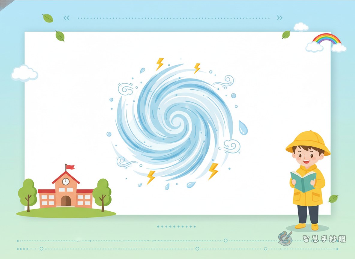
You do not need complex illustrations. Repeating simple weather icons can be enough, such as dark clouds, raindrops, wind swirls, umbrellas, houses, trees, waves, and warning signs. This creates a unified style and saves time.
For colors, blue, white, and gray work especially well. A small amount of yellow or red can be used to show warning or danger points.
How to finish the page well
End with a short reminder about paying attention to weather changes and learning how to protect yourself in severe weather. A clear ending makes the whole handwritten newspaper feel complete and useful for class display.
If you want to keep improving the layout, title styles, or ready-to-use text blocks, you can continue exploring ideas in the Zhihui Shouchaobao WeChat mini program.