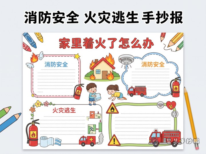
Build the page around one useful question
A strong fire safety handwritten newspaper should not try to cover everything. It works better when it answers one clear question, such as what should we do first in a fire. This makes the poster practical for students and easier for teachers and parents to use in class or at home.
Instead of writing general safety facts, focus on real escape actions: what to do when smoke appears, how to leave safely, and which mistakes must be avoided. A question-based theme feels more natural and searchable.
Four sections that fit this topic well
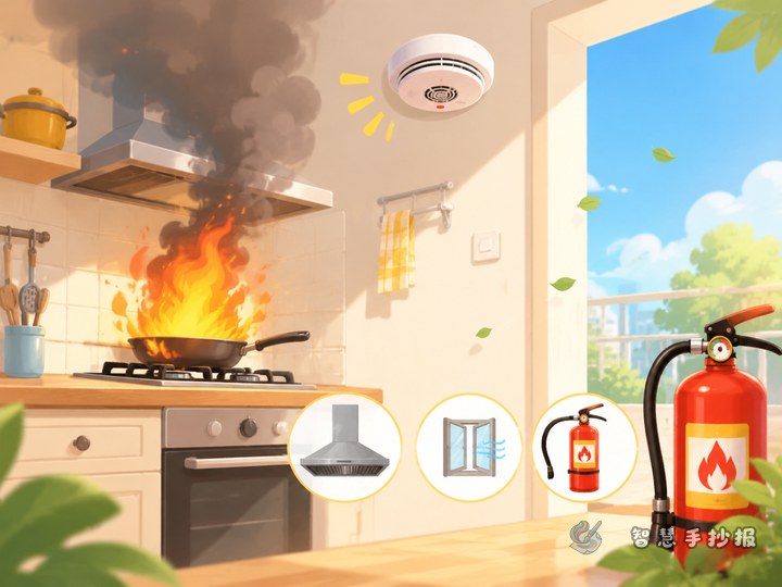
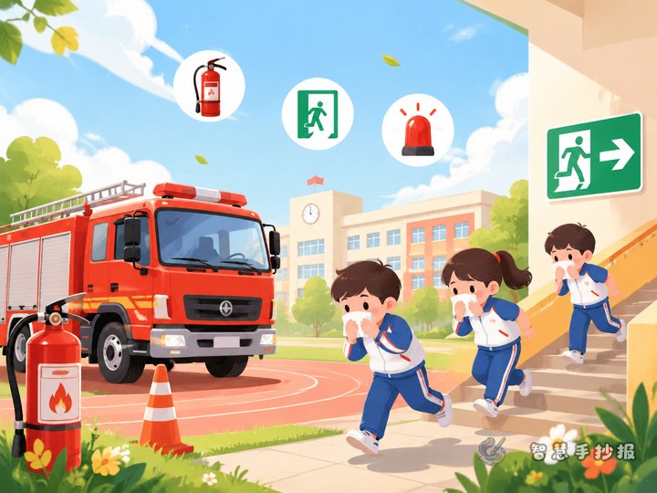
Five escape steps
- Call out loudly and warn people nearby.
- Leave quickly if the path is safe.
- Cover your nose and mouth with a wet towel or cloth.
- Move in a low posture under the smoke.
- Reach a safe place and never go back inside.
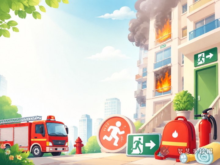
Emergency call notes
- Say where the fire is happening.
- Explain what is burning.
- Tell if anyone may be trapped.
- Stay calm and listen carefully.
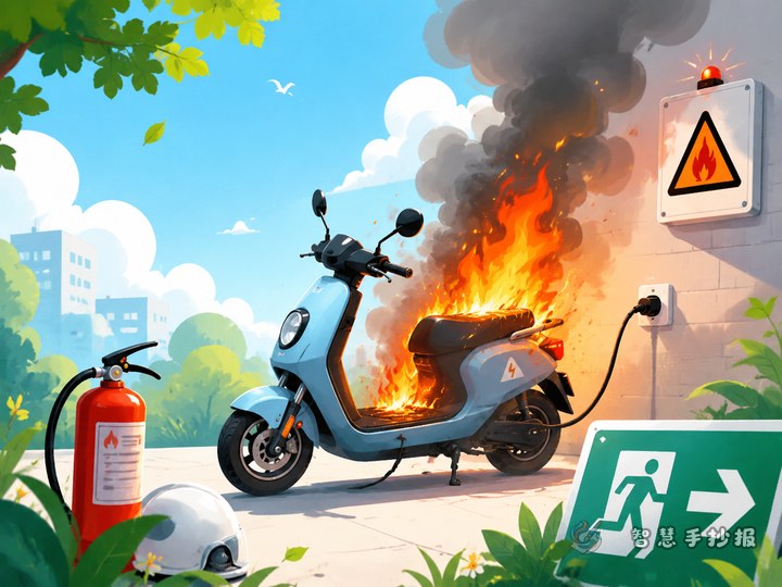
Mistakes to avoid
- Do not go back for bags or toys.
- Do not hide in small spaces.
- Do not use the elevator during a fire.
- Do not return to look for objects or friends.
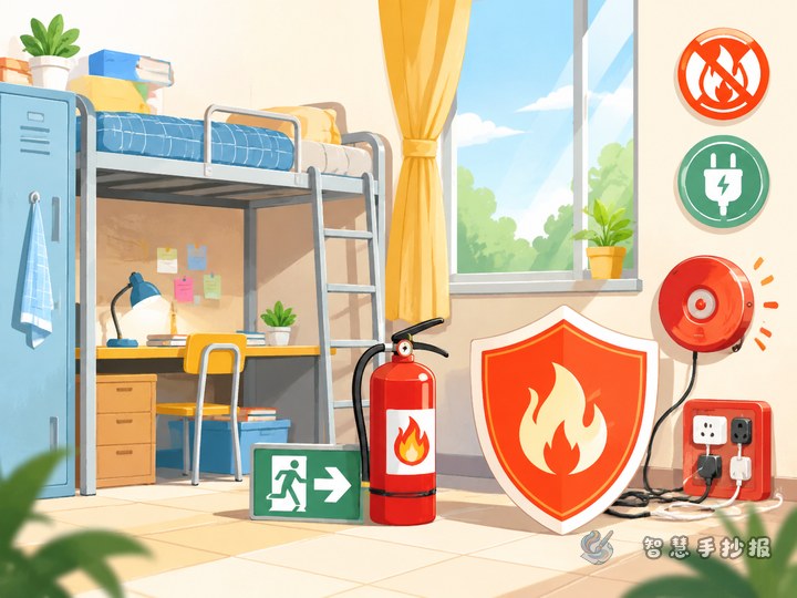
Short safety slogan
Add a simple line in a corner or border, such as: Stay calm, stay low, follow the exit, and never turn back.
Make the layout easy to follow
A practical page design is a large title in the center or top, with clear sections on both sides and a short reminder bar at the bottom. Put the escape steps in one area, unsafe actions in another, and emergency call tips in a separate block. This helps readers move through the page naturally.
Use red, orange, and yellow as the main colors for a fire safety theme. Add a lighter color to reduce visual heaviness. Important lines and numbered steps should be in bold so children can spot them quickly.
Simple text materials for students
If the page feels too plain, add short and memorable lines:
- When fire comes, stay calm and move out fast.
- Cover your nose, bend down low, and follow the exit signs.
- See a fire, call for help, and report it right away.
- Saving life comes first, never go back for things.
These short lines work well in blank corners, border areas, or at the end of a section. They make the page feel complete without adding too much text.
Final details that improve the whole poster
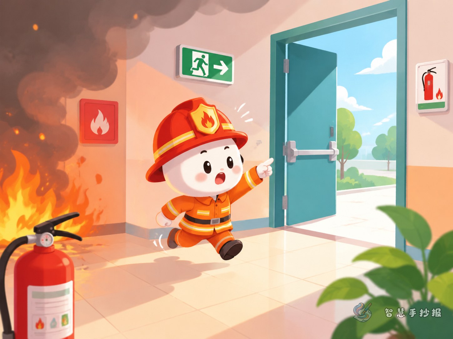
Many students draw large flames and fire trucks but leave the important writing too small. Try to keep illustrations supportive rather than dominant. Good visual elements include exit signs, stair arrows, a phone icon, or a small figure moving low under smoke.
Before finishing, check three things: whether the title is clear, whether the key escape content can be read quickly, and whether each section is easy to find. If you want to keep improving the design, you can continue arranging the page and materials in the Zhihui Shouchaobao WeChat mini program.