Start with the right focus: show both architecture and old-town charm
When making a handwritten newspaper about Lijiang Ancient City, it helps to organize the page around three ideas: traditional buildings, streets and waterways, and the cultural feeling of the old town. This makes the work clearer and more vivid for students.
A good title could be “Exploring Lijiang Ancient City,” “The Beauty of Lijiang Old Town,” or “Traditional Architecture in Lijiang Ancient City.” A short subtitle such as “wooden houses, stone roads, and flowing water” can make the topic more focused.
Ready-to-use content sections
1. Brief introduction
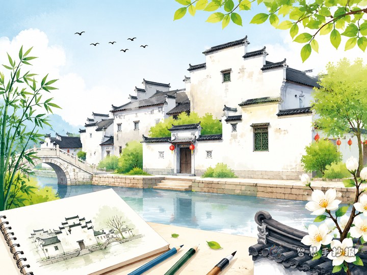
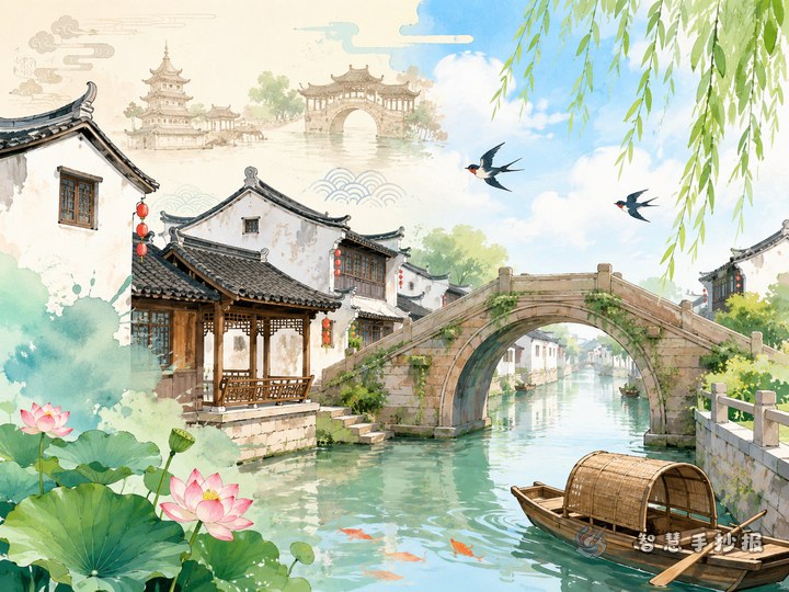
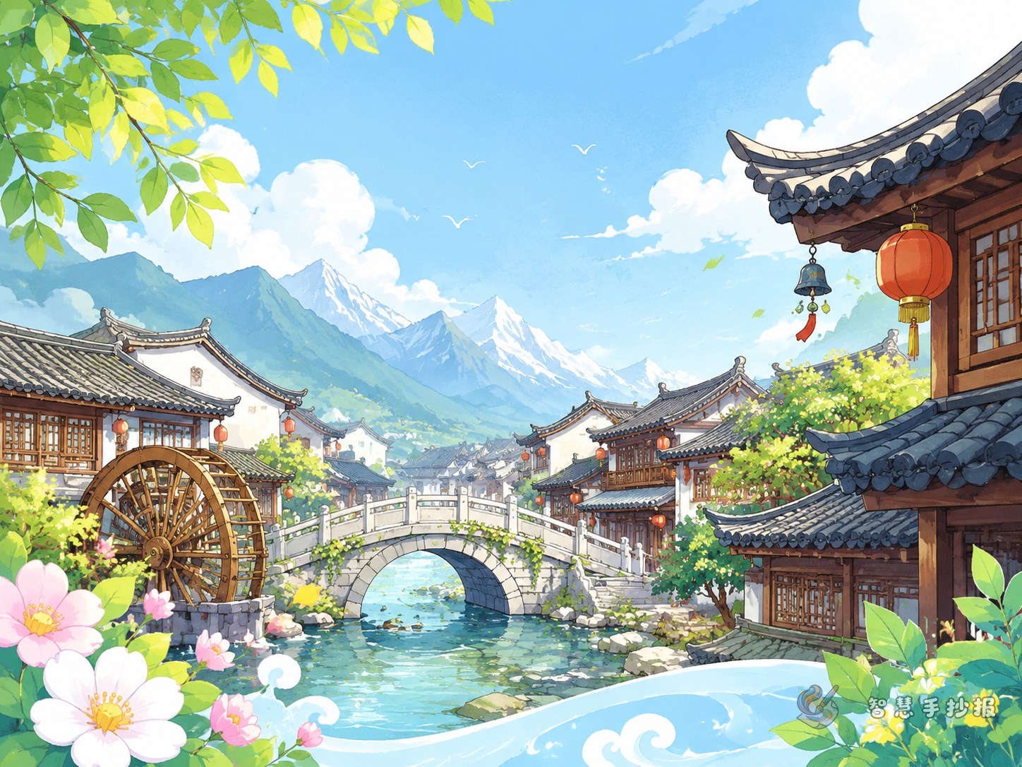
Lijiang Ancient City is an old town with a strong sense of history. Its streets follow the natural landscape, and the town is known for traditional homes, lively lanes, and beautiful waterways. Walking through the old town, people often see stone-paved roads, wooden buildings, small bridges, and flowing streams.
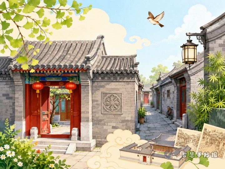
2. Architectural highlights
- Many homes are traditional wooden structures with a natural and classic look.
- Courtyards and lanes connect smoothly, creating rich layers of space.
- Gray roof tiles, wooden doors, and carved windows show traditional beauty.
- The buildings blend well with the surrounding mountains and water.
3. Cultural impression
Lijiang Ancient City is not only beautiful in architecture, but also full of human warmth. Its culture can be felt through daily life, old streets, local customs, and traditional handicrafts. Students can use words like “peaceful,” “lively,” “warm,” and “graceful” to describe the atmosphere.
4. My thoughts
A short ending can say: Lijiang Ancient City feels like a moving painting. The stone roads carry history, and the wooden houses and streams show the harmony between traditional architecture and nature. This kind of reflection works well in the bottom corner of the page.
Layout ideas for a more layered old-town look
For a horizontal page, place the main title in the center and arrange sections on both sides. Put “Introduction” and “Architectural Highlights” on the left, and “Cultural Impression” and “My Thoughts” on the right. A road or water pattern along the bottom can connect the whole page.
For a vertical page, use a top-middle-bottom structure. Draw rooflines at the top, place the main text in the middle, and add bridges, lanterns, or window-frame decorations at the bottom for a unified look.
What to draw around the text
- Main illustrations: wooden houses, tiled roofs, stone paths, bridges, and streams.
- Corner decorations: lanterns, window patterns, roof tiles, or flowers.
- Section boxes: scroll shapes, wooden sign shapes, or arch-style frames.
- Recommended colors: brown, gray-blue, light blue, and soft beige.
Do not color every space too heavily. A little blank space helps the page look cleaner and keeps the calm old-town feeling.
Simple tips to make the work better
- Keep each section short, about 3 to 5 sentences, so it is easy to read.
- Write building features first, then cultural feelings, to create a clear order.
- The title can look artistic, but the body text should stay neat and readable.
- If you want more layout ideas, templates, or color matching, you can continue designing in the Zhihui Shouchaobao WeChat mini program.