Why Building Shapes First Beats Copying a Picture
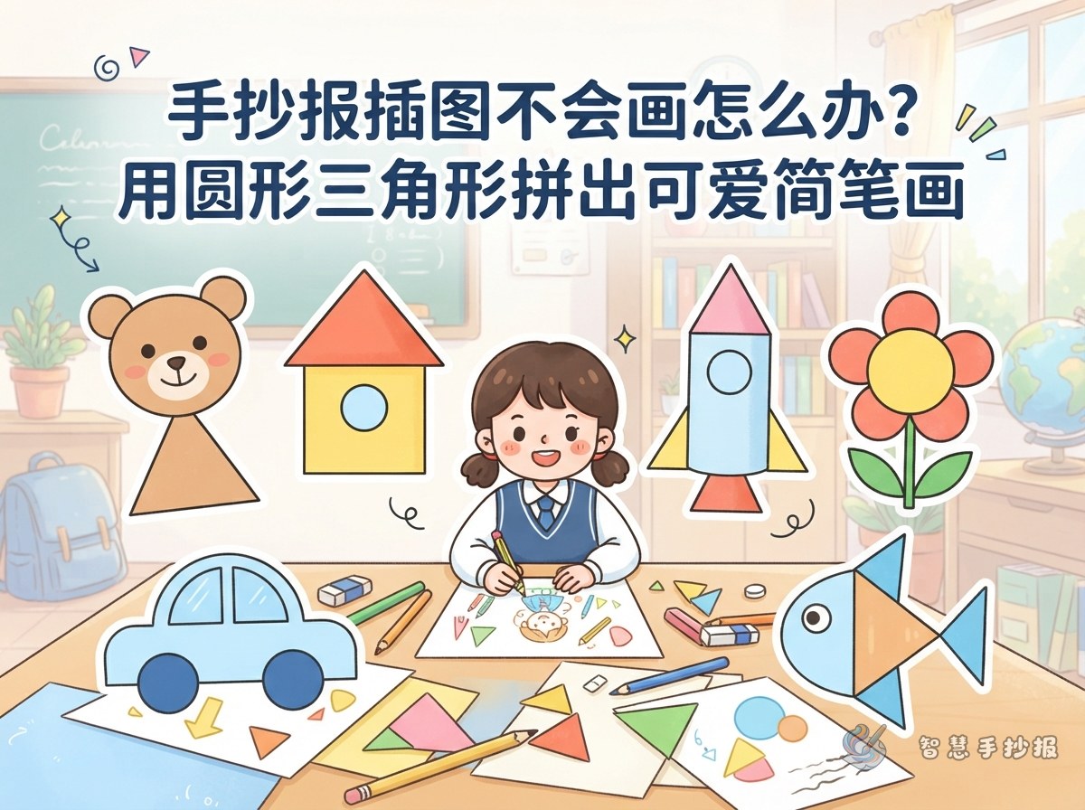
Many children freeze the moment they have to draw something on a handmade poster. The difficulty is rarely in their hands; it is in how they read the picture. Any doodle that looks complicated can be reduced to circles, triangles and squares. Place those shapes correctly first, add lines afterwards, and the drawing will hold together on its own.
This method is also forgiving. If a shape comes out lopsided, just erase that shape and redraw it, instead of starting the whole sheet again.
- Step 1: Sketch the base shapes lightly in pencil.
- Step 2: Compare sizes, such as whether the head is bigger or smaller than the body.
- Step 3: Join the shapes with curved lines so the outline becomes one shape.
- Step 4: Erase the guide lines, then add eyes, patterns and small decorations.
Three Base Shapes Cover Most of the Art on a Poster
Circles: animal heads, suns and flowers
Circles work for heads and anything round. A circle with two triangle ears becomes a cat, with two long ovals it becomes a rabbit, and with short strokes around the edge it turns into a sun or a sunflower. A flower is simply several small circles around a bigger center circle.
Triangles: roofs, sails and bird bodies
Triangles feel stable and pointed. An upside-down triangle can be a bird body or a fish tail, while an upright one becomes a roof, a sail, a hill or a treetop.
Squares: houses, books and window frames
Squares suit anything tidy and structured. Houses, blackboards, books, gift boxes and cups all start from a square. Round the corners slightly and the shape immediately looks friendlier.
Four Tweaks That Turn Accurate into Adorable
- Exaggerate the proportions. A big head with a small body, or oversized ears and eyes, is far more appealing than a strictly realistic figure.
- Give the lines a little curve. Perfectly straight lines look stiff; a slight bend makes them softer.
- Add one expression. Two dots for eyes, a curved smile, rosy cheeks, a sweat drop or star-shaped eyes instantly give the drawing a mood.
- Leave one memorable detail. A bell on the cat's collar, a carrot in the rabbit's paws or an envelope in the bird's beak gives the illustration a small story.
Where to Place Illustrations So the Page Does Not Feel Crowded
More drawings do not automatically mean a richer page. Mark out the title area, the text areas and the illustration areas on scrap paper first, then decide where each picture should sit.
- Four corners: place the main characters here to set the tone of the design.
- Beside the title: add small patterns, taking care not to cover the lettering.
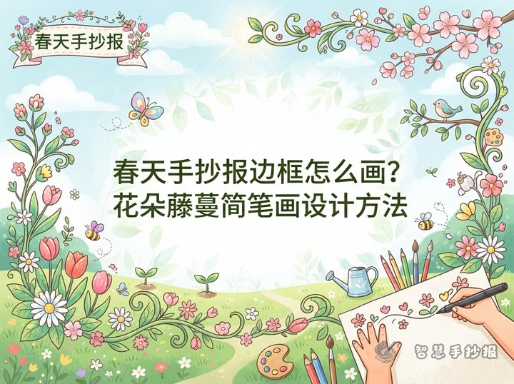
- Between text blocks: use slender plants, vines, pencils or music notes as dividers.
- Outside the border: repeat small motifs such as stars, clouds or leaves to create a decorative edge.
One simple rule helps: fewer drawings where the writing is dense, more drawings where the page is empty. Contrast between busy and open areas is what makes a layout look good.
Keep Lines and Colors Consistent Across Every Doodle
A poster often looks messy even when each individual drawing is fine. The cause is usually inconsistent line weight and too many colors. Outline every illustration with a pen of the same thickness first, then color them in. Limit the palette to three main colors and repeat the same shade in different drawings so the page reads as one design.
To make color choices easier, pick one main color, one support color and one accent color, and draw animals, houses and flowers only from those three. Leave some white space instead of filling every shape completely; simple doodles usually look fresher with a little breathing room.
If a child is just starting out, practice one shape plus one animal per day, and within a week there will be a small personal library of illustrations. When more ready-made layouts and pattern references are needed, open the 智慧手抄报 WeChat mini program, choose a themed template and drop the practiced doodles straight into the layout, which saves a lot of time.