Plan the Page Like a Little Summer Stall
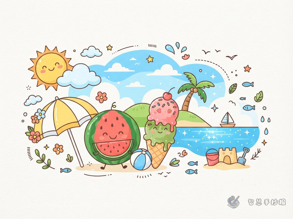
A cool summer handwritten poster does not need a complicated drawing. Imagine the whole page as a cheerful summer stall. Write a title such as “Cool Summer” or “A Lovely Summer Day” at the top, place a watermelon and an ice cream cone in the center, and use a parasol, sunglasses, a small fan, or a cold drink to balance the two sides.
- Top area: Add the title and a few small clouds. Rounded bubble letters work well for a playful look.
- Center area: Draw a watermelon slice and an ice cream cone as the main illustrations.
- Bottom area: Divide the space into two or three short sections for summer facts, cool-weather tips, and summer wishes.
Three Main Doodles with Clear Size Relationships
Watermelon: Use Simple Shapes for a Fresh Look
Start with a curved semicircle, then add red fruit, green rind, and a few black seeds. A tiny face can make the watermelon look friendlier. You can also draw two slices in different sizes to create depth. Leave some space around the watermelon so the nearby text remains easy to read.
Ice Cream: Use Repeated Curves to Show Softness
Draw an upside-down triangle for the cone and place two or three rounded scoops on top. Pink, cream, and light blue make a gentle color combination. Add a cherry or a few sprinkles for detail. The outline does not have to be perfectly symmetrical; small changes make it feel more handmade.
Parasol: A Useful Decoration for the Corners
Place a small parasol in the upper-left or lower-right corner, using blue-and-white or yellow-and-white stripes. A cold drink under the parasol can connect the illustration to the summer theme. This doodle is also useful for filling a corner without making the page feel crowded.
Give Every Text Section a Summer Feeling
Arrange the writing after the main illustrations are planned. Do not fill the page with text first and then search for places to decorate. Keep each section short and write in a generous size so the poster is easy to read.
- Summer Fact: “Drink enough water in hot weather, wear a hat outdoors, and rest in a cool place when needed.”
- Cool Summer Tips: “Enjoy cold drinks in moderation, wash fruit before eating, and rest briefly before drinking water after exercise.”
- My Summer Wish: “I would like to eat watermelon with my family, enjoy the evening breeze, and record summer’s bright colors with my drawings.”
Section titles such as “Watermelon Corner,” “Cool Reminder Station,” and “My Summer Wish List” are short to write and echo the surrounding illustrations.
Unify the Design with Four Main Colors
Try watermelon red, leaf green, ice-cream yellow, and sky blue as the main colors, with black or dark blue for the outlines. Red can highlight the title and watermelon flesh, green can connect the rind and leaves, and light blue can appear in clouds, parasols, or text boxes. Do not color every area completely. White space will make the page feel brighter.
Text boxes can look like ice cubes, clouds, or juice cups, but avoid using too many different shapes. When the main illustrations are large, keep the text boxes simple. When a section has more writing, use cleaner and smaller doodles so the layout stays comfortable.
A Simple Order from Pencil Sketch to Color
- Lightly divide the page into a title area, a main illustration area, and text sections.
- Finish the large drawings first, then add clouds, sprinkles, and tiny dots.
- Copy the text into the sections and check the spacing between paragraphs.
- Use a black outline pen to unify the main contours, then erase unnecessary pencil marks.
- Color from light to dark, and add white highlights or small dots at the end for a fresh finish.
To decide on the title, text boxes, and illustration positions more quickly, scan into the 智慧手抄报 WeChat Mini Program, choose a suitable handwritten-poster layout, and continue creating by replacing the sample decorations with your own summer ideas.