Build the poster around comparison
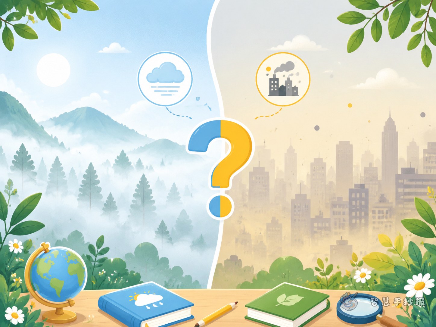
A handwritten poster on fog and haze works best when readers can compare the two at a glance. Instead of writing long explanations, organize the page so that the differences are easy to notice. A clear title such as What Is the Difference Between Fog and Haze? is simple and effective.
You can divide the page into two large sections, one for fog and one for haze, then add a short conclusion in the middle or at the bottom.
Key content you can write directly
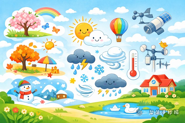
What is fog?
Fog forms when there are many tiny water droplets in the air. It often appears in the early morning or in places with high humidity. When fog comes, nearby and distant objects look blurry, and the air often appears whitish.
What is haze?
Haze happens when very fine particles stay suspended in the air. It can make the sky look gray and reduce visibility, and people may feel that the air is less fresh.
A one-line comparison
You can write: Fog is mostly tiny water droplets, while haze is mostly fine particles. Fog often looks white and moist; haze often looks gray and dry.
- Fog: high humidity and a white misty look
- Haze: gray air and less clear distant views
- Fog is often obvious in the morning and may weaken later
- Haze can last longer and is often linked with air quality concerns
Useful mini sections for the poster
Observation notes
On a foggy morning, the outside world can look as if it is covered by a thin white veil. On hazy days, the sky often looks gray and buildings in the distance are harder to see clearly.
Safety and protection
- Be more careful in traffic during foggy weather
- Reduce long outdoor activity when air quality is poor
- Keep classrooms and homes clean and pay attention to weather changes
- Practice environmental protection in everyday life
Short slogan ideas
- Learn about weather, care about air
- Protect the environment from small daily actions
- Understand fog and haze, stay safe and informed
Layout ideas that look neat and clear
You can divide the poster into four parts: title area, comparison area, daily life area, and decoration area.
- Title area: use large lettering and simple weather icons
- Comparison area: explain fog on one side and haze on the other
- Daily life area: add observation notes and practical advice
- Decoration area: use light blue, gray, and pale yellow borders or small drawings
Short subheadings such as causes, appearance, effects, and protection tips will make the page easier to read.
How to avoid a flat and boring poster
Many students only write definitions, which makes the poster feel thin. A better way is to include comparison, observation, and advice.
- Comparison: what fog is and what haze is
- Observation: what you noticed on the way to school or in the morning
- Advice: what people should do in different weather conditions
This makes the poster more complete and more connected to real life.
A simple ending for the final section
You can end with a short conclusion: weather changes contain a lot of science, and careful observation helps us understand nature better. Learning the difference between fog and haze helps not only with a school poster, but also with daily awareness of health and the environment.
After planning your title, sections, and layout, you can also continue polishing your work in the Zhihui Handwritten Poster WeChat mini program.