Match the Title Style to the Poster Theme
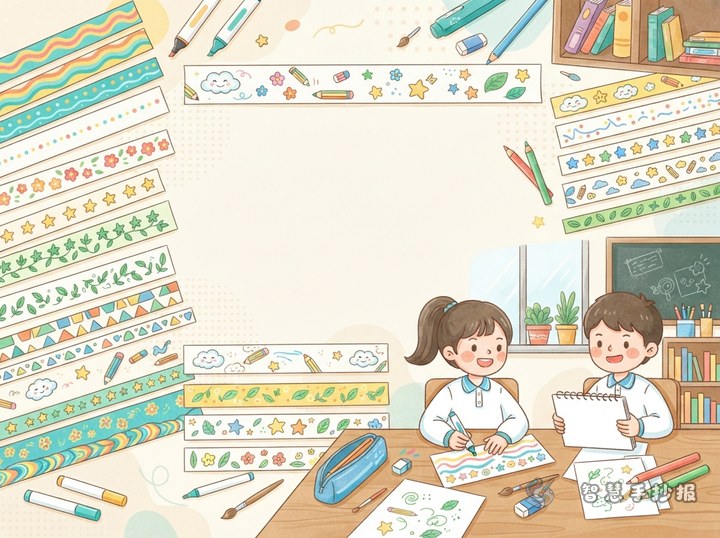
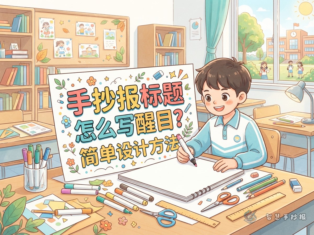
A strong title should be large enough to notice and should also fit the subject. An environmental poster may use green, blue, and small leaf decorations. A reading poster can include book, bookmark, or pencil motifs. A holiday topic often works well with brighter colors. Choose the exact wording before drawing and, when possible, keep it between four and ten words so it does not take over the page.
For a poster titled “Protect the Earth, Start with Me,” make “Protect the Earth” the largest line and use “Start with Me” as a smaller subtitle. This creates a clear focus and leaves more room for the information sections.
Build Clear Title Letters in Four Steps
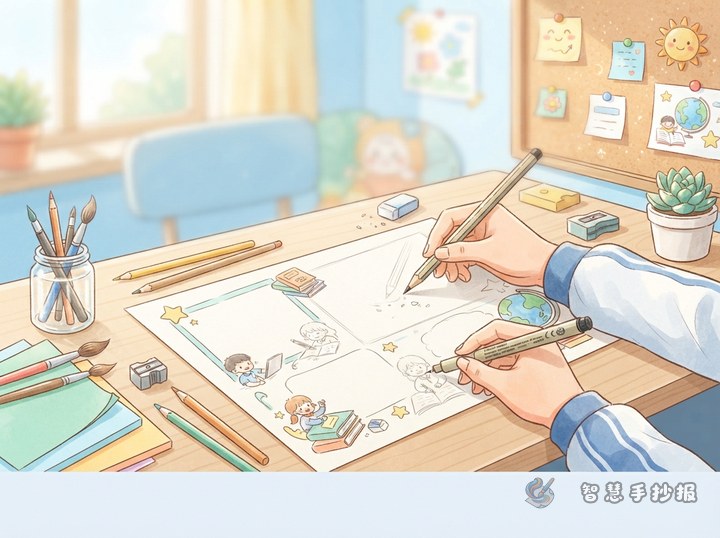
- Mark the space:Lightly draw the title area in pencil and check that the full wording will fit.
- Sketch the letters:Begin near the center or estimate the spacing first so the letters stay close in height.
- Thicken the outline:Draw a simple border around ordinary letters to create easy outline lettering.
- Add color and contrast:Fill the letters with one main color, trace them with a darker shade, and add a light shadow on the lower right if desired.
Finish the complete pencil draft before tracing so spelling and spacing can still be corrected. A few stars, leaves, or dots can decorate the title, but they should never cover the letters.
Arrange Useful Sections Below the Title
Place two to four sections beneath the heading. For an environmental theme, possible section names include “Eco Facts,” “My Green Actions,” and “Ways to Save Resources.” Give the largest box to the section with the most information, and use narrower spaces for action lists and quick tips.
- Eco Facts:Explain simple ideas about saving resources, sorting waste, or protecting plants.
- My Green Actions:Use short lines such as “Turn off unused lights,” “Save water,” and “Avoid unnecessary disposable items.”
- Ways to Save Resources:List three to five practical tips, keeping each one to a sentence or two.
The same approach works for other subjects: include one fact section, then add suggestions, a short story, a quotation, or a personal reflection. Short paragraphs and intentional blank space are easier to read than a page packed with writing.
Check the Whole Page Before Finishing
Step back and look at the complete poster. The title should attract attention first without covering the body text. Check whether there are too many colors and whether one side feels much heavier than the other. If the title is large, simplify the illustrations and section borders. If it is small, strengthen it with a color block, ribbon shape, or clean border.
If you still need help choosing a title style or organizing the sections, continue your project in the 智慧手抄报 WeChat Mini Program. You can organize the title, content sections, and layout ideas there, then adjust them to match your paper size.