Decide what the poster should help readers understand
If your topic is China’s 34 provincial-level regions, the goal is not to fill the page with long text. The real goal is to help readers quickly understand where the regions are and remember their basic facts. The most useful points are names, abbreviations, capitals, geographic location, and one key feature.
For primary school students, the best method is to combine a map with short written notes. The map gives the big picture, while the text highlights the important details.
A practical layout: map in the center, sections around it
A clear and effective design is to place a China outline map in the middle and build small information sections around it. This keeps the theme focused and makes the page easier to read.
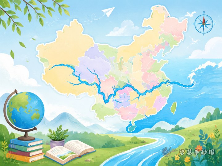
- Center: a China map with several important provincial-level regions marked.
- Top left: types of provincial-level regions, such as provinces, autonomous regions, municipalities, and special administrative regions.
- Top right: abbreviations and capitals in a short list.
- Bottom left: simple regional divisions of China.
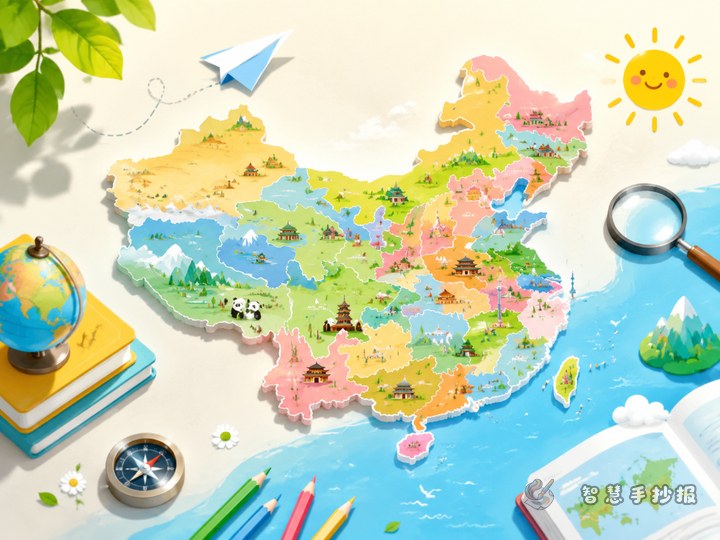
- Bottom right: featured provinces, your hometown, or a fun fact section.
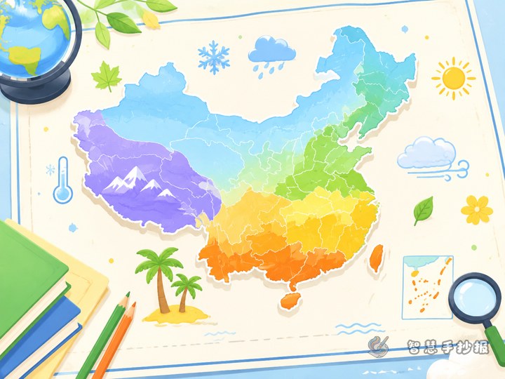
You can use different colors for different parts of China. This makes the poster more lively and also helps with memory.
What facts should you write
1. Basic classification
A short opening line can explain that China has 34 provincial-level regions, including provinces, autonomous regions, municipalities, and special administrative regions.
2. Abbreviations and capitals
You do not need to turn this into long paragraphs. Short entries work much better for a handwritten newspaper. For example:
- Beijing: abbreviation Jing, capital Beijing.
- Guangdong: abbreviation Yue, capital Guangzhou.
- Sichuan: abbreviation Chuan or Shu, capital Chengdu.
- Shaanxi: abbreviation Shan or Qin, capital Xi’an.
- Xinjiang Uygur Autonomous Region: abbreviation Xin, capital Urumqi.
3. Regional grouping
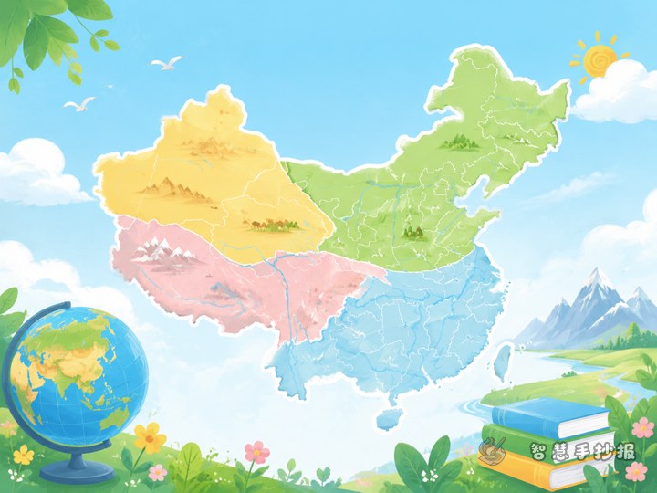
You may also briefly mention common geographic divisions such as Northeast, North, East, Central, South, Southwest, and Northwest China. This helps readers build a spatial understanding instead of just memorizing names.
Best section ideas for a school handwritten newspaper
- Find it on the map: mark Beijing, your home province, and a few key regions.
- Abbreviation corner: match common abbreviations with their regions.
- Province profile cards: give each region one label, such as tropical scenery or snowy winters.
- My hometown: explain which provincial-level region your hometown belongs to.
- Quick quiz: include a few simple geography questions for interaction.
These sections make the poster more interesting and help students organize facts clearly.
How to make the page look better
The most common problem with geography posters is either a map that is too small or too much text that feels crowded. A few simple design choices can improve the final effect.
- Place a bold title at the top.
- Keep the map clear instead of overcomplicated.
- Limit each section to a few key lines.
- Use borders or color blocks to separate topics.
- Add simple decorations like a compass, mountains, rivers, or skyline shapes without covering the main map.
For younger students, shorter sentences are better than long explanations.
A simple ending that feels complete
You do not need a long conclusion. A short closing idea is enough: learning about China’s 34 provincial-level regions helps us understand the size of the country and the richness of its regional cultures. With a map and clear categories, province names, capitals, and locations become much easier to remember.
If you already have your content ideas and want to keep improving the layout, colors, and sections, you can continue your work in the Zhihui Shouchao Bao WeChat mini program.