Decide Where Guidelines Are Actually Needed
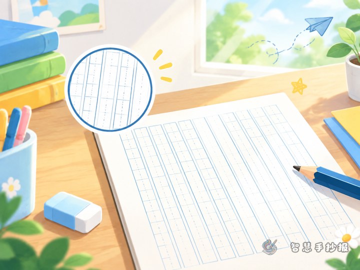
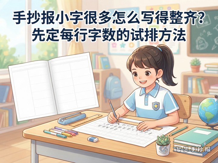
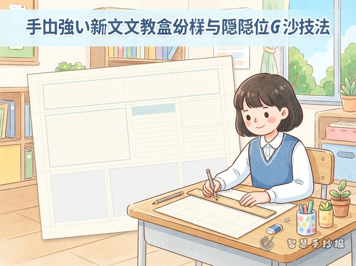
More lines do not automatically create a neater handwritten poster. Body-text areas mainly need consistent baselines and side boundaries. Section headings may need only a top and bottom limit, while drawings, borders, and open spaces can remain unlined. List the planned sections and estimate the amount of text before deciding how many rows each area needs.
For a poster about good handwriting habits, possible sections include “A Neat Writing Rhyme,” “Common Mistakes,” “Finishing Steps,” and “My Final Checklist.” The same planning method also works when invisible guidelines are being prepared for a science, reading, holiday, or safety poster.
Choose One of Four Low-Visibility Methods
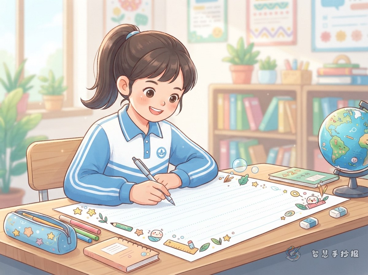
Light Pencil Baselines
- Make matching marks at equal intervals on the left and right sides of the text box.
- Connect each pair with a ruler and a sharp HB or 2H pencil, using minimal pressure.
- Draw only the baseline for each row instead of covering the area with full squares.
A Guide Sheet Underneath
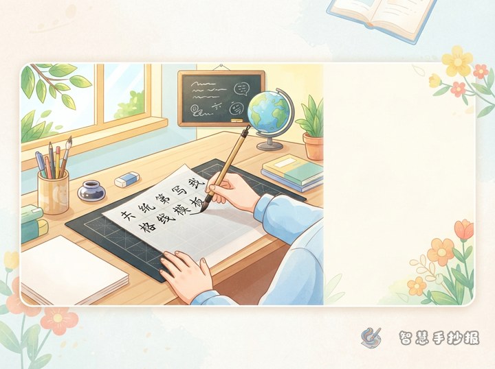
If the poster paper is thin enough, place lined or graph paper underneath it and secure the edges with clips. The visible pattern becomes a temporary reference without leaving graphite on the final sheet. Move and realign the guide paper when starting another section.
Paired Edge Marks
Students who can already control letter height may use small paired dots along the two edges instead of drawing long lines. Start each row at the matching height, then hide the dots in the border or erase them gently after writing.
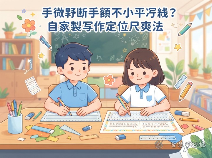
A Movable Guide Card
Cut a straight strip of plain card and place it directly below the current row. Move it down by the same distance after each line. The card provides a horizontal reference and also keeps the writing hand away from fresh ink.
Match Spacing to the Poster Layout
- Main title: Sketch a light outline first so the words fit without becoming cramped.
- Section headings: Make them larger than body text, but keep headings of the same level at a similar height.
- Body text: Use a consistent letter size and leave a clear gap between rows.
- Paragraphs: Short blocks of two to four sentences are easier to read than one dense passage.
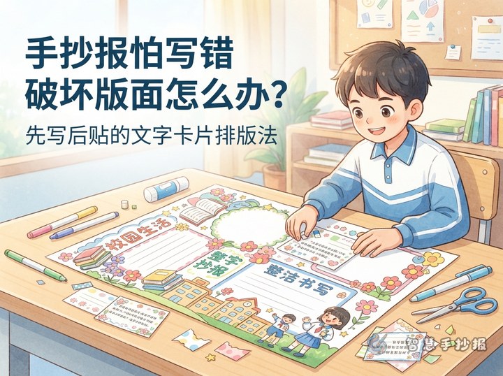
Place the title at the top or near the visual center, then arrange two to four sections of different sizes around it. Keep the longer text toward the middle, place small illustrations beside related information, and preserve some open space around the page.
Ready-to-Use Writing Material
Short rhyme: Plan the page before you write; keep letters even and rows in line; let the ink dry before erasing; leave some space so ideas are clear.
Checklist text: After finishing a section, check whether its heading stands out, whether any words cross the boundary, whether the spacing changes suddenly, and whether punctuation has enough room. If an area looks empty, add a small symbol or brief tip instead of enlarging the final lines.
Mini paragraph: A neat poster is not a page with every space filled. It gives titles, writing, drawings, and blank areas their own roles. Plan each section first, maintain a consistent writing size, and check spelling and guide marks at the end.
Erase in the Right Order
- Finish the pencil layout before copying the body text and outlining the title.
- Wait until gel pens, felt-tip pens, and markers are completely dry.
- Erase gently from one side toward the other without scrubbing the paper.
- Remove crumbs, restore any faded border details, and check for spelling errors or smudges.
Always test the pencil, ink, and eraser on a spare piece of similar paper first. To compare different section arrangements before copying the final design, follow the page prompt to open the Smart Handwritten Poster WeChat Mini Program and continue planning your poster there.