Make the Reading Action Easy to Recognize
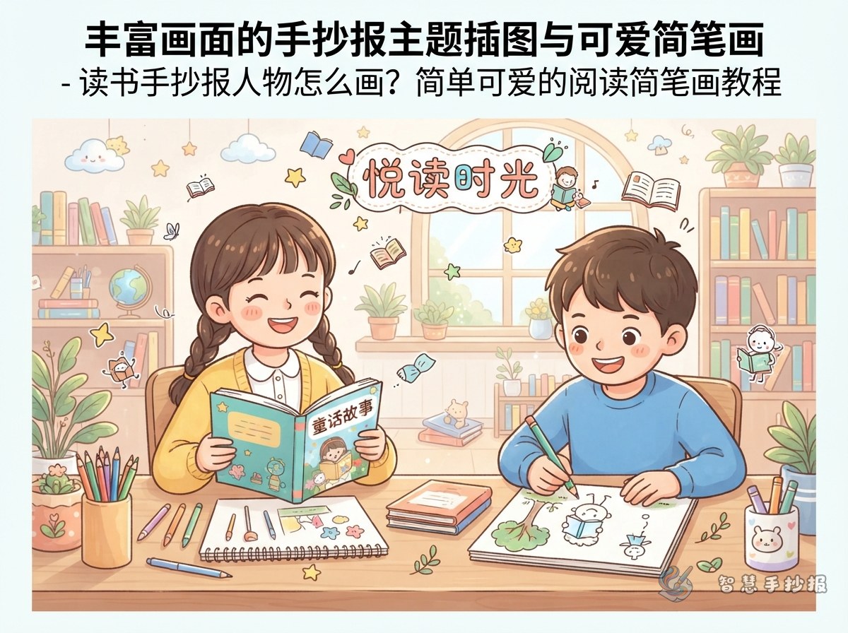
The character does not need realistic anatomy. A child holding a book, sitting beside a stack of books, or peeking over an open page immediately communicates the reading theme. Choose one main character first, then arrange the title and writing sections around that focal point.
Three beginner-friendly poses
- Holding a book: Show the head and upper body while the open book covers the hands.
- Sitting and reading: Use a few curved lines for bent legs, then add a cushion or a small stack of books.
- Peeking over a page: Draw a large book at the bottom and let the smiling character appear behind it.
Draw a Cute Reader in Six Steps
- Draw a circle or a softly rounded shape for the head.
- Add the fringe and hair with several smooth curved lines.
- Use dots for the eyes and add a tiny nose and smiling mouth.
- Draw an open book below the face with two rounded page shapes.
- Connect the shoulders to the book with short curves to suggest the arms.
- Color the hair, clothing, and book, then add blush, a bookmark, or a few stars.
Sketch lightly in pencil before outlining. A slightly oversized head and simplified facial features create a cheerful doodle style that works well for elementary school posters.
Pair the Illustration with Useful Writing
Possible sections include “My Reading Habits,” “A Book I Recommend,” “What I Learned,” and “Favorite Lines.” Keep each section to a short paragraph or three to five points so that the text remains easy to read and the illustration has enough space.
Short text ideas to adapt
- Reading habit: Look at the contents first, read with a question in mind, and record useful words or ideas.
- Book recommendation: Introduce the title, the main character, and one reason the story is worth reading.
- Reading reflection: Books help us explore unfamiliar worlds, build vocabulary, and think about problems in new ways.
Guide the Eye Across the Page
One useful layout places the title at the top and the character in the lower left, facing two text boxes on the right. Small books, pencils, or bookmarks can lead the eye from one section to the next. Another option places the character in the center with three differently sized writing areas around it.
Let the main illustration use about one quarter of the page. A palette of blue, orange, and pale yellow feels bright without becoming distracting. Instead of drawing a heavy border on every side, use a curved page line or a short row of books to keep the composition light.
Check the Final Details
- Make sure the character is clearly reading rather than appearing as an unrelated portrait.
- Leave comfortable blank space between the title, illustration, and writing.
- Keep the smaller decorations connected to books and reading, with consistent colors and line styles.
For more character poses, writing sections, and layout combinations, continue your project in the 智慧手抄报 WeChat Mini Program and adjust the design to match the assignment.