Choose a clear angle for the page
A good handwritten newspaper about the beauty of Chinese characters works best when it has one strong idea. Instead of trying to include everything, you can focus on how characters began, how they changed shape, and how they appear in idioms and classical poetry.
A practical title could highlight the charm of characters, their evolution, or the connection between writing and culture. Once the angle is clear, the whole page becomes easier to organize.
Sections that fit the theme
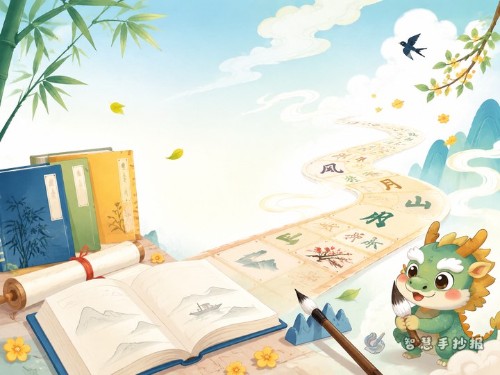
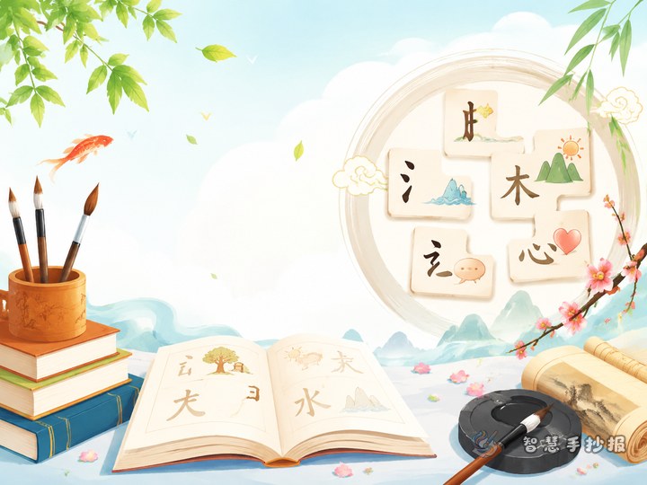
Character origin corner
Pick two or three common characters such as sun, moon, mountain, or river. Briefly explain how the earliest forms looked like pictures and how they became the characters we use today.
Character evolution corner
Show simple changes from early forms to regular script. You do not need too many details. One short sentence for each example is enough for a primary school handwritten newspaper.
Idioms and poetry corner
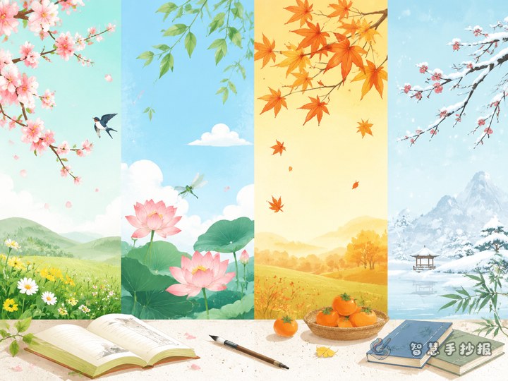
Choose idioms related to learning, reading, nature, or good character. Add one or two classical lines that include vivid imagery or meaningful words. This makes the page richer and more literary.
Ready-to-use text materials
- Pictographic idea: Early characters often began from pictures of real things.
- Character evolution idea: As writing changed over time, characters became clearer and easier to write.
- Idiom example: Pick simple idioms with positive meaning and explain them in one sentence.
- Poetry example: Use short, familiar classical lines that children can understand and recite.
You can also add a short closing line such as learning Chinese characters is not only learning to write, but also learning to understand culture.
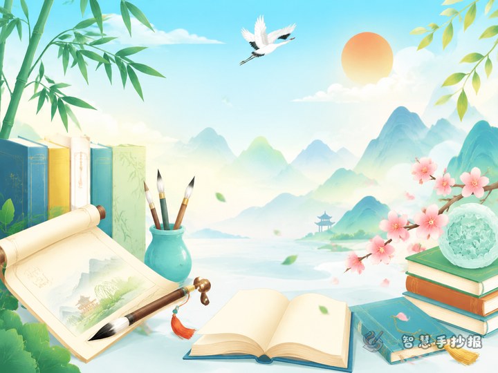
Layout ideas that feel lively
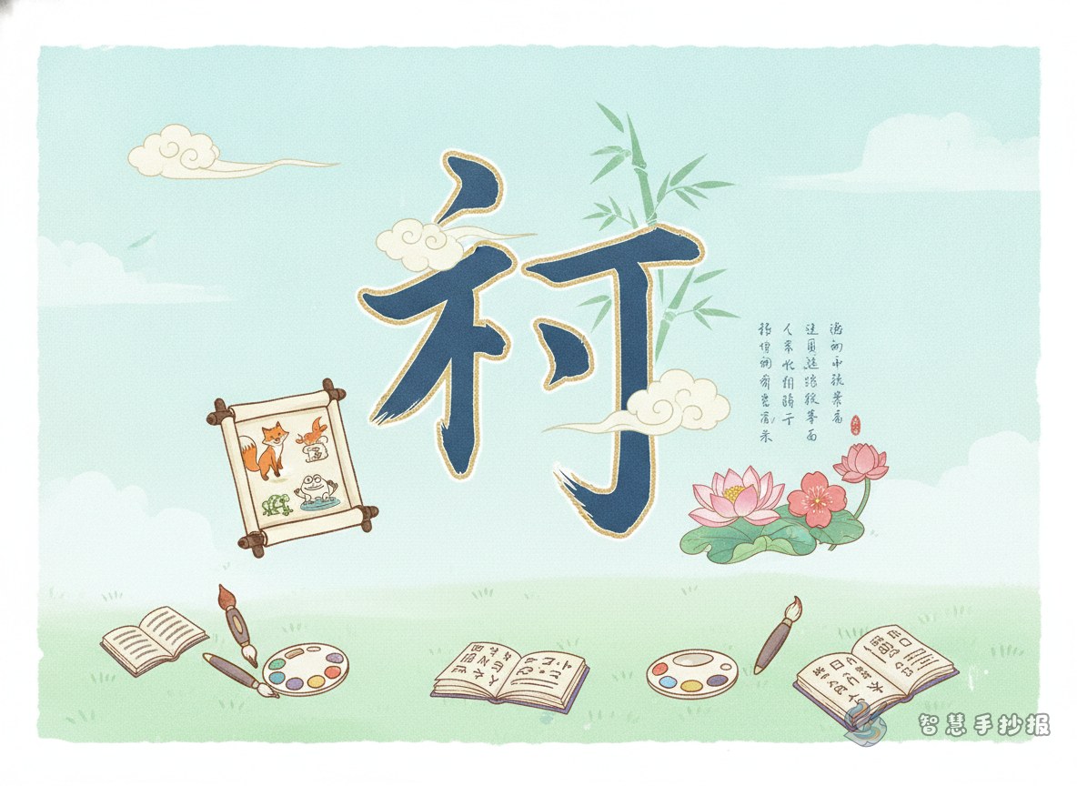
You can place the main title at the top center, then use four surrounding content blocks. One block can focus on character origins, one on evolved forms, one on idioms, and one on poetry. This structure feels balanced and easy to read.
For decorations, use simple lines, seals, brushes, scroll edges, bamboo, or cloud patterns. Keep enough blank space so the text does not feel crowded.
Tips for making the final page look better
- Keep each paragraph short and readable.
- Use slightly larger writing for subheadings.
- Choose two or three main colors, such as black, red, and light green.
- Make the important examples stand out with boxes or bold labels.
- Finish with a short personal sentence to make the work feel complete.
If you already have your theme but want a cleaner arrangement, you can continue adjusting titles, sections, and styles in the WeChat mini program for a more polished handwritten newspaper.