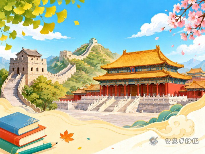
Pick a Clear Comparison Theme First
If you want your handwritten newspaper to stand out, try a theme like “How the Great Wall and the Forbidden City Show Ancient Chinese Architectural Wisdom”. This idea is more interesting than a simple introduction because it adds comparison and personal thinking.
You can place the main title at the top center and add a short subtitle such as: one shows the strength of defense, the other shows the beauty of palace design.
A Smart Section Plan for the Page
- Section 1: What the Great Wall Is — write about its purpose, mountain setting, and strong appearance.
- Section 2: What Makes the Forbidden City Special — write about palace layout, colors, and royal atmosphere.
- Section 3: Comparing Architectural Wisdom — compare defense, scale, symmetry, and beauty.
- Section 4: My Thoughts on Historic Landmarks — add two or three sentences of your own feelings to make the work feel original.
This structure gives your page both knowledge and personal expression, which works well for school assignments and classroom displays.
Short Text Materials You Can Use
Text for the Great Wall
The Great Wall stretches across the mountains like a giant dragon. It was an important defensive project in ancient times and also shows the determination and wisdom of the people who built it. Standing on the Wall, people can feel the weight of history and the beauty of the land.
Text for the Forbidden City
The Forbidden City is a classic example of traditional Chinese palace architecture. Its red walls, golden roofs, and orderly halls create a grand and dignified feeling. Its design shows the beauty and balance of Chinese architecture.
Text for the Comparison
The Great Wall emphasizes strength and distance, while the Forbidden City highlights order and elegance. One stands among mountains, and the other stands in the heart of a city. Though they served different purposes, both reflect the skill of ancient builders.
Make the Layout Show Contrast
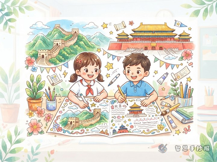
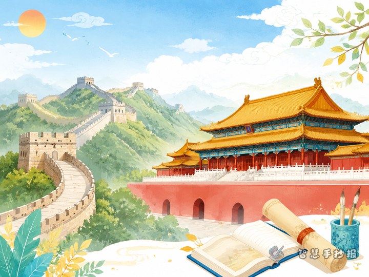
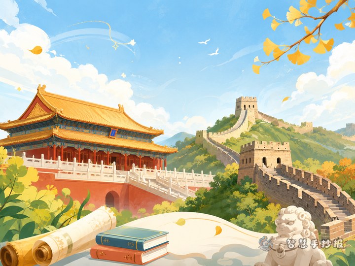
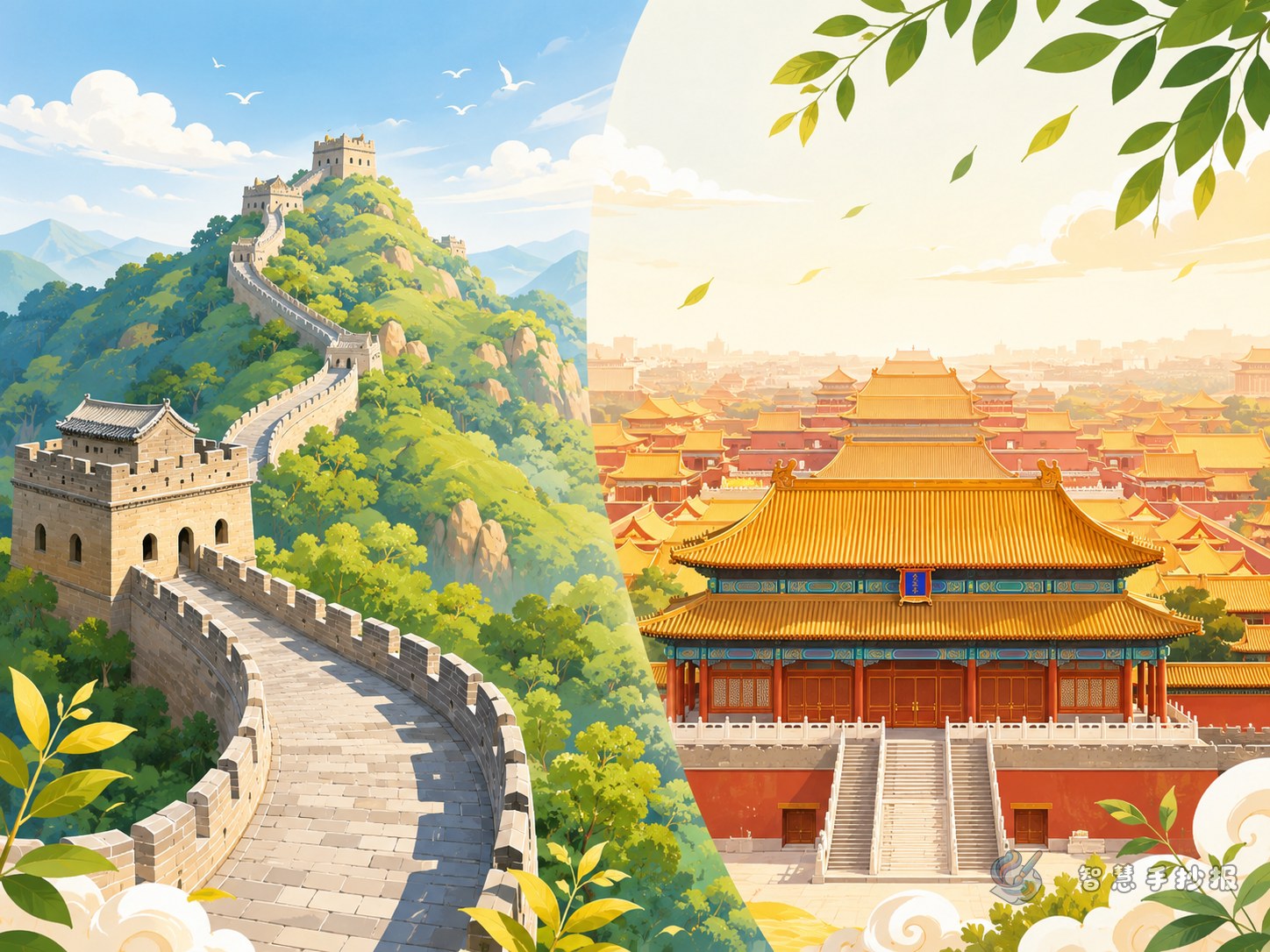
This topic works especially well with a left-right comparison layout. Put the Great Wall on the left and the Forbidden City on the right. In the middle, add a small comparison box to show similarities and differences.
- Decorate the title with wall lines or palace roof shapes.
- Use mountains, watchtowers, or brick borders for the Great Wall side.
- Use palace gates, clouds, lanterns, or roofline patterns for the Forbidden City side.
- Add a short sentence in the center, such as: Historic landmarks are precious gifts from history.
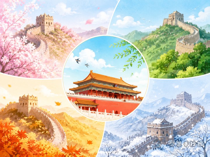
Good color choices include brick red, golden yellow, and gray-blue. These colors match the theme and keep the page neat.
Small Details That Make the Work Better
- Do not fill the page with long paragraphs. Three to five sentences per section are enough.
- Add a small box called “Why We Should Protect Historic Sites.”
- End with a sentence such as “Learn history and treasure cultural heritage.”
- If you need to finish quickly, sketch the layout on paper first, then continue improving it in the WeChat mini program.
As long as your theme is clear, the sections are logical, and the handwriting is neat, this comparison-style Great Wall and Forbidden City handwritten newspaper will look more memorable than a basic introduction page.