Start with a strong theme: make corn feel like summer in the field
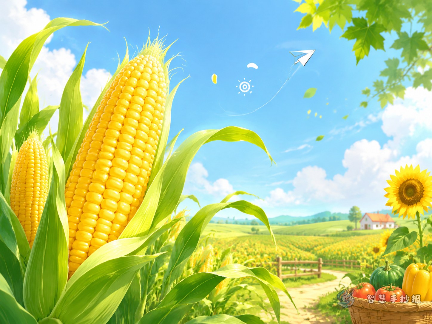
Corn is a vivid crop for a handwritten newspaper because students can easily imagine the plant, the field, and the harvest. A clear title such as “The Life of Corn”, “Into the Summer Cornfield”, or “What I Know About Corn” helps the page feel focused from the start.
It is best to choose one main direction. You can either explain how corn grows or show how corn connects with everyday life. A simple central idea makes the whole page easier to design.
Best sections to place on the page
How corn grows
- Seeds are planted in the soil
- Small sprouts appear
- The plant grows taller with more leaves
- Flowers appear and ears begin to form
- The corn ripens and is ready to harvest
This section works well in time order and is easy for children to understand.
What corn is used for
- It can be boiled or steamed as food
- It can be made into corn porridge or corn kernels
- The plant parts can have other practical uses
- It is an important crop in rural life
Keep this section simple and close to daily life so readers can connect science with real experience.
What a summer cornfield looks like
You can add short observation lines such as: Corn leaves are long and narrow, and they wave like little green flags in the wind. Ripe ears of corn wear layers of husks, hiding bright yellow kernels inside. These lines make the poster feel more lively.
Short ready-to-use writing materials
Material 1: Corn is a common summer crop. From planting to harvest, it goes through sprouting, leaf growth, flowering, and ripening.
Material 2: In the cornfield, rows of corn stand tall like little guards, bringing green life to the summer countryside.
Material 3: Corn is not only food. It also reminds us that growing grain takes hard work, so we should value every grain.
Material 4: Learning about corn helps us understand plant growth, seasonal change, and the meaning of farm work.
Try a field-style layout instead of even boxes
A corn-themed page looks especially good with a layout that feels like farmland. Put the title in the middle and divide the rest into natural blocks, almost like small fields around it.
- Top area: main title with sun and cloud decorations
- Left side: growth stages of corn
- Right side: uses of corn and fun facts
- Bottom area: food-saving tips or observation notes
If there is extra space, add small decorations such as corn leaves, fences, paths, or straw hats to strengthen the countryside feeling.
Three design tips that make the poster look better
Make the title stand out
You can shape the title like an ear of corn or wrap it with leaf patterns so the topic is easy to recognize.
Keep drawings simple
There is no need for detailed art. Corn cobs, leaves, soil, sunshine, and tiny insects are enough to create a lively farm scene.
Use a unified color scheme
Green and golden yellow should be the main colors, with a little blue for the sky and brown for the earth. A consistent palette makes the page look clean and bright.
How to end the page neatly
A good final line could be “To learn about corn is to learn about summer fields and the value of every grain.” It matches the theme and adds educational meaning.
After choosing your content and layout, you can continue making the page in the Smart Handwritten Newspaper WeChat mini program to improve borders, title styles, and color details.