Begin With One Narrow Idea
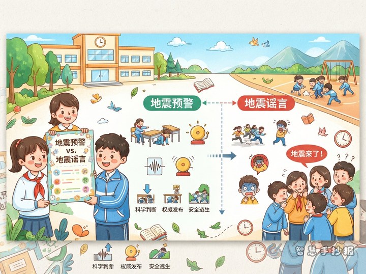
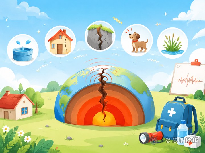
Disaster Prevention Day covers many hazards, but one sheet of paper cannot hold them all. A reliable approach is to let the masthead name the day and let the rest of the page deal only with earthquakes, explaining what to do the moment the shaking starts. The poster stays on topic and readers come away with something they can act on.
Before drawing anything, write one sentence you want readers to remember, such as “drop, cover and hold on first.” That sentence becomes the spine of the poster and every column should support it.
Keep the Masthead to Three Lines
The masthead is the first thing anyone sees, so place it across the top and give it roughly one fifth of the sheet. Do not let borders or drawings crowd it out.
- Main title: four to six characters is easiest to remember, for example “Small Moves, Big Safety.”
- Subtitle: one concrete line or question, such as “Protect your head and neck first.”
- Date and name: a small box in the top right corner, one size smaller than the main title.
Make the main title bold, outlined or boxed so it separates clearly from every other line of text.
Four Columns, Each With Lines Kids Can Copy
Column one: the three protective actions
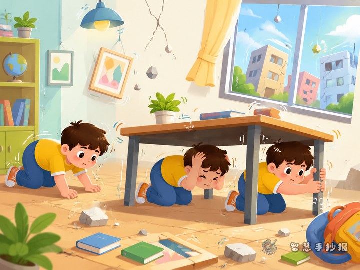
Use “drop, cover, hold on” as a mini heading and follow it with two or three short lines. Phrased like a chant, it sticks.
Column two: hiding inside a classroom
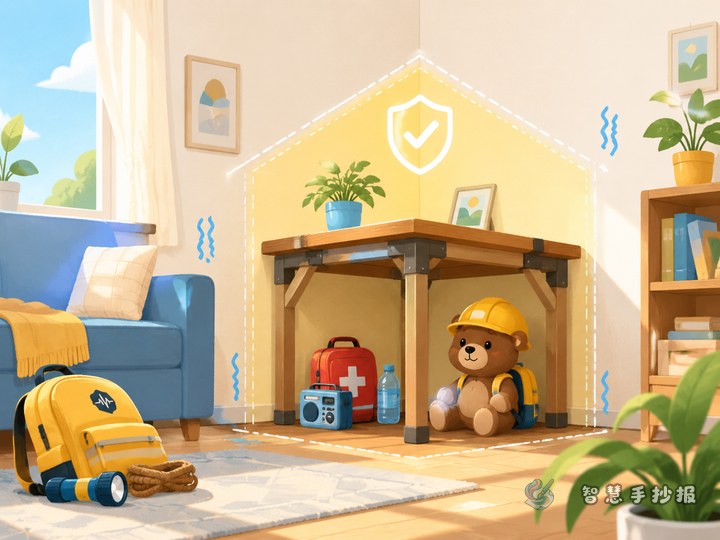
Write: get under the desk quickly, cover your head and neck with one hand and grip the desk leg with the other; stay away from windows and hanging objects; follow the teacher instead of rushing out first.
Column three: what not to do when leaving
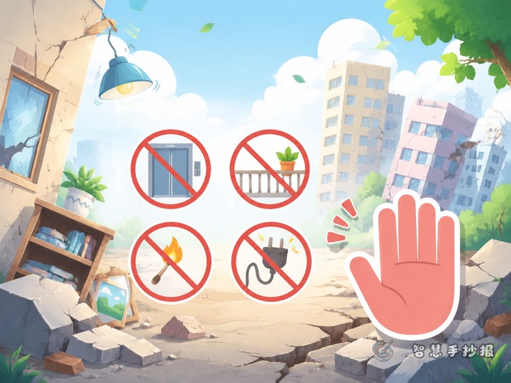
Three “do nots” work well here: do not use the lift, do not go back for your bag, do not push at the stairwell door. Short lines with a small icon make the warning sharper.
Column four: a small task for home
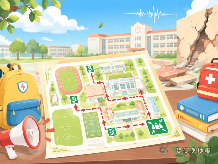
Reserve a corner for “one thing to do with your family,” such as agreeing on a meeting spot or finding out where the emergency kit is kept. This turns the poster from homework into action.
Lines you can copy straight onto the sheet: cover your head before you crouch; under a desk beats a corridor; move only after the shaking stops; take the stairs and keep to the wall.
Zone the Page in Three Blocks
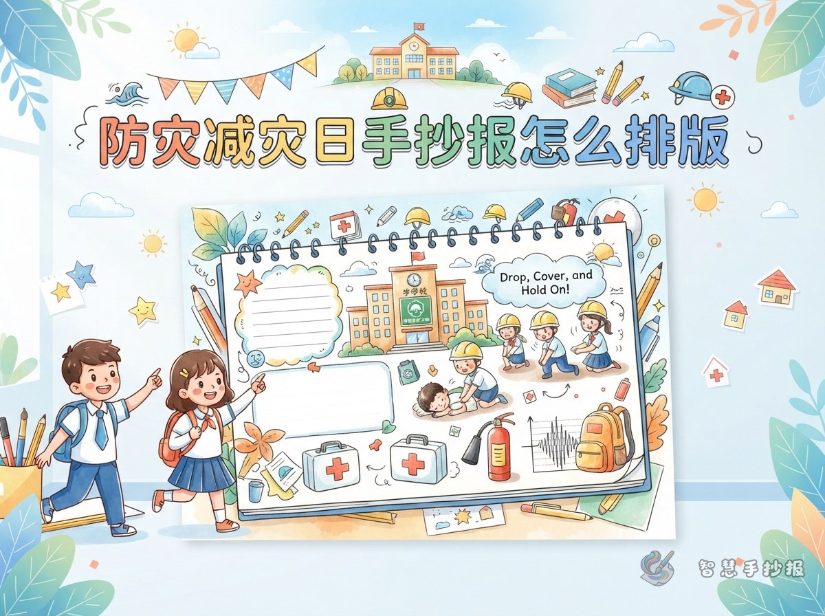
Lightly pencil the divisions first: masthead across the top, one tall column on the left, two stacked panels on the right. The tall column carries the protective actions, the stacked panels cover classroom hiding and evacuation, and the last small space belongs to the family task.
- Pencil the layout, then letter the headings in colour, and copy the body text last to avoid redoing work.
- Limit yourself to two or three main colours, dark for headings and light for body text.
- Leave breathing space between panels and keep text off the border lines.
- Add arrows or numbers so the reading order is obvious.
Five-Minute Check Before You Colour
- Reading only the main title, can you tell what the poster is about?
- Is the body text clearly smaller than the headings yet still readable from a metre away?
- Do the columns have a clear order, or could a reader get lost?
- Is there at least one instruction someone could actually follow?
- Are there spelling slips, messy corrections or empty patches left unfilled?
If You Want a Tidier Grid
When time is short, open the Smart Handwritten Newspaper mini program in WeChat, pick an earthquake-safety layout frame, paste these lines into the panels and adjust the column sizes and colours. Then copy the structure onto paper by hand, so the poster still looks drawn rather than printed.