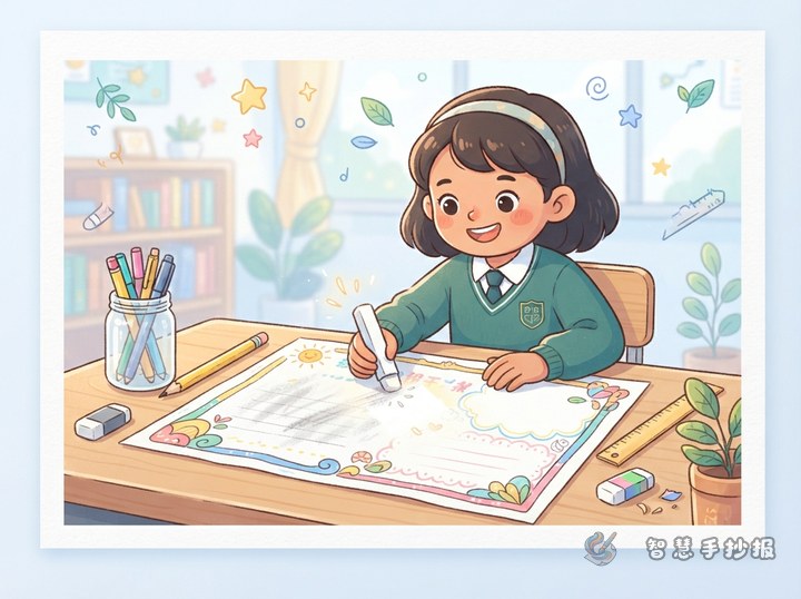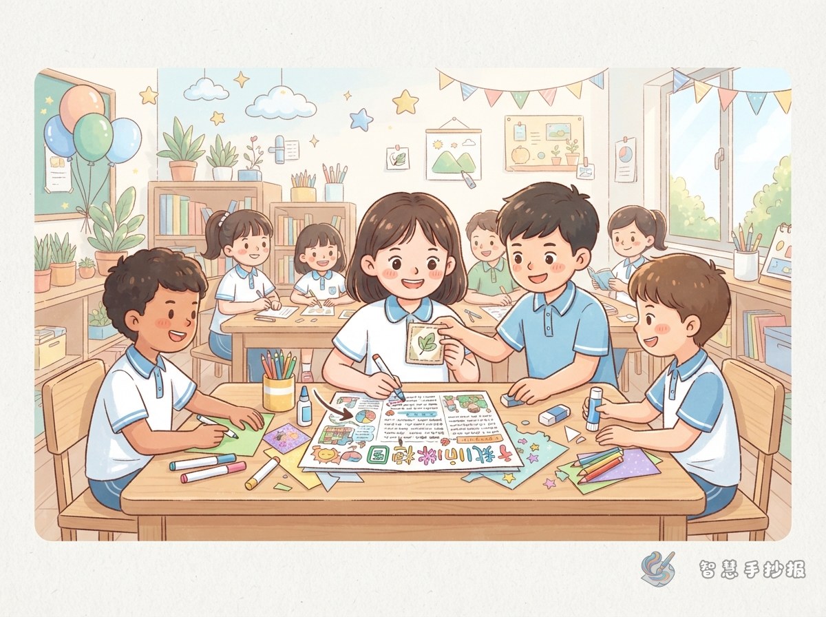
First decide whether the poster really needs a restart
Do not immediately scribble over a mistake with a dark pen. Check whether it affects readability and whether it appears in the heading, body text, or decoration area. One misspelled word, a missing character, or a slightly uneven line can usually be repaired. A restart makes more sense when the paper is torn or several major sections have been placed incorrectly.
- Small mistake: Cover and rewrite a single word or punctuation mark.
- Medium mistake: Shorten a sentence or add a small label when text is missing.
- Visible layout problem: Use borders and illustrations to rebuild the visual balance.
Match the repair to the location
- Cover with a matching surface: On white paper, use a clean piece of thin white paper or a light strip of correction tape.
- Reshape the letter: Add strokes only when the original mark can naturally become the correct letter or character.
- Create a label: Turn the mistake into a note card, bookmark, speech bubble, or fact box.
- Convert it into art: Change an error near the edge into a leaf, flower, star, pencil, or theme-related icon.
- Redesign the section: Cover a larger area with a neat color block and add a new column such as “Quick Facts” or “My Action Plan.”
Make every patch support the theme
A repair should do more than hide a mark. For an environmental poster, use leaves or recycling symbols. A reading poster can include books and bookmarks. Shields and warning signs suit a safety topic, while flags, lanterns, or flowers work well for celebrations. The corrected area will then look intentional.
Short lines for a new mini-section
- Friendly reminder: Good habits grow through small actions every day.
- Knowledge card: Careful observation and active thinking help us discover new ideas.
- My action plan: Choose one small goal and complete it step by step.
These short lines fit compact spaces created by a patch. Replace key words to match an environment, reading, safety, or holiday theme.
Restore balance after the repair
If the covered area looks too bright, repeat the same color in a small illustration on the opposite side. When the body text feels crowded, divide it into three short points instead of adding another long sentence. Near a repaired heading, use a double border, pale shadow, or a few small icons, but avoid excessive decoration.
- Keep the main heading larger and more prominent than any repair label.
- Limit the design to two or three main colors instead of adding a new color for every correction.
- Leave clear gaps between sections so the revised layout can breathe.
A one-minute check before using ink
Lightly mark section boundaries in pencil, then verify headings, sentences, and punctuation on scrap paper. Write the longest text blocks first and fill remaining spaces with short lines or illustrations. A final word-by-word check can reveal omissions and repeated words. If section sizes are still difficult to judge, open the Smart Hand-Copied Poster WeChat Mini Program to continue planning the theme, wording, and layout before copying the final version.