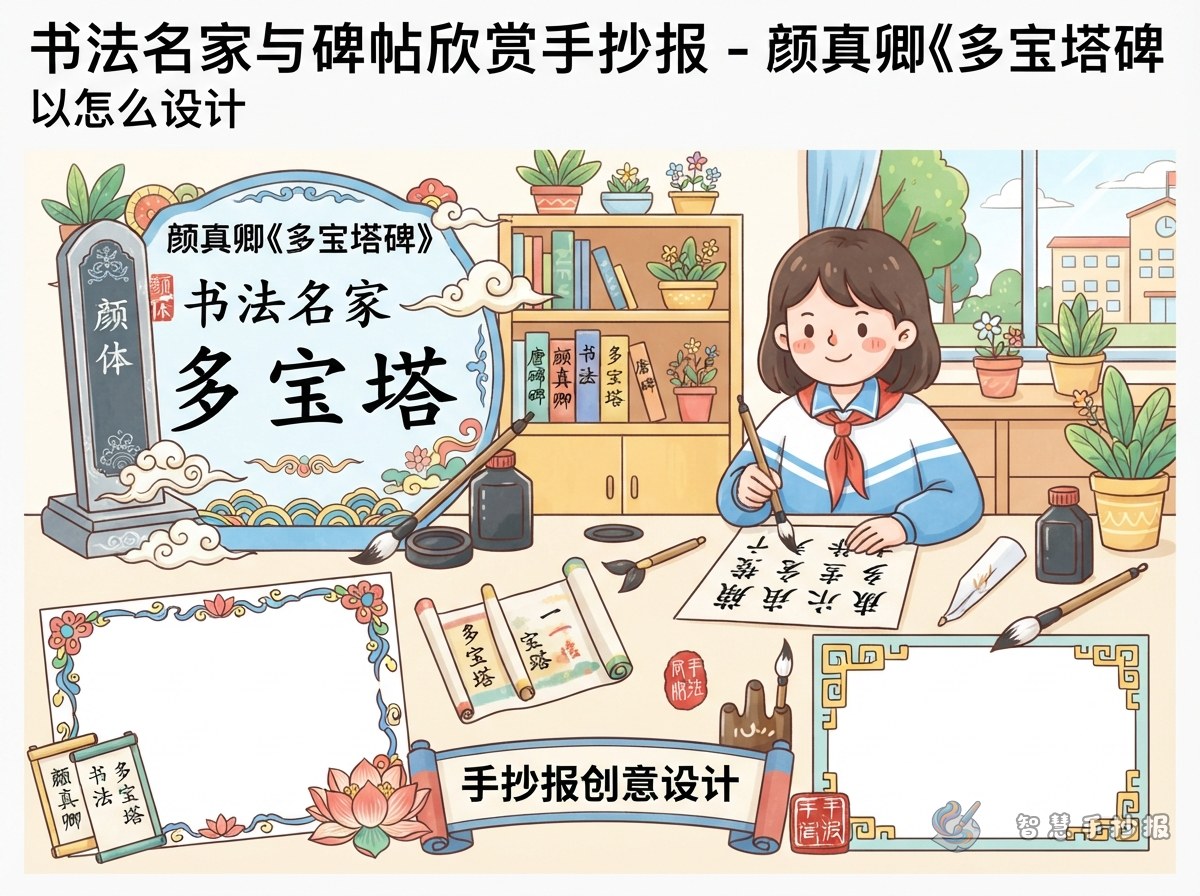
Decide the Main Focus First
A handwritten newspaper about Yan Zhenqing's Duobaota Stele should highlight copybook appreciation, not just a general biography. The best approach is to organize the page around four ideas: who the calligrapher was, what the stele is, what features can be seen in the writing, and what the student learned from it.
This makes the project clear, age-appropriate, and easy to complete.
Useful Sections for the Page
Section 1: A Short Profile of the Calligrapher
Briefly introduce Yan Zhenqing as a famous calligrapher of the Tang Dynasty. His regular script is often described as upright, powerful, and highly influential.
Section 2: What Is the Duobaota Stele?
This part can work like an information card. Explain that it is one of Yan Zhenqing's well-known regular script works and is often appreciated by learners of calligraphy.
Section 3: Features I Notice
- The characters look upright and balanced
- The strokes appear clear and strong
- The structure feels neat and stable
- The overall style looks solemn and energetic
These simple points are easy for students to understand and write down.
Section 4: My Observation Notes
Students can mention that horizontal strokes feel steady, vertical strokes look firm, and dots or turns show strength. Sentences beginning with “I noticed” or “I think” make the page more personal.
Section 5: My Reflection
A short ending can explain why the stele is impressive, such as its orderly beauty, its usefulness for handwriting practice, or the cultural value of Chinese calligraphy.
Ready-to-Use Writing Material
- Yan Zhenqing is a famous Chinese calligrapher whose regular script is admired by many learners.
- The Duobaota Stele is one of his important works and is often used for appreciation and study.
- Its characters are neat, strong, and full of dignity.
- Appreciating a copybook means observing strokes, structure, rhythm, and overall spirit.
- This project helped me feel the beauty of Chinese characters and traditional culture.
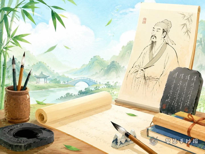
Create a Strong Calligraphy Atmosphere
The page does not need to be complicated. A calm and clean layout suits this topic best. Place the main title at the top and use side columns or a central block with smaller surrounding sections.
- Main colors: black, red, and light beige
- Border ideas: stone-tablet lines, scroll-style frames, seal patterns
- Small decorations: brush, inkstone, bamboo slips, square seal marks
- Writing tip: make the title bold, keep the body text neat
Leave some blank space so the page does not feel crowded. This often makes a calligraphy-themed newspaper look more elegant.
Simple Tips for a Better Final Result
- Do not write only about the person's life; keep the focus on the stele.
- Include at least one section about writing features.
- Add a personal reflection to make the work feel genuine.
- Keep the title style and subheadings consistent.
- If time is short, list the sections first and fill in the text afterward.
If you want more help with layout and section matching, you can continue your design in the Zhihui Shouchaobao WeChat mini program.