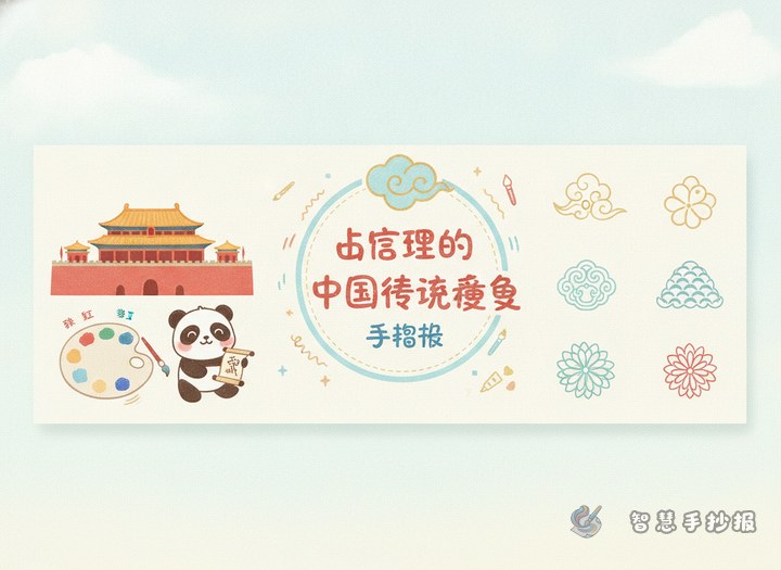
Begin with a theme that is easy to develop
You do not need to include every traditional Chinese color in one project. A better approach is to choose a smaller focus, such as colors I know from Chinese tradition, how traditional colors work together, or beautiful ancient-style color names. A clear topic makes both writing and layout much easier.
For elementary students, it is best to choose colors with names that are easy to remember, meanings that are easy to explain, and combinations that are easy to show on the page.
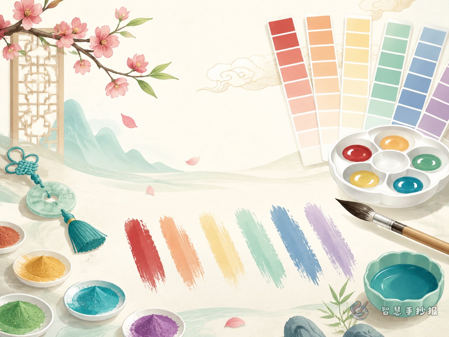
Color materials you can write directly into the page
You can select four to six traditional colors and introduce each one in two or three short sentences. This keeps the page readable and visually clean.
- Vermilion: bright and lively, often linked with festivals, celebration, and energy. It pairs well with ivory or black.
- Moon White: soft and gentle, like moonlight. It gives a quiet and clean feeling and works well with pale blue-green or light gray.
- Dark Cyan: calm and refined, often associated with mountains, water, and classical beauty. It can be matched with moon white or light yellow.
- Apricot Yellow: warm and cheerful without being too strong. It looks friendly and can be paired with brown or bamboo green.
- Bamboo Green: fresh and natural, reminding people of spring and bamboo groves. It works well with moon white or soft green.
- Stone Blue: richer and deeper in tone, useful for headings or key borders because it adds visual weight.
A simple writing pattern like color name + feeling + matching idea is easy for students to use.
Make the idea of color culture easy to understand
The phrase color matching culture may sound difficult, but in a hand-copy newspaper it can be explained in a simple way. Focus on short and practical ideas.
- Traditional colors are not only beautiful; they also express mood. Red feels warm and festive, blue-green feels calm, and pale white feels elegant.
- Good color matching is about harmony, not using as many colors as possible. Three main colors are usually enough.
- Traditional palettes often value layers and softness, so using light and dark variations works better than filling the page with very strong colors.
You can place these points in a small section called Color Tips or Matching Notes.
A layout plan that fits this topic well
This subject works especially well as a page with color-card sections. You can divide the newspaper into clear parts so readers understand it at a glance.
- Title area: use a strong traditional color such as vermilion or dark cyan.
- Color display area: present each traditional color in a small card with a name and short explanation.
- Matching knowledge area: add three or four short color-matching rules.
- My favorite combinations: list sets such as moon white plus dark cyan, apricot yellow plus bamboo green, or vermilion plus ivory.
- Decorative border area: add simple motifs like clouds, floral lines, fan shapes, or seal-style frames.
If you have more space, you can add a small section called My Favorite Traditional Color to make the page more personal.
Small design tricks to create a traditional Chinese mood
You do not need very complex drawings to make the page feel elegant. Color control and blank space are more important.
- Choose the main color first, then add supporting colors instead of using many unrelated shades.
- Use stronger colors for the title and softer ones for text backgrounds and borders.
- Try light and dark versions of the same color family to create a gentle layered effect.
- Keep decorations simple. A few cloud patterns, floral corners, or ancient-style frames are enough.
- Leave blank space so the colors and text can breathe.
If you already have your topic and sections but want to finish the page faster, you can continue designing in the Zhihui Shouchao Bao WeChat mini program.