
Poster topics and copy references
Not sure what to write? Browse topics with section ideas, short copy and layout suggestions.
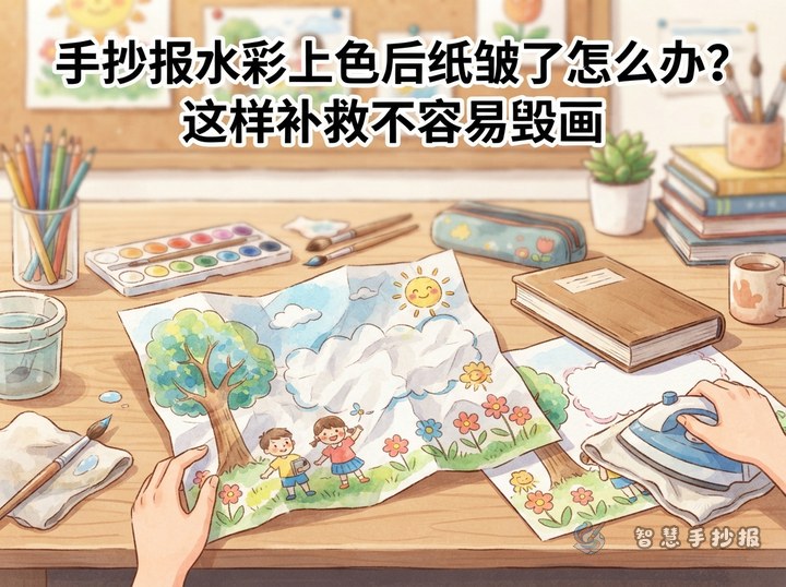
Paper Wrinkled After Watercoloring a Poster? Safe Ways to Fix It
A wrinkled hand-copied poster may not need to be restarted. This guide explains how to blot, air-dry, press, and mount warped paper, then turn stubborn ripples into title cards or small content sections. It also includes short text ideas, layout fixes, and practical ways to prevent buckling next time.

How to Make a School Poster Title Stand Out with an Arched Layout
An arched composition connects the title, central illustration, and text sections into one strong shape. This guide provides curve-marking steps, section ideas, sample writing, color rules, and a clear drawing order for reading, environmental, festival, and other school poster themes.

How Do You Draw Hollow Title Letters with Theme Patterns?
Hollow lettering makes a school poster heading stand out while leaving room for theme-based decoration. This guide explains how to sketch the letter shapes, add simple motifs, control colors and spacing, connect the title with content sections, and keep the finished heading easy to read.

How Can You Make a Handwritten Poster If You Cannot Draw? Use Simple Shapes for a Neat Page
This beginner guide shows students how to create a clear handwritten poster with one title, four content cards, and simple geometric decorations. It covers topic selection, section ideas, short writing materials, color choices, spacing, and final checks, making the project manageable even without drawing experience.
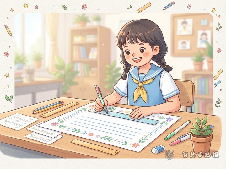
How to Draw a Neat Poster Border with Simple Divided Lines
Create a clean, adaptable handwritten poster border using only a ruler and straight lines. This guide covers double frames, dotted details, alternating color blocks, and right-angle dividers, along with topic sections, writing prompts, color planning, and white-space tips for a balanced school poster.
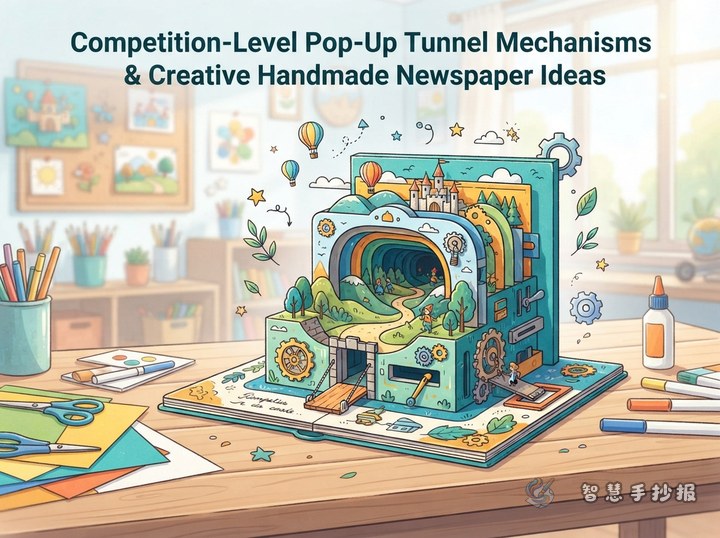
How to Make a Layered Tunnel Mechanism for a Contest Poster
A layered tunnel mechanism uses several paper frames to create the illusion of depth. It works especially well for ocean, forest, space, and cultural themes. A strong contest entry should combine the central dimensional feature with readable text blocks, coordinated colors, sturdy folds, and carefully controlled decoration.
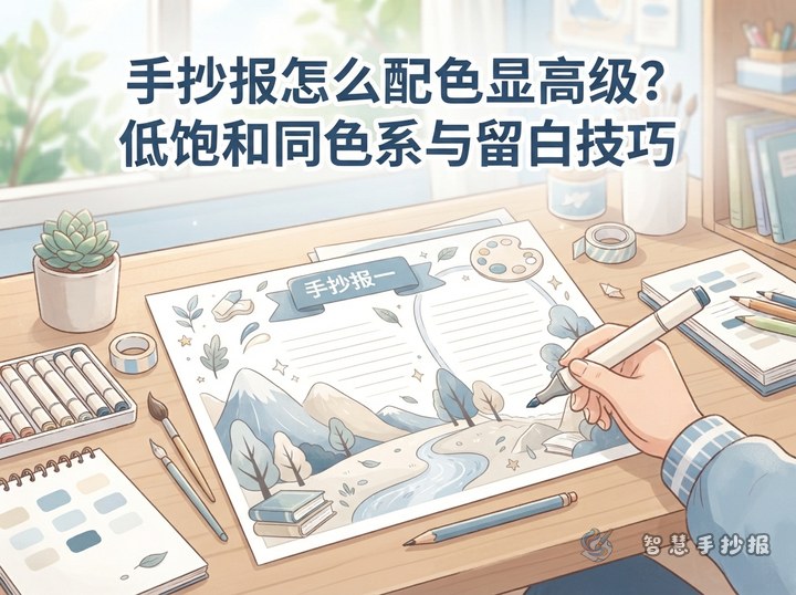
How Can a Hand-Copied Poster Look Polished with Muted Colors?
A clean, polished hand-copied poster can be built with one muted main color, lighter and darker shades, and carefully planned whitespace. This guide covers section planning, adaptable writing material, marker order, outlining, and simple ways to keep the page balanced and readable.

How Do You Arrange a Long Hand-Copied Poster Title? A Two-Line Offset Lettering Guide
A long poster title does not have to be squeezed into tiny lettering. Divide it at a natural phrase break, arrange the two lines with a slight offset, and enlarge the key words. Consistent outlines, limited colors, and a few theme-related motifs will keep the title clear while preserving room for content sections.
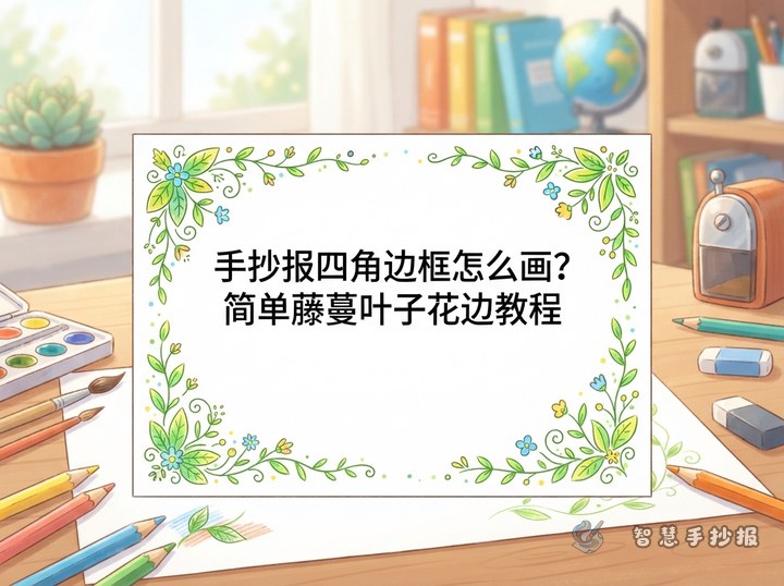
How to Draw an Easy Vine-and-Leaf Corner Border for a School Poster
A vine-and-leaf corner frame is easy to draw and flexible enough for reading, environmental, seasonal, and school-life posters. Start with four curved vines, add alternating leaves, and connect the sides with thin lines. The guide also provides adaptable sections, short text samples, and spacing tips.
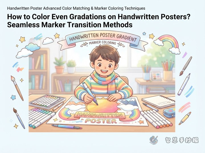
How Do You Make a Smooth Marker Gradient on a Handwritten Poster?
A smooth marker gradient depends on choosing neighboring shades, working from light to dark, and blending while the edges are still damp. This guide explains testing, stroke direction, title coloring, whitespace, layout planning, and simple ways to repair uneven areas.
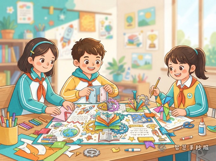
How to Make a Creative Lift-the-Flap Poster for a School Contest
Lift-the-flap elements add interaction and extra writing space to a school poster. This guide explains how to connect each flap with the topic, plan readable sections, prepare short text, arrange the page, and reinforce moving parts so the finished entry looks creative, neat, and easy to explore.

How to Stop Handwritten Poster Text from Slanting: Use Guide Dots for Alignment and Spacing
A handwritten poster can look neat without drawing a complete grid. Divide the page into text areas, mark a few light guide dots for line starts, endings, baselines, and letter height, and check the spacing every few lines. This guide also includes section ideas, adaptable writing material, and a final layout checklist.
Have a topic? Generate the layout and line art
Enter the topic in the mini program to generate section copy, a layout draft and printable line art.
 Scan with WeChat