Why Poster Text Starts to Drift
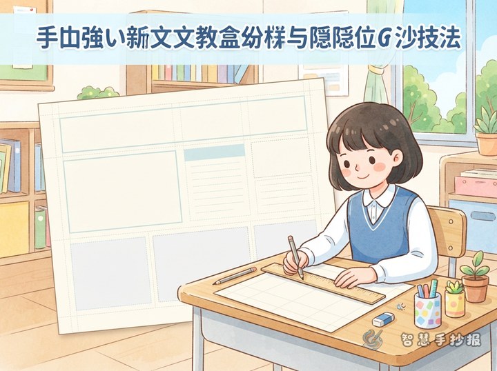
Slanted writing is not always a handwriting problem. It often happens because the text box has no clear boundaries, each line begins in a different place, or a long sentence is forced into the remaining space. Separate the title, illustrations, and writing areas before adding body text.
- Changing line starts: Uneven paragraph edges make the whole page look untidy.
- Inconsistent letter height: Large letters at the beginning often shrink near the end of a line.
- Unplanned line breaks: Crowded final words can make a line rise, fall, or curve.
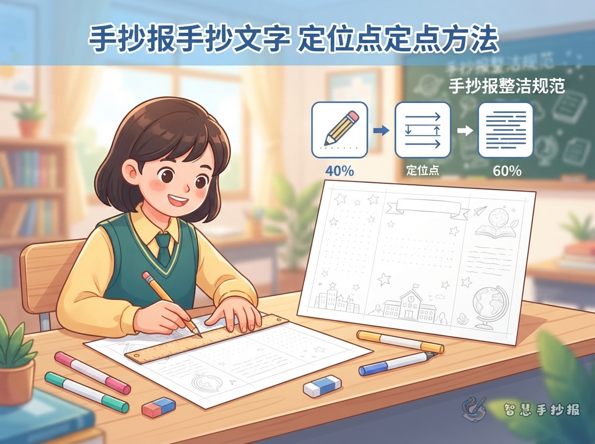
Replace a Full Grid with Four Simple Reference Points
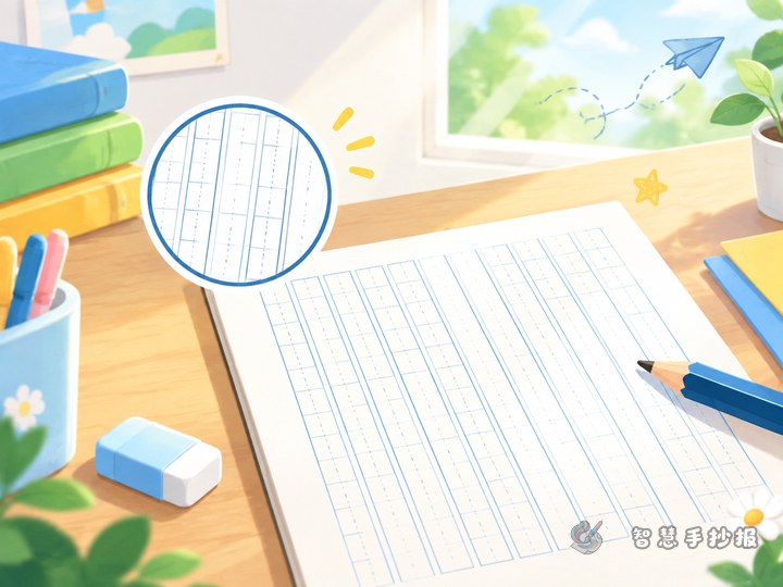
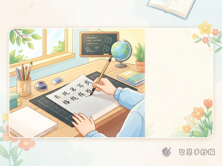
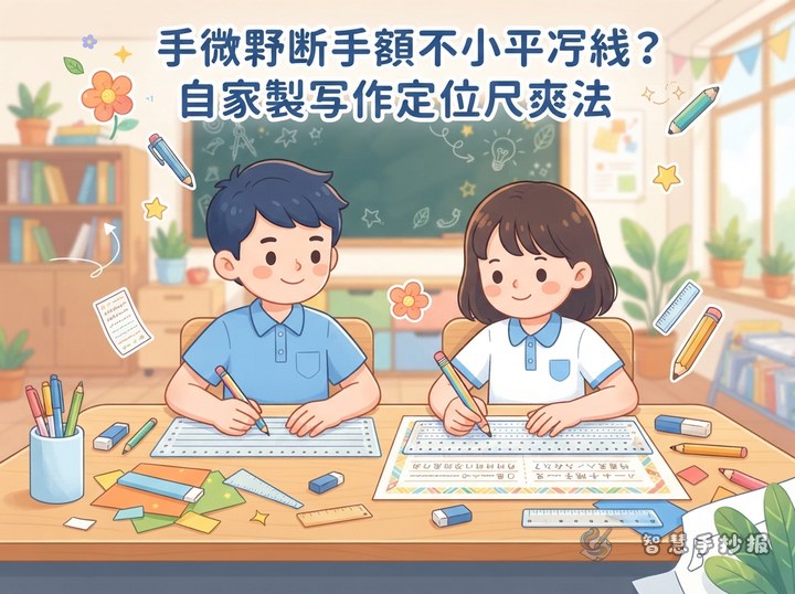
Use a ruler to decide the left and right edges of the writing area. Add faint pencil dots for the start and end of each line. If the writing tends to rise or fall, mark matching baseline points on both sides. If letter size changes easily, add a small upper-height marker beside the first letter.
- Mark evenly spaced line positions down both sides of the text area.
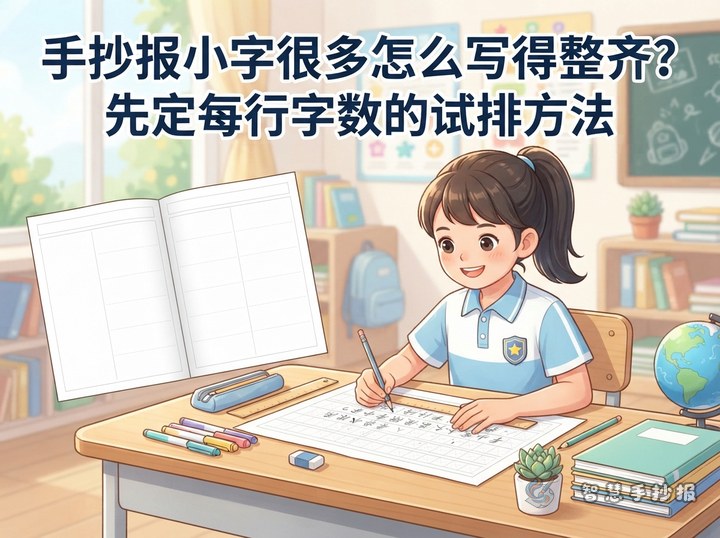
- Test the first line to estimate how many words will fit.
- Plan meaningful line breaks before writing long sentences.
- Write two lines, step back, and check their direction.
- Let the ink dry fully before gently erasing the pencil marks.
Give Each Type of Content Its Own Alignment Rule
Center the Main Heading
A main heading may be centered, curved, or arranged on two levels. It does not need to match the body text edge, but its visual center should be planned before the letters are drawn.
Follow a Baseline for Paragraphs
Explanations, short stories, and fact paragraphs look clearest on horizontal baselines. Leave about half a line of extra space between paragraphs so that sections remain distinct without wasting room.
Align Lists by Their First Word
Tips, safety reminders, and action steps work well with a consistent left edge. Keep the same gap between each bullet or number and the first word instead of stretching every line to the right boundary.
Match Section Density to the Poster Theme
For a science poster, try sections such as “Quick Facts,” “How It Works,” and “What We Can Do.” A festival poster can use “Origins,” “Traditions,” and “Greetings,” with more open space for decoration. A safety poster may include “Warning Signs,” “Correct Actions,” and a short “Self-Check List.”
Adaptable lines include: “Learning the key facts helps us make better choices.” “Small actions can grow into valuable everyday habits.” “Let us observe carefully, take action, and help create a better place to learn and live.” Replace the general wording with details from the chosen theme.
Use a Three-Distance Final Check
- Check closely: Look for crowded letters, oversized punctuation, and uneven word spacing.
- Check at desk distance: Make sure the lines are parallel and paragraph starts are consistent.
- Check from farther away: Compare the visual weight on both sides and preserve enough open space.
After choosing a theme, students and parents can use Smart Handwritten Poster to organize headings, sections, and text blocks, then scan into the WeChat Mini Program to continue making the poster.