Why a calligraphy facts column fits this newspaper
At a school art festival, calligraphy and painting works are often displayed side by side. If the newspaper only contains exhibition notes and artwork descriptions, the page can feel thin. A calligraphy facts column adds a cultural touch and gives the layout a second layer.
It is also easy to write. The notes are short, and you do not need to comment on anyone's artwork, so there is less risk of writing something inaccurate.
Simple calligraphy topics worth including
- The four treasures: brush, ink, paper and inkstone. One sentence about what each one does is enough.
- Script styles: seal, clerical, regular, running and cursive. Compare them simply, for example 'regular script looks the steadiest, running script looks the smoothest'.
- Writing posture: head straight, body upright, arms open, feet steady. Turn these into a short chant that is easy to remember.
- Artwork terms: signature, seal, hanging scroll, central scroll and couplet. Pick two and explain them.
- Practice stories: old tales about people who practised until the pond turned black with ink or the wooden board wore through. Tell them in two or three sentences only.
How long each note should be
- One note, one idea, ideally under forty characters so it reads like a small card.
- Turn some notes into questions, such as 'Why should a brush be rinsed after use?'
- Numbers help a lot. Phrases like 'four script styles' or 'three key points' are easy to remember.
- Do not copy a long paragraph. Choose the one sentence you like best and write the rest in your own words.
Where to place the column on the page
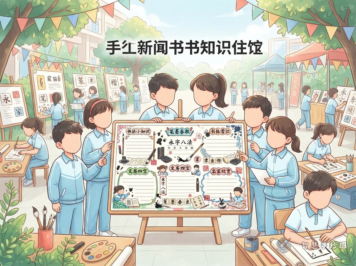
Sketch the main title and main picture first, then decide the shape of the column. A vertical strip works well on the right side, while a horizontal strip fits neatly across the bottom.
- Separate the column from nearby text with a thin border or a light coloured block.
- Give it a short heading of four to six characters, such as 'Calligraphy Corner' or 'Ink and Brush Notes'.
- Draw a small dot, brush, inkstone or seal icon before each note. Keep the drawings simple.
- Use dark grey or black for the body text so it stays easy to read against the border.
A short passage you can copy
If you are short on time, copy the passage below and shorten it to fit your layout:
'To write with a brush, first meet four good friends: brush, ink, paper and inkstone. Brushes can be soft or firm, ink is ground slowly, paper soaks up water well, and the inkstone holds the ink. When you write, remember four words: head straight, body upright, arms open, feet steady. Go stroke by stroke, and your writing will grow steadier.'
Finish with one line of your own, for example 'I like clerical script best because it looks flat and stable.'
Three checks before you finish
First, read every line aloud and fix spelling and punctuation. Second, make sure the column heading is larger than the body text. Third, check that the border, heading and text are clearly separated so readers can spot the column from a distance. If you want to save time on layout, you can open the Smart Handwritten Newspaper mini program, choose an art festival template and type your finished text into it.