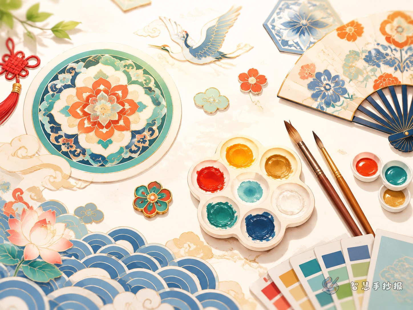
Choose one leading color before you start
A common mistake in this kind of hand-copied poster is using too many colors too early. The page may look lively, but it loses focus. A better method is to decide on one main palette first, then add two or three supporting colors.
If you want an elegant look, try blue-and-white tones, pale white, and soft gray. If you want a festive feeling, choose cinnabar red, gold, and warm cream. If you prefer a more classical mood, use mineral blue, mineral green, and earthy brown. This makes the page more unified and visually layered.
Use fewer motifs, but use them well
Traditional motifs work best when they support the theme instead of filling every empty space. For a student poster, the most useful motifs are the ones with clear shapes and repeatable lines.
- Cloud patterns: soft and flowing, ideal around the title.
- Fret patterns: regular and structured, good for borders and dividers.
- Ruyi motifs: symbolic and auspicious, suitable for corners and subtitles.
- Lotus motifs: graceful and calm, perfect for pairing with traditional color notes.
If your page is not large, two motifs are enough to keep the design consistent.
Content sections you can actually use
To make the poster readable and student-friendly, divide the writing into short sections instead of long blocks of text.
- What are traditional Chinese colors? Give a short explanation of how these colors come from nature, crafts, clothing, and historical aesthetics.
- Traditional motifs I know Introduce cloud, fret, lotus, and ruyi designs with simple meanings.
- How colors and motifs work together For example, blue with floral scrolls feels elegant, while red with ruyi motifs feels festive.
- Traditional beauty in daily life Mention ceramics, window patterns, Hanfu, New Year prints, or painted architecture.
Each section can be kept short so it is easier to copy by hand and easier to read.
Make the title area stand out
Your title can be something clear and attractive, such as “The Beauty of Chinese Traditional Colors and Motifs.” Draw a thin border around the title and place small symmetrical decorations in the corners. This gives the page a center without making it feel crowded.
Do not decorate all four sides too heavily. You can add detail only in the top left and bottom right, or use a slim fret border on one or two edges. This helps the main text remain tidy and readable.
Small details that improve the whole page
Use light and dark shades of the same color
For example, use a darker blue for the title and a lighter blue for lines and highlights. This creates softness and depth.
Leave space between text blocks
Traditional-style posters often look better when they are not crowded. Space helps the page feel calm and elegant.
Highlight key words
Important terms such as “cinnabar red,” “cloud pattern,” or “ruyi motif” can be written slightly larger or in a different color to guide the reader’s eye.
If you already have a topic but still need help refining the structure, you can continue organizing your title, sections, and layout in Zhihui Shouchaobao on the WeChat mini program.
