Find the Reason the Page Looks Muddy
Markers produce strong, attractive color, but repeated strokes can leave dark joins and uneven patches. A poster often looks messy not because the drawing is poor, but because too many saturated colors compete across the title, borders, and illustrations.
- Scattered colors: A different color in every section prevents the page from feeling unified.
- Too much darkness: Large areas of black, navy, or deep purple can overpower the writing.
- Mixed stroke directions: Switching between horizontal, vertical, and circular strokes creates visible patches.
- Insufficient white space: Crowded text, pictures, and borders make even a good palette look untidy.
Build the Design Around Three Colors
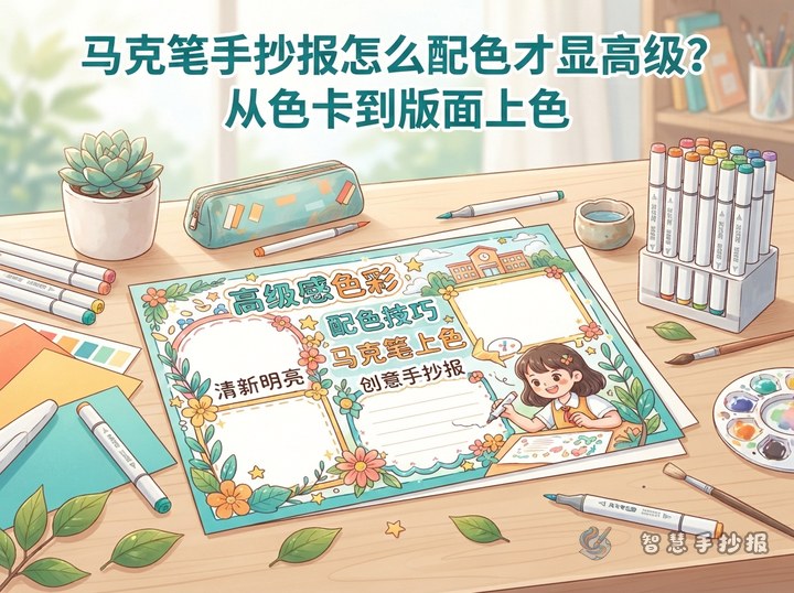
Choose a main color that matches the topic, then add one supporting color and one accent. The main color should cover about half of all colored areas, the supporting color should organize sections, and the accent should appear only in a few small places.
Easy Palettes to Try
- Mint green, light blue, and orange: Fresh choices for nature, spring, environmental, or school-life topics.
- Navy, sky blue, and yellow: Suitable for science, space, ocean, and study themes.
- Dusty pink, cream yellow, and brown: A warm palette for reading, gratitude, or traditional celebrations.
- Purple, pale pink, and teal: Useful for art, dreams, and personal growth, provided that deep purple is used sparingly.
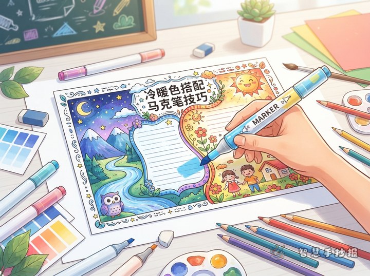
For an easy combination, keep the main and supporting colors at a similar temperature and use a small contrasting accent. Fluorescent markers work well for stars, arrows, and keywords, but not for large backgrounds.
Color in a Reliable Order
- Test on scrap paper: Check the nib width, actual ink color, and the result of overlapping two markers.
- Work from light to dark: Lay down a pale base before adding a darker shade from the same color family.
- Keep strokes consistent: Move continuously in one direction instead of repeatedly correcting a half-dry area.
- Limit layering: Let the first coat dry, then add a small shadow beneath title letters, at the base of leaves, or on the shaded side of an object.
- Refine outlines last: Wait until the marker is dry before using a fine liner, so the dark outline does not smear.
Place scrap paper underneath if the poster paper is thin. Instead of filling a large solid shape, use stripes, dots, or small geometric areas. They require less ink and are easier to color evenly.
Give Every Part a Color Job
Use the main color for the title and add a slightly darker shade along one side of each letter for simple depth. Draw section frames with thin supporting-color lines, rounded labels, or pale patterns rather than filling every box. Reserve the accent for corner icons, section numbers, and underlines beneath important words.
Short Sections and Text Ideas
- My color rule: Fewer, coordinated colors make important details easier to notice.
- Coloring reminder: Test first, use even strokes, and move from light to dark.
- Why white space matters: Open areas make the reading order clearer.
- My palette notes: List the three selected colors and explain why they fit the topic.
Write body text in black or dark gray. Highlight only the key words rather than placing an entire paragraph on a dark background. This keeps the content readable and lets marker decoration establish a clear visual hierarchy.
Finish With a Color-Reduction Check
Place the poster at a distance and look again. The title should attract attention first, followed by two to four main sections, with decorations noticed last. If one corner is too dominant, shrink its pattern, remove some dark color, or create more open space nearby.
Once the topic and three-color palette are settled, continue in the 智慧手抄报 WeChat Mini Program to choose a layout, arrange sections, and develop the poster. Completing the black-and-white draft before coloring usually produces a cleaner result than selecting colors while drawing.