Why Rail History Works So Well on a Poster
Railways give you a ready-made story: the trains changed, the speed changed, and the stations changed too. For younger students, that steady march from old to new is easy to show with pictures and easy to divide into sections. Showing the change clearly matters more than listing technical terms.
One Straight Timeline Does Most of the Work
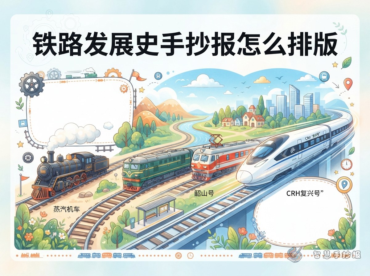
A horizontal timeline reads from left to right, which naturally means "from the past to today". Give each stop a small drawing and one short caption, and the whole page becomes easy to follow.
Stop One: Steam Locomotives
Think coal, boiler, white smoke and iron wheels. Draw a round-bodied engine with a tall chimney and a few puffs of smoke, then add a caption about steam pushing the wheels.
Stop Two: Diesel and Electric Locomotives
The key change here is moving from coal to oil, and then to electricity. The body becomes boxier, and electric engines carry a pantograph on the roof. Draw the overhead wires too, and explain that the power comes from above.
Stop Three: High-Speed EMUs
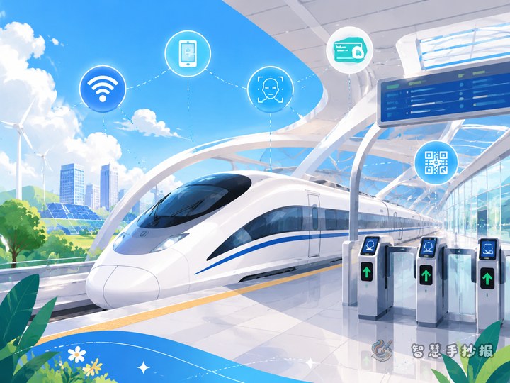
Streamlined white bodies, blue stripes and long pointed noses. Trains like Fuxing and Harmony are the most eye-catching element on the page. A short note that they can run at around 350 kilometres per hour fits nicely beside the drawing.
Arranging the Page Around the Nose of a Train
- Place the timeline across the lower middle of the sheet, leaving the top for the headline and a large hand-drawn train.
- Keep the headline short, four to seven characters or two or three words.
- Put a small picture above each stop and two or three lines of text below it, so the page reads picture, line, words.
- Save a small box in the top corner for "What I found out" or "My favourite train", which makes the poster feel personal.
Sentences You Can Copy Straight Onto the Sheet
- The turning of the wheels marks how fast the world moves forward.
- From burning coal to using electricity: the engine itself shows how technology grows.
- Steel rails stretch into the distance and link one city to the next.
- Train noses became streamlined because the faster you go, the more the air pushes back.
- Today's Fuxing trains were improved step by step by generations of railway workers.
Mixing Old and New Colours
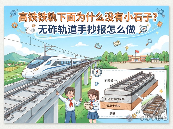
Use warm yellows, browns and off-white on the historical side, as if the page were an old photograph. Use blue, white and silver-grey on the modern side for a clean, high-tech feel. A soft gradient band in the middle helps the two halves meet. Small decorations such as signals, rail clips or track cross-sections work well, but leave enough empty space for writing.
Before You Pick Up the Pencil
Sketch the timeline lightly in pencil, then work out the size of each train, and only write the text last. Faint ruled lines help keep handwriting straight. If you want a neater layout, open the WeChat mini program "智慧手抄报" and choose a railway-themed template to arrange your sections before copying them out.