Start with the most recognizable look
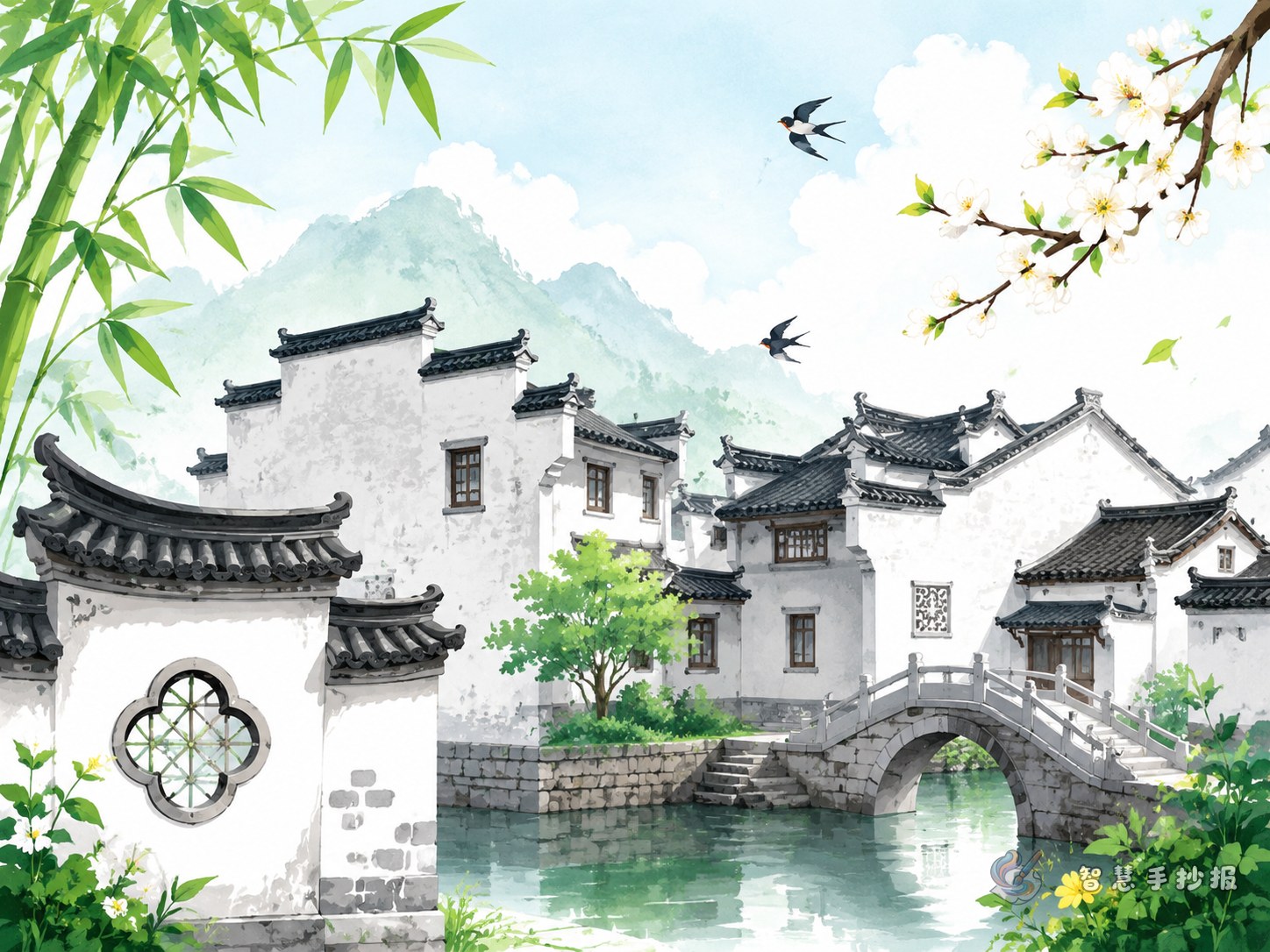
The easiest way to make this topic clear is to show the classic visual image of Hui-style architecture: white walls, black tiles, and layered horse-head walls. Place the title at the top of the page and add simple roofline shapes, tile patterns, or square window frames around it so the traditional style stands out immediately.
You do not need too much text. If the page clearly shows the architectural look and includes a few matching illustrations, it can already feel rich and complete.
Useful sections you can put on the page
Section 1: What does Hui-style architecture look like?
- Walls are usually white, and roof tiles are dark gray or black.
- Horse-head walls rise in layers and create a strong silhouette.
- Many houses include patios for light, airflow, and drainage.
- Doors, beams, and windows often feature delicate carvings.
Section 2: Why do people like this style?
- It looks elegant and calm, like an ink painting.
- The buildings blend naturally with mountains and villages.
- It combines practical living with cultural beauty.
Section 3: Key elements to highlight
- Horse-head walls
- Patios
- Wood, brick, and stone carvings
- Decorative gates
- Lattice windows
You can arrange these as two columns or a four-part layout for a clean and student-friendly page.
Keep the writing simple and readable
A handwritten newspaper should not read like a textbook. Short sentences work better. Here are some easy ideas students can adapt:
- Hui-style architecture looks like a black-and-white ink painting.
- Horse-head walls create a lively and layered outline.
- Patios bring sunlight and fresh air into the house.
- The three kinds of carvings show the beauty of traditional craftsmanship.
- This style connects architecture with nature in a harmonious way.
If you want more content, add a small box called “My impression of Hui-style architecture” and write two or three personal sentences. That makes the work feel more original.
A layout that feels traditional without being complicated
This theme works well with a top title and lower content blocks structure. Write the main title boldly across the top and decorate both sides with roof corners or tile shapes. In the middle and lower parts, divide the content into three or four sections. They do not need to be the same size. Uneven blocks can make the page more lively.
- Title area: theme name with a roofline border.
- Main area: architectural features, key elements, and short cultural notes.
- Decoration area: small drawings of windows, lanterns, seals, trees, or stone paths.
- Blank space: leave some empty areas so the page feels elegant rather than crowded.
Use black or dark gray for the main text, and mark important words lightly with muted red.
Small details that improve the final result
A cultured-looking page does not depend on long writing. It depends on visual unity. Try using repeating border patterns, tile motifs, lattice lines, or seal-style labels. For small drawings, a gate, part of a roof, or a horse-head wall is enough to support the topic.
If time is limited, decide the title and sections first, then add short text and simple decorations, and finally unify the color scheme. After sketching your draft, you can also continue polishing the page in the Zhihui Shouchaobao WeChat mini program.