Start with a clear angle instead of writing everything
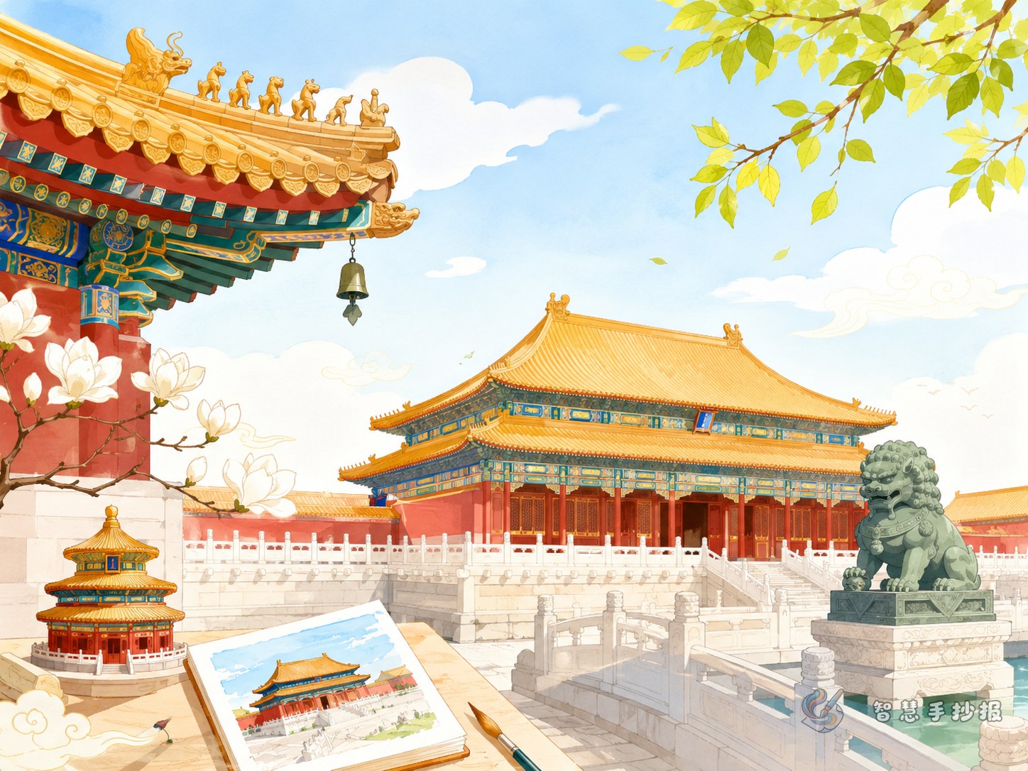
A Forbidden City handwritten newspaper works best when it has one clear focus. Rather than writing a general history page, center the poster on the beauty of imperial architecture, traditional Chinese palace design, or the cultural meaning of the Forbidden City. This makes the content easier to organize and more suitable for a school project.
For younger students, it is smart to write about visible features such as colors, roofs, gates, courtyards, and the central-axis layout. These details are easier to understand and easier to illustrate.
Useful sections you can place on the poster
Section 1: A short introduction to the Forbidden City
You may write: The Forbidden City is in Beijing and is one of the most famous ancient palace complexes in China. Its grand scale, orderly layout, and red walls with yellow tiles make it a classic example of traditional Chinese architecture.
Section 2: Landmark buildings inside the palace
- Hall of Supreme Harmony: A grand hall that shows the dignity of imperial architecture.
- Corner Towers: Elegant and detailed in shape, perfect for themed drawings.
- Meridian Gate: A strong visual symbol that works well near the title area.
Section 3: Main architectural features
- Red and yellow colors create a solemn and noble feeling.
- Symmetry is used to show order and balance.
- Roof forms and upturned eaves are highly decorative.
- Layered courtyards reveal the beauty of traditional planning.
Section 4: What I learned from this architecture
You can add a few simple lines such as: The Forbidden City shows that ancient buildings are not only useful spaces, but also carry ceremony, beauty, and history. Its balanced layout and refined roofs reflect the wisdom of the past.
A layout style that matches the theme
This topic is ideal for a central-axis page design. Put the main title at the top center, add symmetrical decorations on both sides, and place the content blocks in a balanced way underneath. This echoes the architectural order of the palace itself.
- Turn the title into a palace plaque style.
- Use borders inspired by roof tiles, clouds, lanterns, or traditional patterns.
- Add small icons like halls, gates, or pavilions beside each subtitle.
- Choose red, yellow, brown, and a little teal for a classic palace feeling.
If the page is large enough, draw a simple outline of a main hall in the middle to strengthen the theme instantly.
Short text materials ready to use
Text 1: The Forbidden City is a major example of traditional Chinese palace architecture, known for its order, scale, and beauty.
Text 2: Red walls, yellow tiles, upturned eaves, and grand halls give the palace a solemn and elegant style.
Text 3: The Forbidden City is not only a group of buildings, but also a visible book of history.
Text 4: Protecting ancient buildings means protecting excellent traditional Chinese culture.
Small details that improve the final work
- Do not turn the whole poster into a long history article. Keep it poster-friendly.
- Short paragraphs are better than heavy text blocks.
- Simple drawings of eaves, lanterns, palace walls, or corner towers already look effective.
- Leave a small area for personal thoughts to make the page more complete.
After planning your content, you can continue refining the title style, section order, and page arrangement in the WeChat mini program to make the handwritten newspaper cleaner and more polished.