Choose Line Weight by Purpose, Not by Pack Size
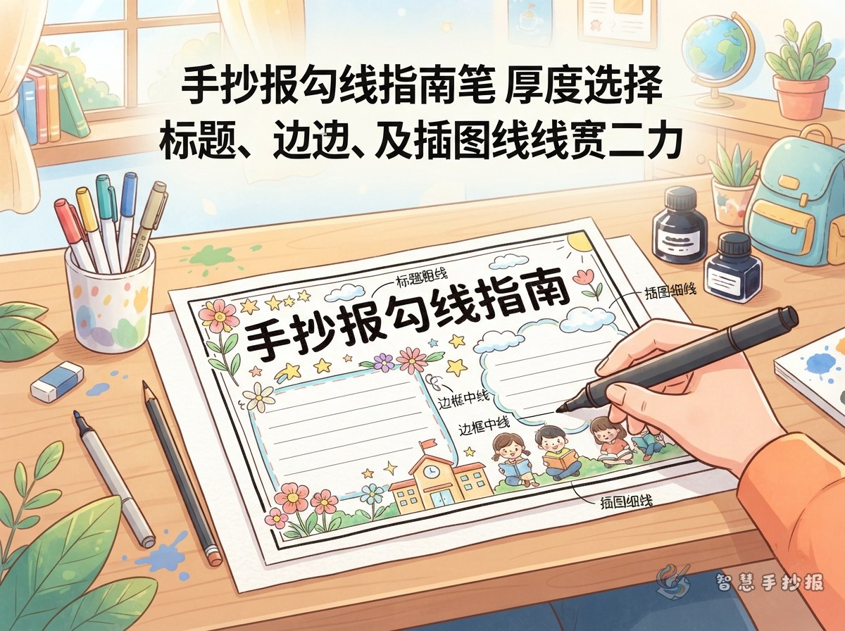
A handwritten school poster usually contains a title, content boxes, body text, illustrations, and decorative borders. Fineliners should separate these parts clearly rather than making every line equally dark. Three common sizes are enough for most assignments.
- 0.3 mm: Best for leaf veins, facial features, tiny stars, patterns, and light decorations inside content boxes.
- 0.5 mm: Useful for main illustration outlines, section borders, and dividers. It is the most flexible everyday size.
- 0.8 mm: Suitable for large title outlines, key labels, and the outer edge of a layout. It can overwhelm very small drawings.
Younger students who find fine tips difficult to control can complete most outlines with a 0.5 mm pen and thicken only the title with a colored marker.
Create a Visual Path with Thick, Medium, and Fine Lines
The boldest lines should appear around the main title or central illustration. Medium lines can define the sections, while fine lines should be reserved for details. This hierarchy helps readers notice the topic first and then move naturally through the content.
Useful Sections for a Student Poster
- Quick facts: Introduce the main meaning of a holiday, safety topic, environmental theme, or reading activity in short sentences.
- Action list: Present three to five practical steps with numbers or check marks.
- Friendly reminder: Highlight one memorable message inside a stronger border.
- What I learned: Add two or three personal sentences to make the poster sound like student work.
For a water-saving poster, short text could include “Turn off the tap,” “Report leaks quickly,” and “Use only the water you need.” Give the title a thick outline, use medium lines for the action list, and draw water drops and ripples with a fine pen.
Follow a Clean Sketch-to-Ink Routine
- Use a sharpened pencil to place the title, illustrations, and writing boxes lightly without pressing grooves into the paper.
- Ink the main drawings first, add content boxes next, and finish with small decorations so your hand crosses fewer wet lines.
- When using a ruler, keep the tip slightly away from the edge or use a ruler with a raised or beveled edge to prevent ink from spreading underneath.
- Let every inked line dry before removing guidelines with a soft eraser.
- Review the hierarchy at the end and thicken only the title or key images instead of tracing every border again.
Match the Pen to the Paper
Smooth paper usually produces crisp lines, although the ink may take longer to dry. Thin or heavily textured paper can make fine lines look broken and may become rough after repeated tracing. Before starting the final poster, test several strokes on a corner of similar paper and check for feathering, show-through, and smudging.
Replace pen caps immediately and store fineliners horizontally when possible. Clean ink from ruler edges after use. A standard pencil that erases easily and a soft, low-dust eraser are more helpful than an oversized collection of supplies.
Add Color Only After the Line Work Is Balanced
Once the outlines are complete, choose two or three main colors for the title, section labels, and illustrations while leaving enough white space around the body text. Because dark outlines already add emphasis, the entire background does not need to be filled. To explore more topic sections and layout ideas, open the 智慧手抄报 WeChat Mini Program and continue creating your handwritten poster.