Make Three Decisions Before You Start
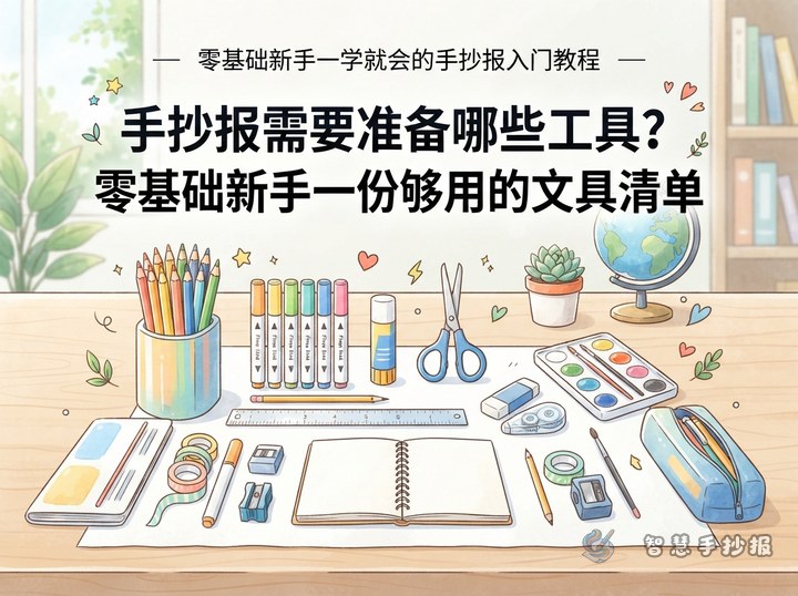
The hardest part of a first handwritten poster is often deciding what to include. Gather paper, a pencil, an eraser, a black outlining pen, and colored pencils. Then describe the topic in one sentence, such as “ways to save water” or “what I learned from reading.” A focused topic makes every later step easier.
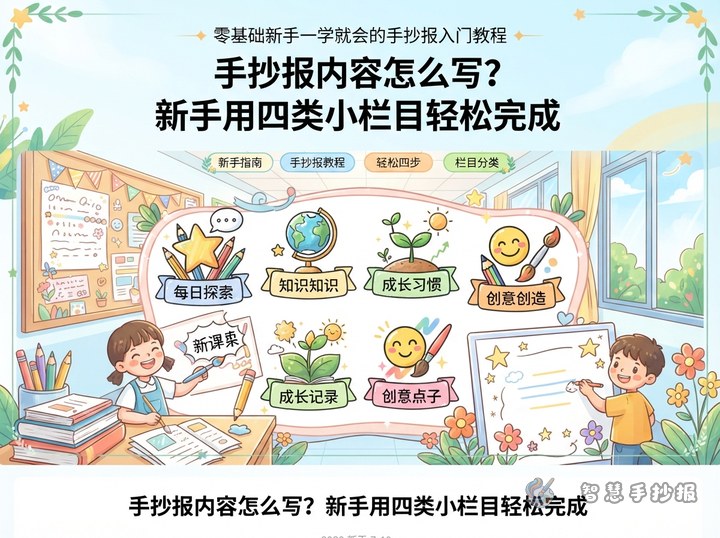
Next, choose three sections. A useful combination is topic introduction, helpful facts or methods, and my action plan. Prepare one short paragraph or three to five bullet points for each section rather than copying long blocks of information.
Build the Poster in Six Simple Steps
- Choose the page direction: Use landscape for several text sections or portrait for a strong central illustration.
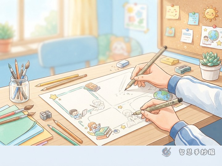
- Sketch the zones: Lightly mark space for the title, three content areas, and illustrations.
- Add the main title: Place it at the top, in one corner, or near the center, and make it two or three times larger than the body text.
- Write the content: Add each section heading first, followed by short, readable sentences with even spacing.
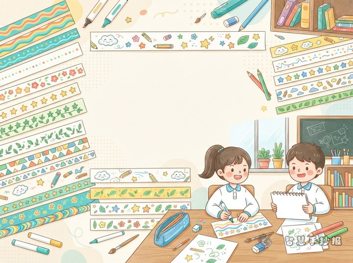
- Draw borders and pictures: Use small topic-related illustrations and simple frames to organize the sections.
- Outline and color: Check everything before outlining. Apply light colors first and use darker shades only for emphasis.
A Reusable Three-Part Content Plan
Opening: What Is the Topic?
Explain the topic in two or three sentences and say why it matters in school or daily life. Use familiar words that classmates can understand quickly.
Middle: Useful Things I Learned
Select three to five practical facts, methods, or reminders and present them as short points. For an environmental poster, for example, these might include saving paper, turning off lights, and sorting waste.
Ending: One Action I Can Take
Describe a specific way to put the topic into practice, or finish with a short positive call to action. Keep it brief and connected to the main theme.
Use Visual Priority and Open Space
The title should be the strongest visual element, so give it one noticeable main color. Keep section headings consistent and write the body text in black. Two or three main colors are usually enough; too many colors can make the page feel busy.
- Try one large section with two smaller sections instead of dividing the page into identical boxes.
- Place each illustration close to the text it supports.
- Leave a margin around the page and space between writing and borders.
- Use circles, books, leaves, flags, and stars when detailed drawing feels difficult.
Do a One-Minute Final Check
Look at the poster from a short distance to see whether the title stands out and the sections are easy to follow. Then check the writing for missing words, spelling errors, and uneven coloring. Add only one or two small icons if an area feels empty; stop decorating if the page already looks full.
If you need help organizing sections and choosing a layout, continue in the 智慧手抄报 WeChat Mini Program. You can adapt the suggested plan to your grade and topic, then complete the handwriting and personal decorations yourself.