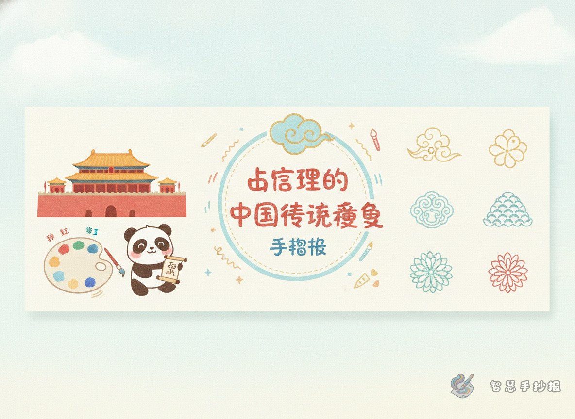
Start with a clear angle: let colors tell the story
For a handwritten newspaper about traditional Chinese colors in the Forbidden City, the key is not listing many color names. Instead, connect each color with palace walls, glazed roofs, painted beams, cultural objects, or seasonal feelings. You can divide the page into color groups such as palace red, imperial yellow, blue-green decoration, calm blue, and soft white space.
For elementary students, choosing four or five representative colors is enough. A smaller palette makes the page cleaner and helps show the balanced and elegant beauty of traditional Chinese color matching.
Color materials you can write directly on the page
Palace red
Red often feels formal, warm, and eye-catching. In a Forbidden City theme, palace red is one of the best-known colors. It works well for the title, borders, and important text boxes.
Glazed yellow
Yellow stands out strongly in traditional architecture. When paired with red, it creates a rich but orderly look. In the newspaper, light yellow can be used for roof drawings, subtitle backgrounds, or decorative corners.
Blue-green and mineral blue
Blue-green tones remind people of painted beams, old buildings, and garden shadows. These colors can soften the strong effect of red and yellow. They are suitable for section headers, small ornaments, or note frames.
Moon white and quiet neutrals
Traditional Chinese color matching is not only about bold colors. It also values calm empty space. Moon white, cream, and light gray can be used as background colors so the main colors look clearer and more refined.
Useful section ideas for the handwritten newspaper
- Main title area: Write a title like “Traditional Chinese Colors in the Forbidden City.”
- Color cards: Introduce each color with its name, feeling, and matching effect.
- Mini lesson on matching: Explain simple ideas such as red and yellow look grand, while red and blue-green feel lively.
- My color impression: Add short personal lines such as “To me, palace red looks warm and solemn.”
- Decorative border area: Use simple window patterns, cloud motifs, or roofline shapes.
How to arrange the page beautifully
This theme works especially well with a balanced layout. Put the title at the top center and divide the rest into two or four neat content blocks. A palace gate, roof edge, or window frame drawing can be used as the visual center.
For handwriting, dark brown, black, or deep red usually looks better than bright fluorescent colors. If the page feels too heavy, add small cloud lines or floral motifs in open spaces to keep the work elegant and lively.
Common mistakes to avoid
- Using too many colors so the focus becomes unclear.
- Putting large areas of bright red and yellow together without balance.
- Leaving no white space, which makes the page crowded.
- Drawing too many patterns that cover the text.
A safe formula is one main color, two supporting colors, and one neutral background. For example, use palace red as the main color, glazed yellow and mineral blue as supporting colors, and cream white as the base.
A short ending paragraph for the page
Traditional Chinese colors are more than beautiful shades. They reflect architecture, order, and cultural taste. The red walls, yellow roofs, blue-green paintings, and quiet white space of the Forbidden City create a lasting sense of Eastern beauty. By using these colors in a handwritten newspaper, students do not only learn color names, but also experience the wisdom of traditional Chinese aesthetics. If you want to keep improving the title, layout, and matching effect, you can continue creating in the Smart Handwritten Newspaper WeChat mini program.
