Give the page an exhibition title first
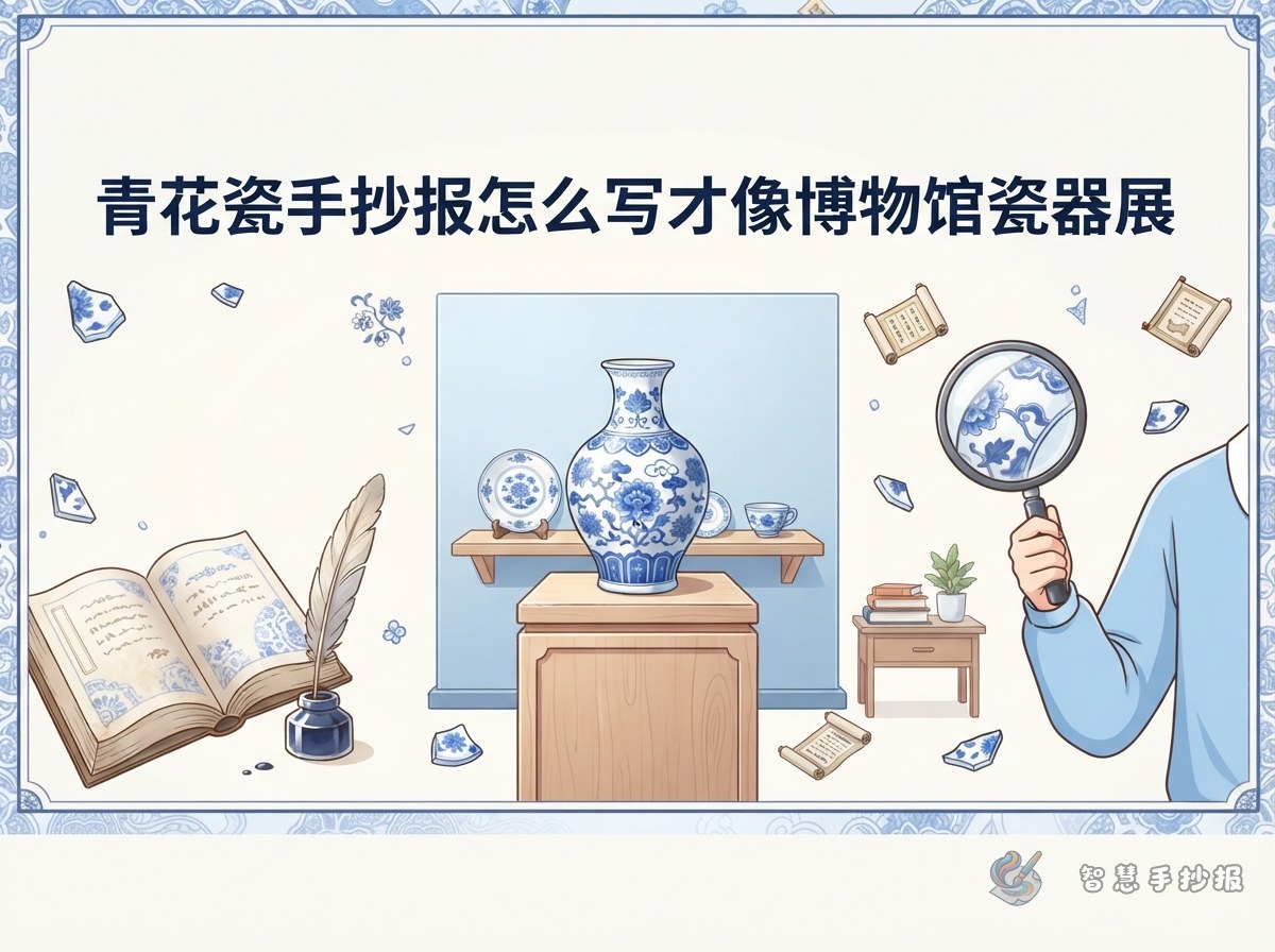
Porcelain posters often turn into instruction sheets: fact after fact, with nothing to hold them together. A better approach is to treat the whole page as a small exhibition. Choose a title such as Blue and White: A Small Porcelain Show or The Journey of One Vase, and let every column relate back to it.
Under the title, choose one star object. It could be a tall vase, a soft-shouldered vase, a plate or a bowl. Pick only one, and resist the urge to show everything.
- Top area for the exhibition title
- Centre or one side for the main drawing
- A small block beside it for the object label
- The remaining space for three or four short text columns
Facts you can copy straight into the columns
Keep each fact to two or three lines. Short blocks look neater and are easier to read from a distance.
- What blue-and-white means: patterns are painted with a cobalt pigment on the clay body, covered with a clear glaze and fired at high temperature, giving a blue pattern on a white ground.
- Common shapes: tall vases, soft-shouldered vases, jars, bowls and plates.
- Common motifs: scrolling lotus, peony, waves and cliffs, clouds and dragons, and children at play. Many of these carry good wishes.
- A long journey: porcelain travelled along sea trade routes to Southeast Asia, West Asia and Europe, and many pieces are now kept in museums.
- Why blue and white: the contrast is clean and bright, and the pattern still reads clearly from far away.
Column names that sound like exhibition labels
Instead of "Fact 1" and "Fact 2", try label-style headings. They make the page feel like a real display.
- Object File: name, period, shape and use, written as briefly as a museum label.
- Pattern Code: draw one motif larger and explain what it may stand for.
- Where the Blue Comes From: a short note on the pigment and the firing, plus a small tile sketch.
- A Long Journey: how the vessel was carried overseas, with a simple route line.
- Visitor's Note: one thing you noticed or wondered about.
- Quick Quiz: two questions, such as "What gives blue-and-white porcelain its colour?"
Keeping the blue-and-white layout calm
The porcelain style depends on two things: few colours and lots of empty space. Stick to blue and white, with perhaps a little pale grey for shading. Adding red, yellow or green will fight against the look.
- Lightly divide the page into three zones: main image, text and corner decoration.
- Split the text zone into two or three columns, one subject per column.
- Leave a finger-width of space between columns instead of boxing everything in.
- Use thin blue key patterns, waves or small flowers as borders.
- Check at the end that no colour or motif has wandered in from outside the theme.
Order of work, from rough draft to finished page
- Decide the exhibition title and the star object, and write them at the top of your draft.
- List four or five column names, each with only three to five lines of text.
- Pencil in the zones and the vessel outline, and check the sizes before writing.
- Write all the text first, then add colour, so your hand does not smudge wet ink.
- Finish with patterns, borders and small decorations.
If your draft never looks quite even, open the Zhihui Handwritten Newspaper mini program in WeChat, choose a porcelain-style layout, type in the text you have already written, and print the result to trace. It saves a lot of rubbing out and redrawing.