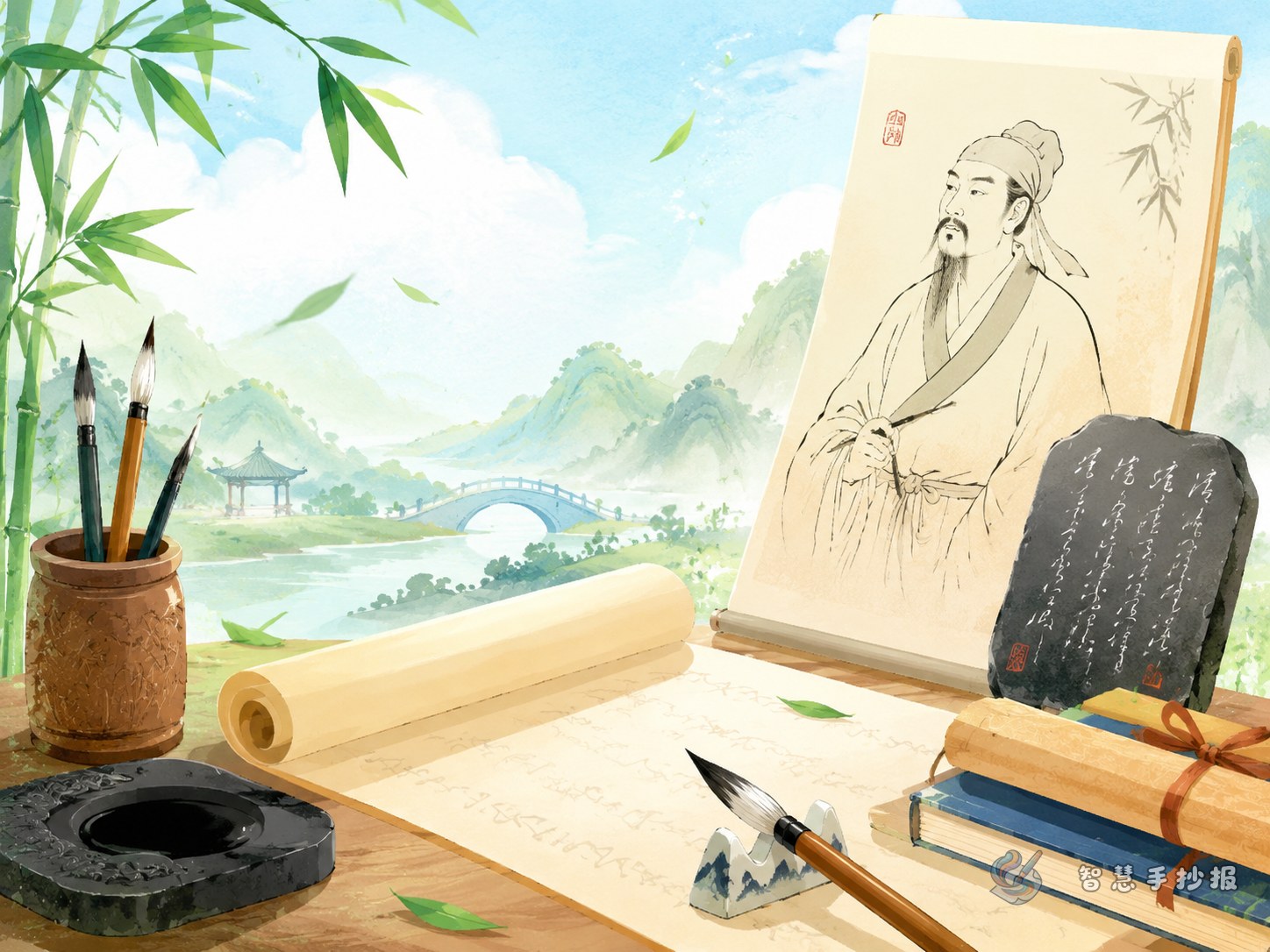
Decide the main focus before writing
When students make a Wang Xizhi handwritten newspaper, they often collect too much information and lose the main point. A better way is to focus on three simple questions: who he was, what he wrote, and why people still admire his calligraphy today.
This topic is suitable for elementary students because Wang Xizhi is widely known and easy to introduce. It also gives enough room for both knowledge and creative page design.
Useful content blocks you can place on the page
Short introduction
You can write a simple introduction like this: Wang Xizhi was a famous ancient Chinese calligrapher and is often called the Sage of Calligraphy. He is especially well known for his graceful and flowing running script.
Famous works
- Lanting Xu: a very famous piece often used to represent the beauty of running script.
- Huangting Jing: a useful work to mention when introducing his neat and elegant writing style.
- Copybooks and stele studies: you may note that later generations learned his style through copies and related materials.
Calligraphy features
- The strokes change naturally and do not look stiff.
- The characters connect smoothly with one another.
- The whole writing feels elegant, lively, and balanced.
- It combines strength with beauty.
A small story section
You can add a short and interesting story, such as the one about his love of geese. A short story makes the page more vivid and easier for younger readers to enjoy.
A layout idea that feels fresh
Instead of making plain boxes, try a scroll-style layout. Put the main title in the center, then place two content sections on the left and two on the right. Leave the bottom area for a reflection or takeaway.
- Top: title and a short opening line.
- Left side: introduction and a fun story.
- Right side: famous works and style features.
- Bottom: what I learned from Wang Xizhi.
If the page is large, you can also create a small “calligraphy gallery” with each section designed like a separate card.
Decoration ideas that match the topic
Decoration should support the calligraphy theme rather than distract from it. Traditional study elements work especially well here.
- Use a title style that suggests brush movement.
- Add borders shaped like scrolls or classic frames.
- Draw brushes, inkstones, seals, and ink drops.
- Choose soft traditional colors such as cream, black, brown, and red.
What to add if the page feels empty
If you need more content, add a section called “What calligraphy teaches me” and write about patience, care, and practice. Another good option is “My favorite piece,” where you explain in simple words why you like one work.
These extra sections make the page feel fuller and more personal, not just copied from reference materials.
A simple ending students can use
You may end with a sentence like this: Wang Xizhi helps us feel the beauty of Chinese characters, and his calligraphy reminds me that good handwriting needs patience and steady practice.
If you want to keep improving the layout, colors, or section names, you can continue designing your page in the Zhihui Shouchaobao WeChat mini program.
